1. Double Page Spread: Construction on InDesign
Now that I have my interview and image sorted for the double page spread, I moved over to
InDesign so that I can place everything together.
~most of my examples will only be showing one side of the double
page spread~
Knowingthateverythingfitwell withthe dimensionsandmeasurements
of the spreadI startedplacingontext.
I got the ‘Aninterview with:’textbygoingontodafont.comandselecting
the right fontandthenusingthe snippingtool tograb the image and then
usedPhotoshoptochange the colourof the text.(Asdemonstratedinmy
‘TestPhotos’post)
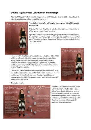
I likedhowitlookedhoweverIneededtoknow thatit wouldlooklike
withthe mainbody.I dividedmyquestionsandanswerssothatit
wouldspreadequallyacrossbothpages.Iusedthe textbox in
InDesignandusedthe Gadugifont(size 14) and thenadjustedit
slightlysuchasusingitalicfontformy questionsandmakingsure the
textisn’thyphenatedetc.
Lookingat itI feltitneededsomethingextrasuchasan intro to attract
the reader.I alsowanteditto relate itto the front coverand I decided
that the use of the white linesroundthe edgeswouldbe quite
creative andeffectinginfillingupthe emptyspace withoutmakingit
look too busyandmessy.
This is the result:
I usedthe same ideawithmyfront cover
withmybanneras the frontcoveruses
italicsforthe date and issue no.but the
modelsname isinregularfont- whichis
the same thingI have done here to show
consistency.Ialsofollowedthroughwith
the white linesroundthe edge andI
reallylike how itturnedout.
2. Feedback:
I askedmymediateacherforher opiniononmyworkand she mentionedtome how I forgotsome
minordetailssuchasthe folios.She alsomentionedthatthe fontmaybe slightlytoobigasmost
magazinesusuallyholdtheirtextata size 12 rather than a 14. Asa resultof thisthere wasa lot more
space amongstmy mainbody.
Thisis the resolvedissue:
To resolve thisIcreateda couple more questionsandadjustedthe perviousquestionsslightlyso
that itwouldall flowwell together.Ichangedthe size of the fontandmovedthe mainbodyon the
righthand side sothat it wouldequal the otherside.Iaddedmypage folios(usingthe same font
fromdafont.com).Ialsoaddedcredentialstothe spreadtoadd professionalism.
I chose to make the bannersmallerasI worrieditwas goingtomake the spreadseemcrampedor
busy.I alsomovedthe topwhite linesclosertowardsthe centre topreventfromanyblankspaces
appearing.
I reallylike howthislooksandIthinkthisgoesreallywell withwhatIwantedformy magazine.
Consideringthishasalteredslightlyfrommyoriginal drawings,Istill have obtainedmostof my
elementssuchasmycolourscheme andlayout.