Injustice - Developers Among Us (SciFiDevCon 2024)
Contents page analysis 1
1. Imebvore Aigbochie AS Media
Contents Page Analysis 1
Overall the page takes on a
Another striking point on this
casual and playful tone
contents page would be that NME
because of the fact that there
mixes images into their contents
are pictures on the contents
page. NME intended audience is
page and it also isn’t even
rather young and no young person
called a contents page. Since Rather than naming a contents page typically as ‘Contents’ NME has decided to do would ever want to read walls of
NME knows that their readers something different and name their magazine ‘Inside this Week’. NME’s readers texts so I believe by using images
are young they try to make consider themselves to be different and ‘above and beyond the trend’ so NME related to an artist, then
their magazine come across as probably did this as a way to appeal to their readers as well as doing something summarising what’s happening in
light hearted and playful since different the article, then clearly putting
that is what is most appealing.
the page number of the article is a
Also the page looks pretty
very successful way of
artsy and trendy since it
summarising a magazine into
doesn’t follow the regular
quick and easy to read points. So a
codes and conventions of a
person of my age would gladly
contents page and as I said
read the contents page because it
before it reminds me of a
looks interesting but is still
collage, NME purposely did
informative.
this once again to appeal to
their audience which would
most likely be young trendy NME has a very simple colour
people. scheme of what is mainly black
and white. This way the
background doesn’t take away
from the pictures themselves and
we can appreciate the colours of
the images more.
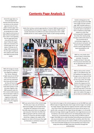
NME still manages to include
what’s going on in the rest of NME has laid out their contents
the magazine by adding a page in a very different way, still
‘Plus’ section. Obviously the heading as the largest font on
straight away we can tell that the page so we can clearly tell that
these are the articles that what it is we are about to read,
have much less importance but also if you notice, the images
than those with the images, are all of different sizes. For
but they still have to be instance the image we are first
included so we as the reader drawn to is of Keith, the image is
know what’s going on inside the largest on the page and so
the whole magazine. Also that must mean that it is the most
NME purposely makes the important article also it is placed
‘Plus’ section smaller because right in the middle of the page so
they would expect readers to we are drawn to it straight away.
know what is in usually the
magazine as they would
expect their readers to be
loyal and buy the magazine
weekly NME uses various fonts on their contents page. If you look at the images on the contents page you can see that NME have used
The fonts vary in type, size and thickness. different types of images like photo shoot images and live images. For example
Obviously the bigger and more bold the font the image related to page 28 of the magazine would be a photo shoot image
the greater the importance of the article. since some of them are looking directly at the camera and are laid out in a
Normally using various fonts on one page can specific order, same goes for the images that go with pages 11, 22, 36 and 66.
look messy but I think that’s the effect that Whereas the image related to page 44 would be a live image because we see a
NME was going for with this contents page, microphone in the artists’ hands and he’s not looking directly at the camera
because it is messy but still looks arranged because he’s in mid performance. By using a variety of different types of
almost like a collage so the readers of the images I think NME tries to make themselves look professional and serious but
magazine can relate to this because they might also casual and playful as well as showing there versatility, which then links
see themselves as sometimes messy yet back to their audience because the readers of NME are quite young they tend
organised. to be casual and playful people but as we are growing up we need to start
being more serious and NME shows their seriousness through their
professionalism.