1. Imebvore Aigbochie AS Media
Mixmags’ contents page has mixed
images and text together into their
Contents Page Analysis 2 contents page like NME. Once again
since Mixmags’ intended audience is
rather young and no young person
would ever want to read walls of
texts so I believe by using images
related to an artist, then
summarising what’s happening in the
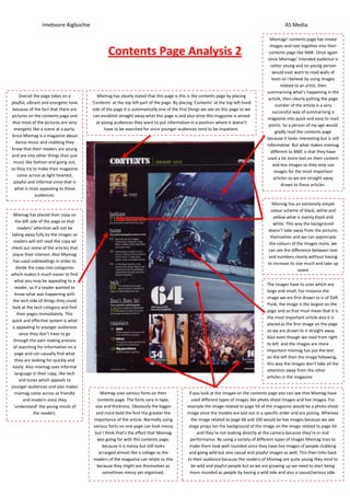
Overall the page takes on a Mixmag has clearly stated that this page is this is the contents page by placing
article, then clearly putting the page
playful, vibrant and energetic tone ‘Contents’ at the top left part of the page. By placing ‘Contents’ at the top left hand
number of the article is a very
because of the fact that there are side of the page it is automatically one of the first things we see on this page so we
successful way of summarising a
pictures on the contents page and can establish straight away what this page is and also since this magazine is aimed
magazine into quick and easy to read
that most of the pictures are very at young audiences they want to put information in a position where it doesn’t
points. So a person of my age would
energetic like a scene at a party. have to be searched for since younger audiences tend to be impatient.
gladly read the contents page
Since Mixmag is a magazine about
because it looks interesting but is still
dance music and clubbing they
informative. But what makes mixmag
know that their readers are young
different to NME is that they have
and are into other things than just
used a lot more text on their content
music like fashion and going out,
and less images so they only use
so they try to make their magazine
images for the most important
come across as light hearted,
articles so we are straight away
playful and informal since that is
drawn to these articles.
what is most appealing to these
audiences.
Mixmag has an extremely simple
colour scheme of black, white and
Mixmag has placed their copy on yellow what is mainly black and
the left side of the page so that white. This way the background
readers’ attention will not be doesn’t take away from the pictures
taking away fully by the images so themselves and we can appreciate
readers will still read the copy ad the colours of the images more, we
check out some of the articles that can see the difference between text
pique their interest. Also Mixmag and numbers clearly without having
has used subheadings in order to to increase its size much and take up
divide the copy into categories space
which makes it much easier to find
what you may be appealing to a
The images have to sizes which are
reader, so if a reader wanted to
large and small. For instance the
know what was happening with
image we are first drawn to is of Daft
the tech side of things they could
Punk, the image is the largest on the
look at the tech category and find
page and so that must mean that it is
their pages immediately. This
the most important article also it is
quick and effective system is what
placed as the first image on the page
is appealing to younger audiences
so we are drawn to it straight away.
since they don’t have to go
Also even though we read from right
through the pain staking process
to left and the images are more
of searching for information on a
important mixmag has put the text
page and can casually find what
on the left then the image following,
they are looking for quickly and
this way the images don’t take all the
easily. Also mixmag uses informal
attention away from the other
language in their copy, like tech
articles in the magazine
and tunes which appeals to
younger audiences and also makes
mixmag come across as friendly Mixmag uses various fonts on their If you look at the images on the contents page you can see that Mixmag have
and modern since they contents page. The fonts vary in type, used different types of images like photo shoot images and live images. For
‘understand’ the young minds of size and thickness. Obviously the bigger example the image related to page 54 of the magazine would be a photo shoot
the readers. and more bold the font the greater the image since the models are laid out in a specific order and are posing. Whereas
importance of the article. Normally using the image related to page 66 and 100 would be live images because we see
various fonts on one page can look messy stage props ion the background of the image on the image related to page 64
but I think that’s the effect that Mixmag and they’re not looking directly at the camera because they’re in mid
was going for with this contents page, performance. By using a variety of different types of images Mixmag tries to
because it is messy but still looks make them look well rounded since they have live images of people clubbing
arranged almost like a collage so the and going wild but also casual and playful images as well. This then links back
readers of the magazine can relate to this to their audience because the readers of Mixmag are quite young they tend to
because they might see themselves as be wild and playful people but as we are growing up we need to start being
sometimes messy yet organised. more rounded as people by having a wild side and also a casual/serious side.