1. alford City College JOSH ROBINSON
Eccles Centre
AS Media Studies
Foundation Portfolio DESIGN BALANCE
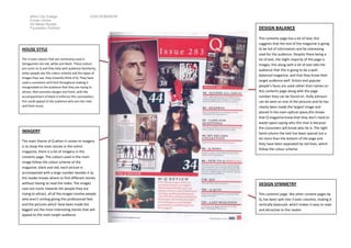
This contents page has a lot of text; this
suggests that the rest of the magazine is going
HOUSE STYLE to be full of information and be interesting
read for the audience. Despite there being a
The 3 main colours that are commonly used in lot of text, the slight majority of the page is
Qmagazines are red, white and black. These colours images, this along with a lot of text tells the
are iconic to Q and they help with audience familiarity, audience that this is going to be a well-
when people see this colour scheme and the types of
balanced magazine, and that they know their
images they use, they instantly think of Q. They have
target audience well. Artists and popular
used a consistent serif font throughout making it
recognisable to the audience that they are trying to people’s faces are used rather than names on
attract. Red connotes danger and fresh, with the this contents page along with the page
accompaniment of black it enforces this connotation, number they can be found on. Holly Johnson
this could appeal to the audience who are into new can be seen on one of the pictures and he has
and fresh music. clearly been made the largest image and
placed in the main optical space,this shows
that Q magazine know that they don’t need to
waste space saying who this man is because
the consumers will know who he is. The right
IMAGERY hand column the text has been spaced out a
lot more than the bottom of the page and
The main theme of Q when it comes to imagery
they have been separated by red lines, which
is to show the main stories in the entire
follow the colour scheme.
magazine, there is a lot of imagery in this
contents page. The colours used in the main
image follow the colour scheme of the
magazine, black and red, each picture is
accompanied with a large number besides it so
the reader knows where to find different stories
without having to read the index. The images DESIGN SYMMETRY
uses are iconic towards the people they are
trying to attract, all of the images involve people This contents page, like other content pages by
who aren’t smiling giving this professional feel, Q, has been split into 3 even columns, making it
and the pictures which have been made the vertically balanced, which makes it easy to read
biggest are the most interesting stories that will and attractive to the reader.
appeal to the main target audience.
2. alford City College JOSH ROBINSON
Eccles Centre
AS Media Studies
Foundation Portfolio
HOUSE STYLE
The 3 main colours that are commonly used in NME DESIGN BALANCE
magazines, especially the contents, are red, white and
black. These colours are iconic to NME and they help This contents page has a lot of text; this
with audience familiarity, when people see this colour suggests that the rest of the magazine is going
scheme, they instantly think of NME. They have used a to be full of information and be interesting
consistent font throughout making it recognisable to read for the audience. The text on this page
the audience that they are trying to attract. Red
surrounds the image, which is consistent with
connotes danger and with the accompaniment of
NME contents pages; the image is usually the
black it enforces this connotation, this could appeal to
the target audience, who are rock fans.
minority and therefore needs to be
highlighted. In the first and last column many
names of popular bands have been displayed,
this can help the readers find if a band they
like is in this issue of the magazine; if there is
the reader will become motivated and read
IMAGERY on. The right hand column the text has been
spaced out a lot more than the left column
The main theme of NME when it comes to and they have been separated by black
imagery is only to show the main story in the headers , which follows the colour scheme.
entire magazine, there is very little imagery in
this contents page. The colours used in the main
image follow the colour scheme of the
magazine, black and red. This is a picture of
Kasabian, the popular band; this instantly
attracts the target audience, but also attracts
people who like the band Kasabian, who don’t DESIGN SYMMETRY
usually read NME magazine. The only other
image is a picture of other NME magazine This contents page, like other content pages by
covers, telling people that if they subscribe they NME, has been split into 3 columns, which
can save money. makes it easy to read and attractive to the
reader.
3. alford City College JOSH ROBINSON
Eccles Centre
AS Media Studies
Foundation Portfolio
Both magazines have used different techniques to make their contents stand out, both of
them don’t use the word ‘Contents’ anywhere on the page, NME call them ‘This Week’
and Q just mentions the issue number. This isn’t a problem as it is just another way of
telling the readers what that page is rather than following the stereotypical contents page
that you see in most magazines.
Q is very image heavy, unlike EMI which is
more text heavy, Q contains a lot of images in
the top left of the page, which is the ideal
optical spot, leaving the bottom right for text,
unlike NME which contains only one image
on the top half of the screen. It seems that
the images on Q are less formal than the
Both of the contents pages are vertically ones on EMI’s contents page, the images are
balanced, from glancing at both of them it can be tilted and overlaid compared to EMI which
a three column design can be seen on both. They have placed the image in a place where text
both seem to follow the colour scheme of red overlays it. Because of the lack of images it
white and black, which seems to be common in seems that EMI have tried to make the text
music magazines. seem like a decoration, containing different
colours and font sizes showing the different
sections of the magazine. Q has focused
more on telling the reader what’s on that
page by using a picture of the page or who
it’s about.