Call Girls In DLf Gurgaon ➥99902@11544 ( Best price)100% Genuine Escort In 24...
Double page spread analysis 2
1. Imebvore Aigbochie AS Media
Double Page Spread Analysis 2
I like how these shapes on the page have really One of the first things we notice about this double page spread by XLR8R Magazine is the typography used in the headline, XLR8R has used quite a few colours in their
smooth gradual tones going from one colour to which is very futuristic and dreamy almost like a concept car but in the form of text. The artist of which the article is about colour scheme but to down tone the use of
another but to be honest I don’t like how they is ‘Skream’. Skream is a Dubstep producer and the music genre Dubstep has a very distinguishable sound which is very multiple colours they have made white they
are placed. They cover up parts of the artists’ futuristic and robotic so XLR8R must’ve tried to reflect the sound of Dubstep into their chosen typography. The headline dominant colour on the page even though
faces and also their hand action of ‘High Fiving’ ‘Whisper to – a Skream’ must be XLR8R’s way of representing rise to fame from being unknown (a whisper) to being famous there are other colours like light blue, light
which signifies union between one another. (a ‘skream’) green, light pink and a pale yellow. XLR8R has
Because of the shapes it obscures the facial deliberately used light colours and even
expressions of these artists so maybe XLR8R put degradations from one colour to another on
in these shapes to make people look away from this double page spread because using light
these artists expression and focus more on the colour gradients and a lot of white makes a
headline and article. page look calm, sophisticated and futuristic.
Since listeners of Dubstep already know what
type of style Dubstep tries to uphold the
futuristic theme that XLR8R has tried to create
will appeal to those audiences
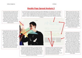
The large image which takes up the whole of the
left page and some of the right is a mid shot
If we look at the layout of the article we see
image. The image is put on the left since we read
that XLR8R has used columns for their article.
from left to right, so the first thing we are drawn
These are one of the codes and conventions
to on the page is the image then the headline,
which are vital for making a magazine look like
then the quote then the sub-heading. In the
a magazine and also no one wants to read an
image we see 2 men with one cut halfway out in
extreme wall of text. By breaking an article
order to bring focus to the main artist of the
into columns it makes the article seem smaller
article. The artists are wearing very simple and
and easier to read, which is definitely
casual clothing since the article is about the
appealing to a younger age group since they
rising of this artist it tries to make Skream look
won’t exactly be into reading so much and
real and authentic by showing him in his
would like to get the vital information straight
comfortable stat. Also this is what artists like
away. Also if you notice XLR8R hasn’t used pull
themselves and also the readers of the magazine
quotes in their article but instead they have
find as popular so readers may want to buy
used sub-headings. Without the pull quote the
clothes that they see these artists wearing. We have to remember that Dubstep is very energetic and wild yet Sub-headings are used to summarise what an article is
page still looks like it came from a magazine
futuristic and robotic which is why XLR8R used bright colours dull about and to give a little insight into what someone is
because they’ve used columns but by using
colours on their double page spread but then dulled these colours about read. The main subheading is deliberately
sub-headings it can also make the page look
down to make the page look futuristic this way they can create a calm placed between the headlines on the page to split
quite simplistic yet sophisticated which is the
and dreamy atmosphere. The colours used throughout the page are away ‘Skream’ from the rest of the headline
theme that XLR8R was trying to convey across
very light hearted and playful since the music these artists make is momentarily so we automatically associate the word
to their readers.
vibrant and playful and also since the audience of these artists are Skream with the artist pictured on the left.
probably just as playful and vibrant.