Top Astrologer in UK Best Vashikaran Specialist in England Amil baba Contact ...
Contents page analysis 3
1. Imebvore Aigbochie AS Media
Contents Page Analysis 3
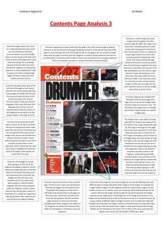
Drummers’ contents page has mixed
images and text together into their
contents page like NME. Once again since
Overall the page is quite calm, there Drummers’ intended audience is rather
Drummer magazine has clearly stated that this page is this is the contents page by placing
isn’t really anything that jumps out at ‘Contents’ at the top left part of the page. By placing ‘Contents’ at the top left hand side of the young and no young person would ever
you and catches your attention; want to read walls of texts so I believe by
page it is automatically one of the first things we see on this page so we can establish straight
Drummer doesn’t use a lot of bright using images related to an artist, then
away what this page is and also since this magazine is aimed at young audiences they want to
colours or even pictures with that much summarising what’s happening in the
put information in a position where it doesn’t have to be searched for since younger audiences
colour to them so the page seems quite article, then clearly putting the page
tend to be impatient and want to receive information quickly and easily
calm and inviting. This is probably number of the article is a very successful
because of the fact that they aren’t way of summarising a magazine into quick
aiming their magazine at really young and easy to read points. So a person of my
audiences so they probably don’t need age would gladly read the contents page
to worry much about making things because it looks interesting but is still
bright and easy to read since their informative. But what makes Drummer
readers are more mature. different to NME is that they have used a
lot more text on their content and less
images so they only use images for the
Drummer has placed their copy on the
most important articles so we are straight
left side of the page so that readers’
away drawn to these articles.
attention will not be taking away fully
by the images so readers will still read
the copy and check out some of the Drummer magazine has included their
articles that pique their interest. masthead on the contents page and a
Drummer doesn’t really use informal logo; this is so we can tell straight away
language in their copy, they kept their that this is part of a Drummer issue. The
language quite formal so we can masthead is the largest font on the page
automatically tell that the readers of and the font is bold a reader can notice it
this magazine are young but not that straight away.
young, maybe in the range of 25-35.
The images have to sizes which are large
Drummer has an extremely simple and small. For instance the image we are
colour scheme of red, black and white. first drawn to the image related with page
This way the background doesn’t take 34, the image is the largest on the page
away from the pictures themselves and and so that must mean that it is the most
we can appreciate the colours of the important article also it is placed as the
images more, we can see the difference first image on the page so we are drawn to
between text and numbers clearly it straight away. Also even though we read
without having to increase its size much from right to left and the images are more
and take up space. Red is a very important Drummer has put the text on
noticeable colour so Drummer has used the left then the image following, this way
red in order to highlight the important the images don’t take all the attention
parts of the page so that readers can away from the other articles in the
notice them from afar. magazine. Unlike Mixmag and NME,
Drummer doesn’t put summaries of the
article on the image itself but instead they
Drummer still manages to include put them in the Features section, so a
what’s going on in the rest of the reader would be enticed by the image
magazine by adding a ‘Regulars’ section. then find out what is going on in the
Obviously straight away we can tell that article and if they like what they see and
these are the articles that have much read they might read into the magazine.
less importance than those with the
images, but they still have to be
included so we as the reader know
what’s going on inside the whole Drummer uses various fonts on their contents If you look at the images on the contents page you can see that Mixmag have used
magazine. Also Drummer purposely page. The fonts vary in type, size and thickness. different types of images like photo shoot images and live images. For example the
makes the ‘Regulars’ section smaller Obviously the bigger and more bold the font image related to page 22 of the magazine would be a photo shoot image since the
because they would expect readers to the greater the importance of the article. models are laid out in a specific order and are posing, whilst looking directly into the
know what is in usually the magazine as Normally using various fonts on one page can camera. Whereas the image related to page 34, 26 and 56 would be live images
they would expect their readers to be look messy but I think that’s the effect that because we see stage props in the background of the image and the artists in the
loyal and buy the magazine weekly. Drummer was going for with this contents images are not looking directly at the camera because they’re in mid performance. By
page, because it is messy but still looks using a variety of different types of images Drummer tries to make them look well
arranged almost like a collage so the readers of rounded since they have live images of artists in mid performance to show what they
the magazine can relate to this because they are like live but then also photo shoot images to show what they are like off stage.
might see themselves as sometimes messy yet Readers will be interested in the artists’ lives as well as their music since they are
organised. slightly more mature than the readers of Mixmag or NME.