Micro-Choices, Max Impact Personalizing Your Journey, One Moment at a Time.pdf
Content page analysis 2
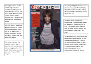
1. The target audience for this
content page looks like it
would focus on the genre of
indie/alternative or even rock
music due to the layout of the
content and the specific
magazine it is. It also looks like
it would target middle aged
people.
The main image is of a Middle
Ages man looking not so well
presented with a very stern
look on his face to create a
serious atmosphere. He has
long which suggests how he’s
quite indie looking.
The colour scheme of this
magazine content page is
based on quite neutral colours
such as red, grey white and
black. These colours contrast
well with the genre of the
magazine.
The writing on this is in a small font and
barely covers up the figure of the man
to show how relevant it is. . None of
the writing covers up any of his facial
features just his clothes. The writing is
in a red bold box with white bold
writing to emphasise on the
importance of the specific writing.
The layout out of this magazine
content cover is quite simple as there’s
not really much going on in it just an
artist’s picture and writing down the
side. The image takes up most of this
content page as the writing is very
small.
The writing ‘100 greatest albums ever’ is
persuasive language which will highly
interest the reader to read on as they
obviously want to see what the greatest
albums ever are.