SlideShare a Scribd company logo
1 of 9
Analysis of magazines
coversBillboard magazine all have the
same style of mast head with this
very bold, simplistic typeface with
the inner part of the letters
coloured in red, yellow, blue and
green. This features on many of
their magazine covers, unless it
requires a different colour scheme,
depending on what the artist is
wearing in their cover photo or if
there is specific theme. Sometimes
the mast head goes down the life
hand side magazine which adds
variety to the magazines look and
makes it more interesting for the
reader. Billboard have been around
for 122 years meaning that as soon
as the consumer sees the iconic
mast head they will know what the
magazine is.
Beyoncé is featured on the cover of the
magazine. She has been put In black and white
which allows the mast head to stand out more
and is the initial focus of the cover. Beyoncé
covers about two thirds of the cover leaving
room for the writing which sits above her
shoulder. She has one hand resting above her
hair and the other resting above her chest.
Her hand resting above hair directs the reader
to look at Beyoncé's eyes. She is looking
directly into the camera which makes the
audience experience a connection with her. Her
other hand, resting above her chest, directs
the readers eyes to her décolletage which
sexualize her and makes her look more sexually
appealing. Her hand then also draw the
attention to the entry point of the magazine.
It is written in white in a similar typeface
to the text above her shoulder, however in a
much bigger type face. The white text has a
black shadow behind it which highlight it and
helps bring the text forward. There are only
three typefaces present on the cover. As Chris
Frost said, “Don’t use too many typefaces. Too
much variation will end up looking a mess.
It’s best to limit yourself to one font, and
variations of it.” All three typefaces look
very similar to one another. Some parts of the
text are in capitals and other parts are not.
This adds variation to the cover and keeps the
reader interested.
The contrast between the white background
and red writing on the left hand side,
allows for the writing to stand out and be
easily visible to the reader. White, black
and red are the three accent colours other
than the colours in the mast head. This
conforms with what the Roger Black quote,
“White for background, black for text, red
for accent and excitement. These three
colours are the best . Be very careful
with all other colours.
The overall look of Fader
magazine covers are very
minimal and simplistic,
however has a good authentic
feel which is appealing to
the reader to look at. The
mast head at the top of the
magazine is written in clean
bold font. The ‘F’ is
transparent to allow for the
background of the magazine to
show through which is a
technique that is often used
in their magazine covers.
This cover has a very neutral colour pallet with pale warm colours such as
nudes, pinks and browns. This also contributes to the clean look to the
magazine. This doesn’t comply with Roger Black’s statement, “White for the
background, black for the text, red for accent and excitement. These three
colours are the best. B very careful with other colours.” The man featuring on
the cover of the magazine is positioned at a funny angle which appears as if he
is lying across the page with one hand above his head and the other reaching
down to touch his trainers. The hand above his head draws the reader’s attention
instantly towards the mast head and his other hand draws the reader’s attention
to the artist’s name at the bottom, ‘J Balvin’. This is an easy way of drawing
the reader’s attention to all the important places that the producer wants the
consumer to look at. This is unique as usually the featuring artists are looking
straight on into the camera.
Fader magazine covers have very
little writing on them. They tend
to have a mast head, the featuring
artist and the name of the artist
at the bottom of the page with
very few cover lines found at the
top of the magazine. This is very
simple but effective approach as
it keeps the reader’s attention
focused on the mast head and the
featuring artist. The simplistic
look to the magazine gives it a
clean, expensive feel which would
increase the chances of the
consumer buying the magazine.
Vibe magazine covers have a very large
font for the master head. The font is very
Bold and makes a statement on the page.
The iconic ‘V’ is in a different typeface
to the rest of the letters. This is the
typeface that Vibe magazine use for all of
their mast heads. In this instance the
master head is in white however they
change the colour of the master head
depending on the background and who is on
the cover. The white lettering sits on top
of the picture of Rihanna. It stands out
and looks vibrant against the colour of
Rihanna’s hair. Directly below the ‘e’ of
the mast head is a list of artist’s names
who will be featuring in the magazine.
This is an easy way of letting the
consumer know what will be in the magazine
without them having to flick through. The
cover of the magazine is the first thing
that the reader will see and by reading
the name of the featuring artists, they
will know whether they will find interest
in the magazine. Also this isn’t giving
away any other information so will entice
the reader to buy it. The font of the
text on the right hand side has been typed
alternatively between bold and original
typeface. This allows the reader to easily
read what the text says as it hasn’t been
spaced out. This is also an alternative to
changing the type face as if there are too
many typefaces on the cover it “will end
up looking a mess” (Chris Frost).
The background of the cover is a block of
electric blue which is where the audience’s
attention is drawn too immediately. The
background is in contrast with the picture of
Rihanna who has been put in black and white.
She is wearing dark makeup on her eyes which
make makes them the focus of her face, which in
comparison, does not have a lot of makeup on
and appears quite natural. She has her lips
slightly parted which gives her a dismissive
sexual facial expression. Along with her
jewellery and the visibility of décolletage,
this appears to make her look very feminine and
seductive which would appeal to both male and
female readers. On the other hand her hair is
cut short which takes away the feminine touch
that her facial expression, makeup and lack of
clothing gives her which connotes her as a
powerful and strong women.
The entry point of the magazine is featured at the bottom of the page on the
left hand side. It uses different colours and type face sizes grab the readers
attention. This conforms to what Chris Frost said, “emphasize your entry point,
with larger intro type, bold faces, drop letters, etc.” This also complies to
what Roger Black said, “get lumpy!” to grab an average individuals attention by
being creative with typefaces, sizes and pictures. The colour pallet of this
cover is very simple with only three colours: blue, black and white. The blue
writing of the entry point is the same colour used for the background which
conforms with Roger Black’s statement, “avoid a free or all of multiple
fonts/colours”
Analysis of magazines
covers
Analysis of magazine
contents pages
The reader can immediately see and picture
of Ariana Grande which takes up about two
thirds of the contents page, leaving space
for the writing on the left hand side. This
shows that she plays a significant role in
the magazine. Her eyes are almost in the
centre of the page which Is where the
readers focus goes too. Her eyes are very
large which emphasizes her childlike
innocence. This helps the reader feel as
though they have a personal connection with
the artist as it looks as though she is
looking right at them. She is looking over
her shoulder, wide eyed with a pink lip to
make her look sweet and feminine which would
appeal to a younger consumer both male and
female. She s wearing her hair in a high
ponytail half up do which is well known to
be her signature look. She has beauty spot
on her cheek which connotes that she wants
to look natural and not edited or ‘perfect’.
This can make the reader feel more confident
about themselves when they see this as she
is a celebrity that so many people look up
too as an inspirational character.
The word ‘contents’ is written in a clear bold font going
down the side of the page at the top on the left right hand
side of the page. It needs to be clear as this is the next
important page in the magazine which the reader would want
too see. Having this positioning for the contents make it
even easy to see it as even if the reader was just flicking
through the magazine, they would see the contents on the
edge of the page and it would immediately be visible as it
is in a large black typeface.
The writing on the left hand side is a similar
font to the word ‘contents’. This adds to the
overall look and authenticity of the magazine.
The text is extremely small, roughly about a
size 9/10. This conforms to Colin Wheildon’s
statement that “9 is the most common size”. The
numbers down the side are in chronological
order to allow the reader to easily find the
page they want. Each section of the magazine is
divided to make it easier for the reader to
locate what section of the magazine they want
to read. This also conforms to the statement,
“break up text to add interest” said by Chris
Frost. The main topic of each section is typed
in bold to indicate to the reader that that is
an important piece of text for them to read
Billboard magazines often have a very simplistic colour pallet
for their contents pages. Billboard magazine edit their pictures
to fit in with their colour scheme or change the colour pallet
for the page. For this contents page, it has very neutral pale
tones. It has a very pale grey background which is almost white
and gives a very soft feel to the image. Ariana’s skin looks as
though it has been edited, along with her hair to fit in with
the similar tones of the over all image. Just like the Billboard
mast head, the contents page also has a pop of colour. Usually
and in this case, the pop of colour is blue, this is a very easy
and simple way of adding interest and grabbing the audience’s
attention
The featuring artist Is the
source of attraction for the
consumer as she is lying down
across the bottom of the
magazine with her legs
vertically up. Her legs are
making a ‘V’ shape which is
the iconic ‘V’ for the Vibe
magazine. The artist is doing
this is sexualized way to
appeal to the male gaze.
Five fonts are used on this contents
page which challenges what Chris Frost
said, “Don’t use too many typefaces.
Too much variation will end up looking
a mess. It’s best to limit yourself to
one font, and variations of it.” as
there is more than one typeface but
the magazine still looks effective
however can be hard to read in some
areas.
Vibe magazines always tend to have their contents
typeface written like this on the page instead of
the stereotypical way of having the contents
written the top. This is their signature
technique to make a an effective contents page.
The word ‘feature’ is written in a larger front
and a different type face which highlight the key
topics and allows the reader to find what they
want. This is also done after each page number to
highlight what is going to be on each page to
allow for easy access to the information that the
consumer wants to read. The
At the top of the contents page it Is black and then gradually
fades into a bright white colour. This further highlights and
draws attention to her as it looks as though a spotlight is
being shone on her. The colour palette of this contents page
is full of neutral cool tones which gives a very sexy sultry
vibe to combine with the sexualized image of the women. Her
outfit also corresponds with the colour palette and reduces the
amount of colours used to comply with Roger Black’s statement,
“avoid a free for all of multiple fonts/colours”
Analysis of magazine
contents pages
The contents page does not have the word
‘contents’ written anywhere on the page,
instead it has the same mast head as the cover
however it is in a smaller size typeface. This
would not make it clear to the consumer which
page is the contents. However what does make it
clear is the red, bold numbering which goes
down the left hand side of the page. Also the
word ‘features’ is also written in same
typeface and colour as the numbering which
allows the consumer to easily access what they
want too read. The main topic of each section
of the magazine is also written in a larger
typeface size in white to clearly highlight
what will feature in each section. Directly
underneath that there is a brief explanation of
what will feature in each section to allow the
consumer to have an insight into what will be
featured in each section of the magazine so
they decide what they want to read about and
what they don’t have nay interest in.
The picture of the featuring artist is the main focus
for the consumer as she is wearing black which, in
comparison to the pale grey background, captures the
audiences attention. She is standing in a very
powerful stance which would empower female consumers
and intrigue them to look further into the magazine
to see where she is featuring. She has vibrant hair
and is wearing pearl earrings and a pearl necklace.
This is an image of an ideal, successful women who
female consumers will aspire too and want to read
about.
There are three fonts used on the contents page
including the iconic ‘MOJO’ type face. The same
font should never ben used for the name of the
magazine and the contents inside. The other two
typefaces are very similar and differ in size
but this helps the consumer to break up the
text and read it more accurately. As Roger
Black said, “Use only one or two typefaces.
Italian design is the model: a strong sense of
a few things that work together. Avoid a free
for all of multiple fonts/colours.”
Analysis of magazine
contents pages
Analysis of double
page spreads
This is a double page spread
featuring Nicki Minaj in the music
magazine NME. There is a single
picture of Nicki Minaj positioned
just off centre of the magazine.She
is the first thing on the double
page spread that the reader sees.
She has be obviously edited as her
eyes are bright white and very
rounded. Her skin is perfect and
her lips are large and plump. This
is seen as a desired look for both
men and female as this is what men
are stereotypically attracted too
and what females aspire to be like.
She is wearing a zebra print top
which creates a contrast between
the top and the pale pink
background. The choice of clothing
as wells the editing of her face
doesn’t make the picture look very
natural. This complies with Colin
Wheildon’s statement, “editors and
designers are missing the link
between the ape world and man.” The
position of Nicki Minaj’s elbow
directly points to her name which
is written in a large pink type
face. This clearly indicates to the
reader who the picture is of and
what the double page spread is
about.
This double page spread has a very basic colour pallet of black, white and pink.
In many cases the black and white is used as a basis for a magazine page with the
accent colour used to add interest and effect. However in this case the pink is
used for the background and the important pieces of text and the black and white
is used as the accent colour on her clothing. The colours are very girly and
feminine which would attract a female audience more so than male audience. The
text for the cover line and block quote is written in a curly smooth font which
gives the double page a creative and unique feel. An additional three more font
have been used. Each font is similar but with a slight variation to it. The Font
used for the main body of text is very simple and can be easily understood for,
even at such a small type face size. This can be easily read by the reader and
wont cause them to have to strain their eyes. Before each section of writing the
typeface is written in bold to indicate the importance of what it is written and
to show what is written in each block of text underneath it. Each block of text
is numbered to give the reader a clearer understanding of what order the text
goes in.
Analysis of double
page spread
This double page spread is of Lady
Gaga featuring in Q magazine. This
is a very simple double page spread
as it has a single image of Lady
Gaga on one side and the second
page of block text on the other
with a large letter ‘L’ written in
read over the top of the text in a
transparent effect. This adds to
the cleanliness of the magazine and
makes it look expensive Lady Gaga
Has very bouncy, curly hair that
looks messy and textured. This
gives a more realistic approach to
women as it doesn’t show her to
have perfectly styled hair. She is
wearing very dark makeup that makes
her look very mature and seductive.
Her makeup makes her eyes look
small and inquisitive. The picture
has been put in a faded black and
white effect which causes shadows
on her body which further makes her
look sexualized and sophisticated.
She is very no clothes but has her
hands and a large black necklace.
She is showing her décolletage,
neck and shoulders which makes her
look very feminine. She is covering
her chest area with her hands which
allows the readers the imagine what
she is covering but not allowing
them to see it. The Chunky black
necklace draws in the readers
attention and also draws the
readers attention to her chest are.
The text on the other side of the
double page is written in a very a
very small type face of about an 8
or 9. This is the typical size for
a magazine or newspaper typeface
and complies with the statement,
“Some newspapers go down to 8, and
many would consider that anything
above 11 is too large, wastes
space, and patronises the reader. 9
is the most common size.” written
by Colin Wheildon. There are very
little gaps between the blocks of
text which allows for a lot of text
on the page. With so much text in a
such a little font size, this could
become hard for the reader to read
and could cause discomfort. There
is drop cap at the start of each
different section of text to
highlight where different section
starts. This tends to be done in
magazines which gives this magazine
a sophistic feel. The large red
latter ‘L’ draws in the readers
attention as it is such a bright
colour and it is the size of the
page. This is a unique style for Q
magazines as they always put the
first letter of the artists name
across the text.
The colour of this double page spread is very
minimal and only includes three colours; black,
white and Red. The white is used for the
background, the black for the text and the red
for the accent colour. This is very simplistic
and makes the double page look clean and
expensive. This complies with the statement,
“White for background, black for text, red for
accent and excitement.” by Roger Black.
Analysis of double
page spreads
this double page spread features a
picture of Adele who takes up about
two thirds of the double page. This a
close up shot of Adele mirrors the
close up shot that Adele used for her
latest album ‘25’. This is her iconic
look and is automatically recognized
by her fans, likewise, Adele’s
eyeliner is her signature look and is
also featured on the cover of the
‘25’ album cover. A close up shot of
Adele is also used as she is larger
lady who is best known for her facial
features. Her hair has been blow-
dried in a very big style that Adele
often wears on her tours and to red
carpet events. The text has been
written around the image of Adele to
show that she is the main focus of
the double spread. Adele isn’t
smiling or pulling any particular
pose, she looks very natural which is
why many fans aspire to be like Adele
as she isn’t like the typical
celebrity who is always perfectly
made up and posing
The colour palette for this double page
spread is monochrome. Adele’s album covers
have featured a monochrome close up of
Adele, both ‘21’ and ’25’. This colour
palette is very minimal and simplistic but
at the same time demonstrates her maturity
and sophistication.
The mast head for this double page I
positioned at the top of the page
across three lines to allow for the
type face to be bigger and make more
of an appearance on the page. The word
‘triumph’ makes a powerful impression
and appears to make Adele seem strong
and powerful. The block quote at the
top of the page, ‘women who rock 2012’
also puts Adele in the position of
being strong and a women who ‘rocks’
the music industry. The block quote
below the mast head is written in a
curly font which adds variation to the
page and also adds a touch of
femininity to the page. The drop cap
at the start of the piece of text
indicates where the start of the text
begins. This adds sophistication the
page as broadsheets often use this in
their newspapers.
The font used for the main body of text is very simple and easy to read. It is typed
in a small typeface however is still large enough for the reader to read. It is only
a small paragraph of text which would mean the reader is more likely to read the
whole thing instead of skim ready or skipping partout entirely

More Related Content

What's hot

Contents Page Analysis
Contents Page Analysis Contents Page Analysis
Contents Page Analysis Shauna-Mullen
 
Presentation1 (2)
Presentation1 (2)Presentation1 (2)
Presentation1 (2)sumaiyaimran
 
Research course work
Research course workResearch course work
Research course workmaleneriise
 
Music magazine analysis
Music magazine analysisMusic magazine analysis
Music magazine analysisDariusslide
 
Analysis of music magazine one nme
Analysis of music magazine one nmeAnalysis of music magazine one nme
Analysis of music magazine one nmealishalumsden
 
Powerpoint on deconstructions finnished
Powerpoint on deconstructions finnishedPowerpoint on deconstructions finnished
Powerpoint on deconstructions finnishedellie_kershaw
 
Powerpoint on deconstructions
Powerpoint on deconstructionsPowerpoint on deconstructions
Powerpoint on deconstructionsellie_kershaw
 
Nme analysis
Nme analysisNme analysis
Nme analysismagda rak
 
Music Magazine Analysis
Music Magazine AnalysisMusic Magazine Analysis
Music Magazine Analysisrachelmullenx
 
GCSE Media Studies Magazine Production
GCSE Media Studies Magazine ProductionGCSE Media Studies Magazine Production
GCSE Media Studies Magazine ProductionMrs Downie
 
Magazine analysis
Magazine analysisMagazine analysis
Magazine analysis1612bensb
 
Radial Analysis
Radial AnalysisRadial Analysis
Radial Analysisguest3dcd7415
 
Analysing music magazines edit
Analysing music magazines editAnalysing music magazines edit
Analysing music magazines editasmediag13
 
Deconstruction 2
Deconstruction 2Deconstruction 2
Deconstruction 2robynneve
 
Deconstruction of front cover
Deconstruction of front coverDeconstruction of front cover
Deconstruction of front coverHannah Ould
 
GCSE Magazine Research and Planning
GCSE Magazine Research and PlanningGCSE Magazine Research and Planning
GCSE Magazine Research and PlanningNeill Ford
 

What's hot (20)

magazine analysing
magazine analysingmagazine analysing
magazine analysing
 
Contents Page Analysis
Contents Page Analysis Contents Page Analysis
Contents Page Analysis
 
Presentation1 (2)
Presentation1 (2)Presentation1 (2)
Presentation1 (2)
 
Research course work
Research course workResearch course work
Research course work
 
Music magazine analysis
Music magazine analysisMusic magazine analysis
Music magazine analysis
 
Analysis of music magazine one nme
Analysis of music magazine one nmeAnalysis of music magazine one nme
Analysis of music magazine one nme
 
Powerpoint on deconstructions finnished
Powerpoint on deconstructions finnishedPowerpoint on deconstructions finnished
Powerpoint on deconstructions finnished
 
The source magazine
The source magazineThe source magazine
The source magazine
 
Powerpoint on deconstructions
Powerpoint on deconstructionsPowerpoint on deconstructions
Powerpoint on deconstructions
 
Analysis of Kerrang
Analysis of KerrangAnalysis of Kerrang
Analysis of Kerrang
 
Vibe
VibeVibe
Vibe
 
Nme analysis
Nme analysisNme analysis
Nme analysis
 
Music Magazine Analysis
Music Magazine AnalysisMusic Magazine Analysis
Music Magazine Analysis
 
GCSE Media Studies Magazine Production
GCSE Media Studies Magazine ProductionGCSE Media Studies Magazine Production
GCSE Media Studies Magazine Production
 
Magazine analysis
Magazine analysisMagazine analysis
Magazine analysis
 
Radial Analysis
Radial AnalysisRadial Analysis
Radial Analysis
 
Analysing music magazines edit
Analysing music magazines editAnalysing music magazines edit
Analysing music magazines edit
 
Deconstruction 2
Deconstruction 2Deconstruction 2
Deconstruction 2
 
Deconstruction of front cover
Deconstruction of front coverDeconstruction of front cover
Deconstruction of front cover
 
GCSE Magazine Research and Planning
GCSE Magazine Research and PlanningGCSE Magazine Research and Planning
GCSE Magazine Research and Planning
 

Viewers also liked

My pitch presentation
My pitch presentationMy pitch presentation
My pitch presentationhannah burton
 
Evaluation 1 final presentation
Evaluation 1 final presentationEvaluation 1 final presentation
Evaluation 1 final presentationhannah burton
 
Presentation nov 4
Presentation nov 4Presentation nov 4
Presentation nov 4petefrasers
 
Research
Research Research
Research AbbiDhabi
 
Mood board
Mood boardMood board
Mood boardAbbiDhabi
 
Colour analysis magazine 7,8,9
Colour analysis magazine 7,8,9Colour analysis magazine 7,8,9
Colour analysis magazine 7,8,9DaisyBirchall14
 
Magazine Institution
Magazine InstitutionMagazine Institution
Magazine InstitutionDaisyBirchall14
 
Colour analysis magazine 10,11,12
Colour analysis magazine 10,11,12Colour analysis magazine 10,11,12
Colour analysis magazine 10,11,12DaisyBirchall14
 

Viewers also liked (12)

My pitch presentation
My pitch presentationMy pitch presentation
My pitch presentation
 
Evaluation 1 final presentation
Evaluation 1 final presentationEvaluation 1 final presentation
Evaluation 1 final presentation
 
Presentation nov 4
Presentation nov 4Presentation nov 4
Presentation nov 4
 
Research
Research Research
Research
 
Feedback
FeedbackFeedback
Feedback
 
Mood board
Mood boardMood board
Mood board
 
Colour analysis magazine 7,8,9
Colour analysis magazine 7,8,9Colour analysis magazine 7,8,9
Colour analysis magazine 7,8,9
 
Audience profiles
Audience profilesAudience profiles
Audience profiles
 
Magazine Institution
Magazine InstitutionMagazine Institution
Magazine Institution
 
Language register
Language registerLanguage register
Language register
 
Font ideas
Font ideasFont ideas
Font ideas
 
Colour analysis magazine 10,11,12
Colour analysis magazine 10,11,12Colour analysis magazine 10,11,12
Colour analysis magazine 10,11,12
 

Similar to Analysis of cover contents and double page

Magazine resarch powerp 2
Magazine resarch powerp 2Magazine resarch powerp 2
Magazine resarch powerp 2Jessica Smith
 
Magazine resarch powerp 2 final
Magazine resarch powerp 2 finalMagazine resarch powerp 2 final
Magazine resarch powerp 2 finalJessica Smith
 
Print research - Abi Willis
Print research - Abi WillisPrint research - Abi Willis
Print research - Abi WillisAbi Willis
 
Contents page analysis.
Contents page analysis.Contents page analysis.
Contents page analysis.Levita123
 
National and regional magazines
National and regional magazinesNational and regional magazines
National and regional magazinesKeeley Maddison
 
Magazine resarch
Magazine resarch Magazine resarch
Magazine resarch Jessica Smith
 
Media deconstructions
Media deconstructionsMedia deconstructions
Media deconstructionstibby_atkinson
 
Media vibe1 2
Media vibe1 2Media vibe1 2
Media vibe1 2ammz786
 
Deconstructions
DeconstructionsDeconstructions
DeconstructionsSamWalker7991
 
Contents pages
Contents pagesContents pages
Contents pages10lysharp
 
Contents page analysis
Contents page analysisContents page analysis
Contents page analysisMina Yaqin
 
Music magazine contents analysis
Music magazine contents analysisMusic magazine contents analysis
Music magazine contents analysiscaitlin99
 
Music magazine contents analysis
Music magazine contents analysisMusic magazine contents analysis
Music magazine contents analysiscaitlin99
 
Magazine cover review
Magazine cover review Magazine cover review
Magazine cover review 09lakeland
 
Analysing 3 magazine covers
Analysing 3 magazine coversAnalysing 3 magazine covers
Analysing 3 magazine coversblack-bird
 
Music magazines
Music magazinesMusic magazines
Music magazinesA99elpula
 
3x cover analysis 2
3x cover analysis 23x cover analysis 2
3x cover analysis 2Cameron Quinn
 
Task 3 - Music Magazine Analysis
Task 3 - Music Magazine AnalysisTask 3 - Music Magazine Analysis
Task 3 - Music Magazine Analysiselliemoore17
 
Kerrang analysis
Kerrang analysisKerrang analysis
Kerrang analysisvickyl4wrence
 
Analysis of music magazines
Analysis of music magazines Analysis of music magazines
Analysis of music magazines kitty elliott
 

Similar to Analysis of cover contents and double page (20)

Magazine resarch powerp 2
Magazine resarch powerp 2Magazine resarch powerp 2
Magazine resarch powerp 2
 
Magazine resarch powerp 2 final
Magazine resarch powerp 2 finalMagazine resarch powerp 2 final
Magazine resarch powerp 2 final
 
Print research - Abi Willis
Print research - Abi WillisPrint research - Abi Willis
Print research - Abi Willis
 
Contents page analysis.
Contents page analysis.Contents page analysis.
Contents page analysis.
 
National and regional magazines
National and regional magazinesNational and regional magazines
National and regional magazines
 
Magazine resarch
Magazine resarch Magazine resarch
Magazine resarch
 
Media deconstructions
Media deconstructionsMedia deconstructions
Media deconstructions
 
Media vibe1 2
Media vibe1 2Media vibe1 2
Media vibe1 2
 
Deconstructions
DeconstructionsDeconstructions
Deconstructions
 
Contents pages
Contents pagesContents pages
Contents pages
 
Contents page analysis
Contents page analysisContents page analysis
Contents page analysis
 
Music magazine contents analysis
Music magazine contents analysisMusic magazine contents analysis
Music magazine contents analysis
 
Music magazine contents analysis
Music magazine contents analysisMusic magazine contents analysis
Music magazine contents analysis
 
Magazine cover review
Magazine cover review Magazine cover review
Magazine cover review
 
Analysing 3 magazine covers
Analysing 3 magazine coversAnalysing 3 magazine covers
Analysing 3 magazine covers
 
Music magazines
Music magazinesMusic magazines
Music magazines
 
3x cover analysis 2
3x cover analysis 23x cover analysis 2
3x cover analysis 2
 
Task 3 - Music Magazine Analysis
Task 3 - Music Magazine AnalysisTask 3 - Music Magazine Analysis
Task 3 - Music Magazine Analysis
 
Kerrang analysis
Kerrang analysisKerrang analysis
Kerrang analysis
 
Analysis of music magazines
Analysis of music magazines Analysis of music magazines
Analysis of music magazines
 

Recently uploaded

Lucknow 💋 Escorts Service Lucknow Phone No 8923113531 Elite Escort Service Av...
Lucknow 💋 Escorts Service Lucknow Phone No 8923113531 Elite Escort Service Av...Lucknow 💋 Escorts Service Lucknow Phone No 8923113531 Elite Escort Service Av...
Lucknow 💋 Escorts Service Lucknow Phone No 8923113531 Elite Escort Service Av...anilsa9823
 
Downtown Call Girls O5O91O128O Pakistani Call Girls in Downtown
Downtown Call Girls O5O91O128O Pakistani Call Girls in DowntownDowntown Call Girls O5O91O128O Pakistani Call Girls in Downtown
Downtown Call Girls O5O91O128O Pakistani Call Girls in Downtowndajasot375
 
FULL ENJOY - 9953040155 Call Girls in Burari | Delhi
FULL ENJOY - 9953040155 Call Girls in Burari | DelhiFULL ENJOY - 9953040155 Call Girls in Burari | Delhi
FULL ENJOY - 9953040155 Call Girls in Burari | DelhiMalviyaNagarCallGirl
 
The First Date by Daniel Johnson (Inspired By True Events)
The First Date by Daniel Johnson (Inspired By True Events)The First Date by Daniel Johnson (Inspired By True Events)
The First Date by Daniel Johnson (Inspired By True Events)thephillipta
 
Aminabad @ Book Call Girls in Lucknow - 450+ Call Girl Cash Payment đŸ” 8923113...
Aminabad @ Book Call Girls in Lucknow - 450+ Call Girl Cash Payment đŸ” 8923113...Aminabad @ Book Call Girls in Lucknow - 450+ Call Girl Cash Payment đŸ” 8923113...
Aminabad @ Book Call Girls in Lucknow - 450+ Call Girl Cash Payment đŸ” 8923113...akbard9823
 
Islamabad Escorts # 03080115551 # Escorts in Islamabad || Call Girls in Islam...
Islamabad Escorts # 03080115551 # Escorts in Islamabad || Call Girls in Islam...Islamabad Escorts # 03080115551 # Escorts in Islamabad || Call Girls in Islam...
Islamabad Escorts # 03080115551 # Escorts in Islamabad || Call Girls in Islam...wdefrd
 
(NEHA) Call Girls Ahmedabad Booking Open 8617697112 Ahmedabad Escorts
(NEHA) Call Girls Ahmedabad Booking Open 8617697112 Ahmedabad Escorts(NEHA) Call Girls Ahmedabad Booking Open 8617697112 Ahmedabad Escorts
(NEHA) Call Girls Ahmedabad Booking Open 8617697112 Ahmedabad EscortsCall girls in Ahmedabad High profile
 
FULL ENJOY - 9953040155 Call Girls in Noida | Delhi
FULL ENJOY - 9953040155 Call Girls in Noida | DelhiFULL ENJOY - 9953040155 Call Girls in Noida | Delhi
FULL ENJOY - 9953040155 Call Girls in Noida | DelhiMalviyaNagarCallGirl
 
Akola Call Girls #9907093804 Contact Number Escorts Service Akola
Akola Call Girls #9907093804 Contact Number Escorts Service AkolaAkola Call Girls #9907093804 Contact Number Escorts Service Akola
Akola Call Girls #9907093804 Contact Number Escorts Service Akolasrsj9000
 
Hazratganj ] (Call Girls) in Lucknow - 450+ Call Girl Cash Payment 🧄 89231135...
Hazratganj ] (Call Girls) in Lucknow - 450+ Call Girl Cash Payment 🧄 89231135...Hazratganj ] (Call Girls) in Lucknow - 450+ Call Girl Cash Payment 🧄 89231135...
Hazratganj ] (Call Girls) in Lucknow - 450+ Call Girl Cash Payment 🧄 89231135...akbard9823
 
FULL ENJOY - 9953040155 Call Girls in Shahdara | Delhi
FULL ENJOY - 9953040155 Call Girls in Shahdara | DelhiFULL ENJOY - 9953040155 Call Girls in Shahdara | Delhi
FULL ENJOY - 9953040155 Call Girls in Shahdara | DelhiMalviyaNagarCallGirl
 
FULL ENJOY - 9953040155 Call Girls in Old Rajendra Nagar | Delhi
FULL ENJOY - 9953040155 Call Girls in Old Rajendra Nagar | DelhiFULL ENJOY - 9953040155 Call Girls in Old Rajendra Nagar | Delhi
FULL ENJOY - 9953040155 Call Girls in Old Rajendra Nagar | DelhiMalviyaNagarCallGirl
 
exhuma plot and synopsis from the exhuma movie.pptx
exhuma plot and synopsis from the exhuma movie.pptxexhuma plot and synopsis from the exhuma movie.pptx
exhuma plot and synopsis from the exhuma movie.pptxKurikulumPenilaian
 
Hazratganj / Call Girl in Lucknow - Phone đŸ«— 8923113531 ☛ Escorts Service at 6...
Hazratganj / Call Girl in Lucknow - Phone đŸ«— 8923113531 ☛ Escorts Service at 6...Hazratganj / Call Girl in Lucknow - Phone đŸ«— 8923113531 ☛ Escorts Service at 6...
Hazratganj / Call Girl in Lucknow - Phone đŸ«— 8923113531 ☛ Escorts Service at 6...akbard9823
 
Lucknow 💋 Virgin Call Girls Lucknow | Book 8923113531 Extreme Naughty Call Gi...
Lucknow 💋 Virgin Call Girls Lucknow | Book 8923113531 Extreme Naughty Call Gi...Lucknow 💋 Virgin Call Girls Lucknow | Book 8923113531 Extreme Naughty Call Gi...
Lucknow 💋 Virgin Call Girls Lucknow | Book 8923113531 Extreme Naughty Call Gi...anilsa9823
 
Roadrunner Lodge, Motel/Residence, Tucumcari NM
Roadrunner Lodge, Motel/Residence, Tucumcari NMRoadrunner Lodge, Motel/Residence, Tucumcari NM
Roadrunner Lodge, Motel/Residence, Tucumcari NMroute66connected
 
Bur Dubai Call Girls O58993O4O2 Call Girls in Bur Dubai
Bur Dubai Call Girls O58993O4O2 Call Girls in Bur DubaiBur Dubai Call Girls O58993O4O2 Call Girls in Bur Dubai
Bur Dubai Call Girls O58993O4O2 Call Girls in Bur Dubaidajasot375
 
Jeremy Casson - An Architectural and Historical Journey Around Europe
Jeremy Casson - An Architectural and Historical Journey Around EuropeJeremy Casson - An Architectural and Historical Journey Around Europe
Jeremy Casson - An Architectural and Historical Journey Around EuropeJeremy Casson
 
Patrakarpuram ) Cheap Call Girls In Lucknow (Adult Only) 🧈 8923113531 𓀓 Esco...
Patrakarpuram ) Cheap Call Girls In Lucknow  (Adult Only) 🧈 8923113531 𓀓 Esco...Patrakarpuram ) Cheap Call Girls In Lucknow  (Adult Only) 🧈 8923113531 𓀓 Esco...
Patrakarpuram ) Cheap Call Girls In Lucknow (Adult Only) 🧈 8923113531 𓀓 Esco...akbard9823
 
Charbagh / best call girls in Lucknow - Book đŸ„€ 8923113531 đŸȘ— Call Girls Availa...
Charbagh / best call girls in Lucknow - Book đŸ„€ 8923113531 đŸȘ— Call Girls Availa...Charbagh / best call girls in Lucknow - Book đŸ„€ 8923113531 đŸȘ— Call Girls Availa...
Charbagh / best call girls in Lucknow - Book đŸ„€ 8923113531 đŸȘ— Call Girls Availa...gurkirankumar98700
 

Recently uploaded (20)

Lucknow 💋 Escorts Service Lucknow Phone No 8923113531 Elite Escort Service Av...
Lucknow 💋 Escorts Service Lucknow Phone No 8923113531 Elite Escort Service Av...Lucknow 💋 Escorts Service Lucknow Phone No 8923113531 Elite Escort Service Av...
Lucknow 💋 Escorts Service Lucknow Phone No 8923113531 Elite Escort Service Av...
 
Downtown Call Girls O5O91O128O Pakistani Call Girls in Downtown
Downtown Call Girls O5O91O128O Pakistani Call Girls in DowntownDowntown Call Girls O5O91O128O Pakistani Call Girls in Downtown
Downtown Call Girls O5O91O128O Pakistani Call Girls in Downtown
 
FULL ENJOY - 9953040155 Call Girls in Burari | Delhi
FULL ENJOY - 9953040155 Call Girls in Burari | DelhiFULL ENJOY - 9953040155 Call Girls in Burari | Delhi
FULL ENJOY - 9953040155 Call Girls in Burari | Delhi
 
The First Date by Daniel Johnson (Inspired By True Events)
The First Date by Daniel Johnson (Inspired By True Events)The First Date by Daniel Johnson (Inspired By True Events)
The First Date by Daniel Johnson (Inspired By True Events)
 
Aminabad @ Book Call Girls in Lucknow - 450+ Call Girl Cash Payment đŸ” 8923113...
Aminabad @ Book Call Girls in Lucknow - 450+ Call Girl Cash Payment đŸ” 8923113...Aminabad @ Book Call Girls in Lucknow - 450+ Call Girl Cash Payment đŸ” 8923113...
Aminabad @ Book Call Girls in Lucknow - 450+ Call Girl Cash Payment đŸ” 8923113...
 
Islamabad Escorts # 03080115551 # Escorts in Islamabad || Call Girls in Islam...
Islamabad Escorts # 03080115551 # Escorts in Islamabad || Call Girls in Islam...Islamabad Escorts # 03080115551 # Escorts in Islamabad || Call Girls in Islam...
Islamabad Escorts # 03080115551 # Escorts in Islamabad || Call Girls in Islam...
 
(NEHA) Call Girls Ahmedabad Booking Open 8617697112 Ahmedabad Escorts
(NEHA) Call Girls Ahmedabad Booking Open 8617697112 Ahmedabad Escorts(NEHA) Call Girls Ahmedabad Booking Open 8617697112 Ahmedabad Escorts
(NEHA) Call Girls Ahmedabad Booking Open 8617697112 Ahmedabad Escorts
 
FULL ENJOY - 9953040155 Call Girls in Noida | Delhi
FULL ENJOY - 9953040155 Call Girls in Noida | DelhiFULL ENJOY - 9953040155 Call Girls in Noida | Delhi
FULL ENJOY - 9953040155 Call Girls in Noida | Delhi
 
Akola Call Girls #9907093804 Contact Number Escorts Service Akola
Akola Call Girls #9907093804 Contact Number Escorts Service AkolaAkola Call Girls #9907093804 Contact Number Escorts Service Akola
Akola Call Girls #9907093804 Contact Number Escorts Service Akola
 
Hazratganj ] (Call Girls) in Lucknow - 450+ Call Girl Cash Payment 🧄 89231135...
Hazratganj ] (Call Girls) in Lucknow - 450+ Call Girl Cash Payment 🧄 89231135...Hazratganj ] (Call Girls) in Lucknow - 450+ Call Girl Cash Payment 🧄 89231135...
Hazratganj ] (Call Girls) in Lucknow - 450+ Call Girl Cash Payment 🧄 89231135...
 
FULL ENJOY - 9953040155 Call Girls in Shahdara | Delhi
FULL ENJOY - 9953040155 Call Girls in Shahdara | DelhiFULL ENJOY - 9953040155 Call Girls in Shahdara | Delhi
FULL ENJOY - 9953040155 Call Girls in Shahdara | Delhi
 
FULL ENJOY - 9953040155 Call Girls in Old Rajendra Nagar | Delhi
FULL ENJOY - 9953040155 Call Girls in Old Rajendra Nagar | DelhiFULL ENJOY - 9953040155 Call Girls in Old Rajendra Nagar | Delhi
FULL ENJOY - 9953040155 Call Girls in Old Rajendra Nagar | Delhi
 
exhuma plot and synopsis from the exhuma movie.pptx
exhuma plot and synopsis from the exhuma movie.pptxexhuma plot and synopsis from the exhuma movie.pptx
exhuma plot and synopsis from the exhuma movie.pptx
 
Hazratganj / Call Girl in Lucknow - Phone đŸ«— 8923113531 ☛ Escorts Service at 6...
Hazratganj / Call Girl in Lucknow - Phone đŸ«— 8923113531 ☛ Escorts Service at 6...Hazratganj / Call Girl in Lucknow - Phone đŸ«— 8923113531 ☛ Escorts Service at 6...
Hazratganj / Call Girl in Lucknow - Phone đŸ«— 8923113531 ☛ Escorts Service at 6...
 
Lucknow 💋 Virgin Call Girls Lucknow | Book 8923113531 Extreme Naughty Call Gi...
Lucknow 💋 Virgin Call Girls Lucknow | Book 8923113531 Extreme Naughty Call Gi...Lucknow 💋 Virgin Call Girls Lucknow | Book 8923113531 Extreme Naughty Call Gi...
Lucknow 💋 Virgin Call Girls Lucknow | Book 8923113531 Extreme Naughty Call Gi...
 
Roadrunner Lodge, Motel/Residence, Tucumcari NM
Roadrunner Lodge, Motel/Residence, Tucumcari NMRoadrunner Lodge, Motel/Residence, Tucumcari NM
Roadrunner Lodge, Motel/Residence, Tucumcari NM
 
Bur Dubai Call Girls O58993O4O2 Call Girls in Bur Dubai
Bur Dubai Call Girls O58993O4O2 Call Girls in Bur DubaiBur Dubai Call Girls O58993O4O2 Call Girls in Bur Dubai
Bur Dubai Call Girls O58993O4O2 Call Girls in Bur Dubai
 
Jeremy Casson - An Architectural and Historical Journey Around Europe
Jeremy Casson - An Architectural and Historical Journey Around EuropeJeremy Casson - An Architectural and Historical Journey Around Europe
Jeremy Casson - An Architectural and Historical Journey Around Europe
 
Patrakarpuram ) Cheap Call Girls In Lucknow (Adult Only) 🧈 8923113531 𓀓 Esco...
Patrakarpuram ) Cheap Call Girls In Lucknow  (Adult Only) 🧈 8923113531 𓀓 Esco...Patrakarpuram ) Cheap Call Girls In Lucknow  (Adult Only) 🧈 8923113531 𓀓 Esco...
Patrakarpuram ) Cheap Call Girls In Lucknow (Adult Only) 🧈 8923113531 𓀓 Esco...
 
Charbagh / best call girls in Lucknow - Book đŸ„€ 8923113531 đŸȘ— Call Girls Availa...
Charbagh / best call girls in Lucknow - Book đŸ„€ 8923113531 đŸȘ— Call Girls Availa...Charbagh / best call girls in Lucknow - Book đŸ„€ 8923113531 đŸȘ— Call Girls Availa...
Charbagh / best call girls in Lucknow - Book đŸ„€ 8923113531 đŸȘ— Call Girls Availa...
 

Analysis of cover contents and double page

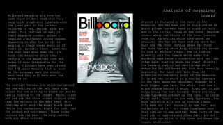
  • 1. Analysis of magazines coversBillboard magazine all have the same style of mast head with this very bold, simplistic typeface with the inner part of the letters coloured in red, yellow, blue and green. This features on many of their magazine covers, unless it requires a different colour scheme, depending on what the artist is wearing in their cover photo or if there is specific theme. Sometimes the mast head goes down the life hand side magazine which adds variety to the magazines look and makes it more interesting for the reader. Billboard have been around for 122 years meaning that as soon as the consumer sees the iconic mast head they will know what the magazine is. BeyoncĂ© is featured on the cover of the magazine. She has been put In black and white which allows the mast head to stand out more and is the initial focus of the cover. BeyoncĂ© covers about two thirds of the cover leaving room for the writing which sits above her shoulder. She has one hand resting above her hair and the other resting above her chest. Her hand resting above hair directs the reader to look at BeyoncĂ©'s eyes. She is looking directly into the camera which makes the audience experience a connection with her. Her other hand, resting above her chest, directs the readers eyes to her dĂ©colletage which sexualize her and makes her look more sexually appealing. Her hand then also draw the attention to the entry point of the magazine. It is written in white in a similar typeface to the text above her shoulder, however in a much bigger type face. The white text has a black shadow behind it which highlight it and helps bring the text forward. There are only three typefaces present on the cover. As Chris Frost said, “Don’t use too many typefaces. Too much variation will end up looking a mess. It’s best to limit yourself to one font, and variations of it.” All three typefaces look very similar to one another. Some parts of the text are in capitals and other parts are not. This adds variation to the cover and keeps the reader interested. The contrast between the white background and red writing on the left hand side, allows for the writing to stand out and be easily visible to the reader. White, black and red are the three accent colours other than the colours in the mast head. This conforms with what the Roger Black quote, “White for background, black for text, red for accent and excitement. These three colours are the best . Be very careful with all other colours.
  • 2. The overall look of Fader magazine covers are very minimal and simplistic, however has a good authentic feel which is appealing to the reader to look at. The mast head at the top of the magazine is written in clean bold font. The ‘F’ is transparent to allow for the background of the magazine to show through which is a technique that is often used in their magazine covers. This cover has a very neutral colour pallet with pale warm colours such as nudes, pinks and browns. This also contributes to the clean look to the magazine. This doesn’t comply with Roger Black’s statement, “White for the background, black for the text, red for accent and excitement. These three colours are the best. B very careful with other colours.” The man featuring on the cover of the magazine is positioned at a funny angle which appears as if he is lying across the page with one hand above his head and the other reaching down to touch his trainers. The hand above his head draws the reader’s attention instantly towards the mast head and his other hand draws the reader’s attention to the artist’s name at the bottom, ‘J Balvin’. This is an easy way of drawing the reader’s attention to all the important places that the producer wants the consumer to look at. This is unique as usually the featuring artists are looking straight on into the camera. Fader magazine covers have very little writing on them. They tend to have a mast head, the featuring artist and the name of the artist at the bottom of the page with very few cover lines found at the top of the magazine. This is very simple but effective approach as it keeps the reader’s attention focused on the mast head and the featuring artist. The simplistic look to the magazine gives it a clean, expensive feel which would increase the chances of the consumer buying the magazine.
  • 3. Vibe magazine covers have a very large font for the master head. The font is very Bold and makes a statement on the page. The iconic ‘V’ is in a different typeface to the rest of the letters. This is the typeface that Vibe magazine use for all of their mast heads. In this instance the master head is in white however they change the colour of the master head depending on the background and who is on the cover. The white lettering sits on top of the picture of Rihanna. It stands out and looks vibrant against the colour of Rihanna’s hair. Directly below the ‘e’ of the mast head is a list of artist’s names who will be featuring in the magazine. This is an easy way of letting the consumer know what will be in the magazine without them having to flick through. The cover of the magazine is the first thing that the reader will see and by reading the name of the featuring artists, they will know whether they will find interest in the magazine. Also this isn’t giving away any other information so will entice the reader to buy it. The font of the text on the right hand side has been typed alternatively between bold and original typeface. This allows the reader to easily read what the text says as it hasn’t been spaced out. This is also an alternative to changing the type face as if there are too many typefaces on the cover it “will end up looking a mess” (Chris Frost). The background of the cover is a block of electric blue which is where the audience’s attention is drawn too immediately. The background is in contrast with the picture of Rihanna who has been put in black and white. She is wearing dark makeup on her eyes which make makes them the focus of her face, which in comparison, does not have a lot of makeup on and appears quite natural. She has her lips slightly parted which gives her a dismissive sexual facial expression. Along with her jewellery and the visibility of dĂ©colletage, this appears to make her look very feminine and seductive which would appeal to both male and female readers. On the other hand her hair is cut short which takes away the feminine touch that her facial expression, makeup and lack of clothing gives her which connotes her as a powerful and strong women. The entry point of the magazine is featured at the bottom of the page on the left hand side. It uses different colours and type face sizes grab the readers attention. This conforms to what Chris Frost said, “emphasize your entry point, with larger intro type, bold faces, drop letters, etc.” This also complies to what Roger Black said, “get lumpy!” to grab an average individuals attention by being creative with typefaces, sizes and pictures. The colour pallet of this cover is very simple with only three colours: blue, black and white. The blue writing of the entry point is the same colour used for the background which conforms with Roger Black’s statement, “avoid a free or all of multiple fonts/colours” Analysis of magazines covers
  • 4. Analysis of magazine contents pages The reader can immediately see and picture of Ariana Grande which takes up about two thirds of the contents page, leaving space for the writing on the left hand side. This shows that she plays a significant role in the magazine. Her eyes are almost in the centre of the page which Is where the readers focus goes too. Her eyes are very large which emphasizes her childlike innocence. This helps the reader feel as though they have a personal connection with the artist as it looks as though she is looking right at them. She is looking over her shoulder, wide eyed with a pink lip to make her look sweet and feminine which would appeal to a younger consumer both male and female. She s wearing her hair in a high ponytail half up do which is well known to be her signature look. She has beauty spot on her cheek which connotes that she wants to look natural and not edited or ‘perfect’. This can make the reader feel more confident about themselves when they see this as she is a celebrity that so many people look up too as an inspirational character. The word ‘contents’ is written in a clear bold font going down the side of the page at the top on the left right hand side of the page. It needs to be clear as this is the next important page in the magazine which the reader would want too see. Having this positioning for the contents make it even easy to see it as even if the reader was just flicking through the magazine, they would see the contents on the edge of the page and it would immediately be visible as it is in a large black typeface. The writing on the left hand side is a similar font to the word ‘contents’. This adds to the overall look and authenticity of the magazine. The text is extremely small, roughly about a size 9/10. This conforms to Colin Wheildon’s statement that “9 is the most common size”. The numbers down the side are in chronological order to allow the reader to easily find the page they want. Each section of the magazine is divided to make it easier for the reader to locate what section of the magazine they want to read. This also conforms to the statement, “break up text to add interest” said by Chris Frost. The main topic of each section is typed in bold to indicate to the reader that that is an important piece of text for them to read Billboard magazines often have a very simplistic colour pallet for their contents pages. Billboard magazine edit their pictures to fit in with their colour scheme or change the colour pallet for the page. For this contents page, it has very neutral pale tones. It has a very pale grey background which is almost white and gives a very soft feel to the image. Ariana’s skin looks as though it has been edited, along with her hair to fit in with the similar tones of the over all image. Just like the Billboard mast head, the contents page also has a pop of colour. Usually and in this case, the pop of colour is blue, this is a very easy and simple way of adding interest and grabbing the audience’s attention
  • 5. The featuring artist Is the source of attraction for the consumer as she is lying down across the bottom of the magazine with her legs vertically up. Her legs are making a ‘V’ shape which is the iconic ‘V’ for the Vibe magazine. The artist is doing this is sexualized way to appeal to the male gaze. Five fonts are used on this contents page which challenges what Chris Frost said, “Don’t use too many typefaces. Too much variation will end up looking a mess. It’s best to limit yourself to one font, and variations of it.” as there is more than one typeface but the magazine still looks effective however can be hard to read in some areas. Vibe magazines always tend to have their contents typeface written like this on the page instead of the stereotypical way of having the contents written the top. This is their signature technique to make a an effective contents page. The word ‘feature’ is written in a larger front and a different type face which highlight the key topics and allows the reader to find what they want. This is also done after each page number to highlight what is going to be on each page to allow for easy access to the information that the consumer wants to read. The At the top of the contents page it Is black and then gradually fades into a bright white colour. This further highlights and draws attention to her as it looks as though a spotlight is being shone on her. The colour palette of this contents page is full of neutral cool tones which gives a very sexy sultry vibe to combine with the sexualized image of the women. Her outfit also corresponds with the colour palette and reduces the amount of colours used to comply with Roger Black’s statement, “avoid a free for all of multiple fonts/colours” Analysis of magazine contents pages
  • 6. The contents page does not have the word ‘contents’ written anywhere on the page, instead it has the same mast head as the cover however it is in a smaller size typeface. This would not make it clear to the consumer which page is the contents. However what does make it clear is the red, bold numbering which goes down the left hand side of the page. Also the word ‘features’ is also written in same typeface and colour as the numbering which allows the consumer to easily access what they want too read. The main topic of each section of the magazine is also written in a larger typeface size in white to clearly highlight what will feature in each section. Directly underneath that there is a brief explanation of what will feature in each section to allow the consumer to have an insight into what will be featured in each section of the magazine so they decide what they want to read about and what they don’t have nay interest in. The picture of the featuring artist is the main focus for the consumer as she is wearing black which, in comparison to the pale grey background, captures the audiences attention. She is standing in a very powerful stance which would empower female consumers and intrigue them to look further into the magazine to see where she is featuring. She has vibrant hair and is wearing pearl earrings and a pearl necklace. This is an image of an ideal, successful women who female consumers will aspire too and want to read about. There are three fonts used on the contents page including the iconic ‘MOJO’ type face. The same font should never ben used for the name of the magazine and the contents inside. The other two typefaces are very similar and differ in size but this helps the consumer to break up the text and read it more accurately. As Roger Black said, “Use only one or two typefaces. Italian design is the model: a strong sense of a few things that work together. Avoid a free for all of multiple fonts/colours.” Analysis of magazine contents pages
  • 7. Analysis of double page spreads This is a double page spread featuring Nicki Minaj in the music magazine NME. There is a single picture of Nicki Minaj positioned just off centre of the magazine.She is the first thing on the double page spread that the reader sees. She has be obviously edited as her eyes are bright white and very rounded. Her skin is perfect and her lips are large and plump. This is seen as a desired look for both men and female as this is what men are stereotypically attracted too and what females aspire to be like. She is wearing a zebra print top which creates a contrast between the top and the pale pink background. The choice of clothing as wells the editing of her face doesn’t make the picture look very natural. This complies with Colin Wheildon’s statement, “editors and designers are missing the link between the ape world and man.” The position of Nicki Minaj’s elbow directly points to her name which is written in a large pink type face. This clearly indicates to the reader who the picture is of and what the double page spread is about. This double page spread has a very basic colour pallet of black, white and pink. In many cases the black and white is used as a basis for a magazine page with the accent colour used to add interest and effect. However in this case the pink is used for the background and the important pieces of text and the black and white is used as the accent colour on her clothing. The colours are very girly and feminine which would attract a female audience more so than male audience. The text for the cover line and block quote is written in a curly smooth font which gives the double page a creative and unique feel. An additional three more font have been used. Each font is similar but with a slight variation to it. The Font used for the main body of text is very simple and can be easily understood for, even at such a small type face size. This can be easily read by the reader and wont cause them to have to strain their eyes. Before each section of writing the typeface is written in bold to indicate the importance of what it is written and to show what is written in each block of text underneath it. Each block of text is numbered to give the reader a clearer understanding of what order the text goes in.
  • 8. Analysis of double page spread This double page spread is of Lady Gaga featuring in Q magazine. This is a very simple double page spread as it has a single image of Lady Gaga on one side and the second page of block text on the other with a large letter ‘L’ written in read over the top of the text in a transparent effect. This adds to the cleanliness of the magazine and makes it look expensive Lady Gaga Has very bouncy, curly hair that looks messy and textured. This gives a more realistic approach to women as it doesn’t show her to have perfectly styled hair. She is wearing very dark makeup that makes her look very mature and seductive. Her makeup makes her eyes look small and inquisitive. The picture has been put in a faded black and white effect which causes shadows on her body which further makes her look sexualized and sophisticated. She is very no clothes but has her hands and a large black necklace. She is showing her dĂ©colletage, neck and shoulders which makes her look very feminine. She is covering her chest area with her hands which allows the readers the imagine what she is covering but not allowing them to see it. The Chunky black necklace draws in the readers attention and also draws the readers attention to her chest are. The text on the other side of the double page is written in a very a very small type face of about an 8 or 9. This is the typical size for a magazine or newspaper typeface and complies with the statement, “Some newspapers go down to 8, and many would consider that anything above 11 is too large, wastes space, and patronises the reader. 9 is the most common size.” written by Colin Wheildon. There are very little gaps between the blocks of text which allows for a lot of text on the page. With so much text in a such a little font size, this could become hard for the reader to read and could cause discomfort. There is drop cap at the start of each different section of text to highlight where different section starts. This tends to be done in magazines which gives this magazine a sophistic feel. The large red latter ‘L’ draws in the readers attention as it is such a bright colour and it is the size of the page. This is a unique style for Q magazines as they always put the first letter of the artists name across the text. The colour of this double page spread is very minimal and only includes three colours; black, white and Red. The white is used for the background, the black for the text and the red for the accent colour. This is very simplistic and makes the double page look clean and expensive. This complies with the statement, “White for background, black for text, red for accent and excitement.” by Roger Black.
  • 9. Analysis of double page spreads this double page spread features a picture of Adele who takes up about two thirds of the double page. This a close up shot of Adele mirrors the close up shot that Adele used for her latest album ‘25’. This is her iconic look and is automatically recognized by her fans, likewise, Adele’s eyeliner is her signature look and is also featured on the cover of the ‘25’ album cover. A close up shot of Adele is also used as she is larger lady who is best known for her facial features. Her hair has been blow- dried in a very big style that Adele often wears on her tours and to red carpet events. The text has been written around the image of Adele to show that she is the main focus of the double spread. Adele isn’t smiling or pulling any particular pose, she looks very natural which is why many fans aspire to be like Adele as she isn’t like the typical celebrity who is always perfectly made up and posing The colour palette for this double page spread is monochrome. Adele’s album covers have featured a monochrome close up of Adele, both ‘21’ and ’25’. This colour palette is very minimal and simplistic but at the same time demonstrates her maturity and sophistication. The mast head for this double page I positioned at the top of the page across three lines to allow for the type face to be bigger and make more of an appearance on the page. The word ‘triumph’ makes a powerful impression and appears to make Adele seem strong and powerful. The block quote at the top of the page, ‘women who rock 2012’ also puts Adele in the position of being strong and a women who ‘rocks’ the music industry. The block quote below the mast head is written in a curly font which adds variation to the page and also adds a touch of femininity to the page. The drop cap at the start of the piece of text indicates where the start of the text begins. This adds sophistication the page as broadsheets often use this in their newspapers. The font used for the main body of text is very simple and easy to read. It is typed in a small typeface however is still large enough for the reader to read. It is only a small paragraph of text which would mean the reader is more likely to read the whole thing instead of skim ready or skipping partout entirely