
Recommended
Recommended
More Related Content
What's hot
What's hot (18)
Viewers also liked
Viewers also liked (16)
Similar to Question 1
Similar to Question 1 (20)
Recently uploaded
Recently uploaded (20)
Question 1
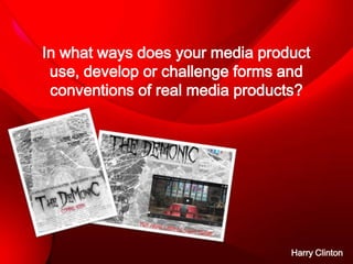
- 1. In what ways does your media product use, develop or challenge forms and conventions of real media products? Harry Clinton
- 2. Trailer conventions • • • • Movie trailers usually include conventions such as voiceovers, music, key scenes, titles and key characters. The conventions that I have used are music. This was an effective decision as it brings tension to the trailer and makes it more dramatic. We also took the decision not to include much dialogue within the trailer. This is effective as it leaves the audiences asking questions such as who, where and what. A key scene that we have included in our trailer is the one where the protagonist is praying inside the church. This is a key scene because it is very different and unusual to what other projects have used. Above all of this it also brings the ‘Horror’ feel to the genre with the scenery being inside of a church. Our research showed that horror movies often contain subtle references to religion. This spiritual location is contrasted with the dark, evil themes of our movie. We have used titles throughout the trailers, specifically highlighting our slogan. We took this decision so that the audience would have questions on there mind which can only be answered by watching the film.
- 3. Poster conventions • • • My poster has many examples of typical industry conventions. The main focus point of the poster is the silhouette image of the church in the background of the poster. The black and white contrast on the photo brings out the contrast between good and evil which is a key theme within our project. The image of the church is very effective because it is a key image within the project. It is shown throughout the film, the poster and the trailer as I believe that this is the focus point of the entire project and should be repeatedly used to show its significance. Using this convention also enables the audience to become familiar with a key setting within the movie. The text I have used had a lot of thought go into it. I tried to use text that looked evil but was bold enough on a black and white background. The text that I ended up using was called ‘October Crow’. This was found while looking on ‘dafont.co.uk’ and straight away caught my eye as it was the perfect choice to use due to the fact it looked like it was sketched and really brings the genre out onto the poster. This font is effective within the aesthetics of our poster because it reflects the horror genre and spiky nature of the plot. The use of colour on the poster is a main theme that was consciously considered. The black and white colours are opposites just like good and evil which I have explained are the main themes of the project. Although black and white is not very original on a horror themed poster, I still chose this as it is very effective and a key convention of the horror genre.
- 4. Website conventions • • • I have used a menu on my website because it is a key convention on every website. A menu is effective because it allows the user to navigate through the websites themselves. The menu style that I have decided to use is very simple yet is still very effective. The buttons are black and have a roll over graphic which turns red which our official sign of a cross by the side. I have chosen the button to turn red as it signifies blood in a horror genre and also looks more highlighted over the black and white background of the website. This emphasizes the branding of our promotional package. Key images – Like I have explained before the key image on the website is the silhouette of the church in the background. This shows that the repetitiveness of the image shows its authority as a main theme to the project. Even though the image covers all of the web page, it is covered by the title on the top of the trailer, the trailer in the centre of the website and the menu on the side of the website. Trailer – The trailer is placed in the centre of the website to stand out from the rest of the conventions that are on the website. This will automatically catch the audiences eye as it in the centre of the web page. This is an important feature as it helps to reinforce the key scenes from the film.
- 5. Horror conventions • During the filming process of the filming I have tried to include as many horror conventions as I could. I have used the themes of tension the most by introducing no dialogue and more music that will keep the audience on the edge of their seats. • The suspense that the film leaves at the end also leaves the audience asking a lot of questions. • Although the film does not use many dark themes, we have included snippets of a dark room which still brings darkness into the trailer without making it the main focus. This is very effective and dangerous as it is unusual for a horror to not include dark colours.