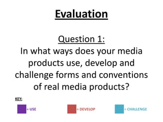
In what ways does your media product use, develop or challenge forms and conv...
Evaluation question 1
1. Evaluation
Question 1:
In what ways does your media
products use, develop and
challenge forms and conventions
of real media products?
KEY:
= USE = DEVELOP = CHALLENGE
3. USE
Same bold style used for the
masthead
Same circle feature
used for a coverline
Main coverline is in the
centre of the page
Coloured blocks
behind some of
the coverlines
Similar ‘+’ plus feature
used on both
magazines- in the
same position
4. USE
• Masthead is centred on the page and covers nearly the whole width of the
page
• I have used the typical conventions of a magazine such as coverlines, issue
number, price, masthead and barcode.
•My main coverlines goes right across the middle of the page as also seen in
the ‘Empire’ -Sherlock Holmes cover.
• My masthead has the same tallness as the ‘Empire’ masthead.
• I used CAPITIALS for most of my coverlines which is also seen on the smaller
coverlines on the ‘Empire’ cover.
• The position of my circle coverline and the ‘+’ feature on my magazine is the
exact same as that seen on the ‘Empire’ cover. - copied this from here
•Copied use of directors name on ‘+’ feature
• Same stroke effect around coverline on circle feature- also seen on the
Sherlock Holmes-Empire cover
5. DEVELOP
My banner is smaller and
takes up less room
Facial Expression used
on the main photo is
slightly different
Some of the smaller
coverlines are in
similar places
I used capitals for
the text to support
my main coverline
film on my
magazine
Used a similar coverline on the circle
feature-got the idea from the ‘Empire’
magazine
6. DEVELOP
• I changed the font of my top banner and made it much smaller than the banner used
on the ‘Empire’-Sherlock Holmes cover buts it still a similar light colour which helps in
stand out against the background colour used on my main picture on the cover.
• Instead of the serious and almost evil look facial expression used on the picture on
Robert Downey Jr on the Empire I decided to use a more plain yet serious facial
expression for the picture of my main character on the cover of my magazine.
• Some of the coverlines on my magazine are positioned in the same place as the
‘Empire’ cover but some are not.
• I have used almost double the amount of coverlines on my cover compared to the
cover of ‘Empire’.
•The size of my main coverline is not as big as the main coverline shown on the
‘Empire’ cover because I thought that this would draw too much attention away from
the main photo I used.
• I used CAPITALS for the text underneath my main coverline which is different to the
‘Empire’ cover because they used a different finer lowercase font for the text
underneath their main coverline. I used the CAPITALS on mine as I wanted to make
sure that the text under the main coverline stood out as much as it could.
7. CHALLENGE
Added a positioning
statement
Only have one picture on
my cover
Added glow effects to
coverlines –not seen
on ‘Empire cover
Whole title-same size
unlike the ‘Empire’ cover
Added a question mark
below main coverline
Added a coverline banner at
the bottom of the page
8. CHALLENGE
• Colour scheme-I used a totally different colour scheme on my magazine. I
used black, white and grey with I have never seen before on a magazine cover. I
did this because I wanted the magazine to have a certain thriller/mystery feel
to it. However I did stick to the conventional three colour rule that is always
seen on magazine covers.
• I used a different shot type to the one used on the ‘Empire’ cover. I used a
medium long shot as oppose to the medium shot used on the ‘Empire’ cover. I
chose the shot type I did because I wanted to show the body language of my
main character in the picture as this could give clues about the film’s narrative.
• I added a question mark underneath the coverline as I thought this could add
to the mystery around the film and as mentioned above could also give clues
about the films narrative as there as huge question mark over the main
character and the events that happen in the film.
• I decided to add a positioning statement even though ‘Empire’ didn’t have
one as I felt this would make my magazine look more professional.
• I added some layer effects such as strokes and inner glows on my smaller
coverlines which I haven’t seen on the Empire cover. I did this because I wanted
them to stand out more and wanted my cover to look unique in some way.
10. USE
Use of the colour blue on both posters
Landscape layout on both
Same close up shot type used
Same ‘Impact’ font used
Main text positioned on the
right of the poster
11. USE
• The layout of my poster is very similar to the layout of the law abiding
citizen poster. Both have the film title, the steeltongs and the film’s tagline on
the right hand side. Also they are both landscape.
• I decided to use an element of blue after looking at the poster and seeing
how well the colour works to give the poster and edgy thriller kind of feel.
• I decided to put a picture inside the ‘Impact’ font used for film title just like
they have done on the law abiding citizen poster.
• I included the names of my main actors on the poster as seen on the law
abiding citizen poster.
• I also attempted to use a shadow effect on half of the face of my main actor
on the poster but mine is a lot lighter and less noticeable than the shadow
seen on the law abiding citizen poster.
• Used CAPITALS for the actors names, the film title and the tagline which is
also seen on the law abiding citizen poster
12. DEVELOP
Changed the positioning of the
actors names
different facial expressions
on both
Tagline in same place
but different colour
Similar use of colour
scheme- blue, grey and
white
13. DEVELOP
• Instead of using an image of another actor from the film in the Impact font I decided to
use an image of photos I had taken from a still of the film. I did this because I didn’t have
another main actor in my film who’s picture I could put in the text. Also I did this because I
liked the idea of giving away little clue about the narrative of the film through the images
on the poster and felt this was a way I could do this subtly without taking too much
attention away from my main image of Dan on the poster.
• I put my actors names in CAPITALS but had them running across the top of my poster
instead of above the film title. I did this because I wanted the names to stand out from the
rest and wanted space between the film title and actors names in order to do this.
• On my poster I wanted a plain neutral facial expression for the main character and
oppose to the angry looking one on the other poster. This is because I wanted to keep the
audience guessing as to what kind of character he is and create a sense of mystery.
• I used most of same colours form the law abiding citizen poster for my colour scheme. I
used the blue and the grey. However I didn’t use the red colour for the tagline as I felt it
didn’t work well with the other colours. Also I didn’t use the rd colour as it far too
associated with horror and so this would go against the conventions of my genre which is
thriller/action. As well as this I wanted to use a lot of white even though the poster didn’t
use it because I thought this was the best colour to stand out against the blue/grey
background colours used underneath it.
14. CHALLENGE
Used an additional image
faded behind the film title
Added a stroke effect to
the film title
Added a release date at
the bottom of the poster
Put an age certificate on
the corner
Made the website for the film bold and stand out
under the steeltongs
15. CHALLENGE
• I included an additional picture which I deliberately faded into the background of the poster
(which I had not seen before on a thriller poster) to add to the depth of the poster and for those
who look at the poster in more detail this images allows them to find out more information
about the plot that is otherwise not visible or not advertised greatly on the film magazine.
• I decided to add a black coloured ‘Stroke’ effect around the letters that make up the film title
on the film poster I created and have not seen this effect used before on any other poster. I used
the stroke effect as it made the title stand out much more against the background it sits in front
of.
• On my poster I added a release date and a BBFC age certificate even though I could not see
these on the law abiding citizen poster. I did this because I feel these are basic conventions of any
film poster and should definitely be included as they give the audience essential information
such as when they will be able to see the film and what age group can see the film as well as
which age group is the film’s target audience.
• Also on my film poster I made sure that the films website was it a bold font that would make it
stand out instead using a small font for the website which is something I have commonly seen on
existing film posters. I did this because in the modern world the internet is a important tool used
to promote a film and if someone wanted to know more about a film the internet would be the
first place they would go and so having the film’s official website clearly written on the poster
would be very useful for those who want to find more about the film online. The ‘GUESS WHO’
part of the web address could also be part of a viral marketing campaign similar to the ‘why so
serious?’ viral marketing campaign used to promote The dark Knight.
17. My film trailer USE Existing film trailer
In my trailer I used Shot showing the
the conventional company logo taken
mpaa rating screen from the Memento
which is also seen at trailer.
the beginning of
every existing film
trailer.
In the film trailer we created we
included production and
distribution logos at the beginning.
This is also seen in the existing film
trailer for Memento.
18. My film trailer USE Existing film trailer
Establishing shot showing
the location the film is set.
Taken from the law abiding
citizen trailer
We included an establishing shot near
the beginning of the trailer which fit
with the conventions of a film trailer
and can also be seen in the existing film
trailer for Law abiding citizen
19. My film trailer USE Existing film trailer
In the trailer we created we
used a black and white effect
on some of the scenes to show Shot of black and white
that they are flashbacks taken flashback. Used in the
from the past. This can also be existing film trailer for
seen in the film trailer for Memento
Memento
20. My film trailer USE Existing film trailer
In my film
trailer we had a Film title
screen with the screens-from
film title on as the film trailer
this is a for Memento
convention of and for Law
every film abiding citizen.
trailer.
The
steeltongs
In our film trailer screen can
we included a also be seen
screen for the
at the end of
steeltongs as this
makes the trailer the existing
more professional trailer for
Memento
21. My film trailer USE Existing film trailer
I used close ups in the trailer that I created as
it helps show facial expression and in some
cases can make the audience feel a little
uncomfortable. Close ups are also used in the
trailers for Law abiding citizen and Memento
22. USE
• Used a male voiceover directly from the protagonist which is also used in the trailer
for Memento.
• Quiet short soft sounds during the beginning. Hear at the same time as part of the
voiceover- this idea is also seen in Memento. Good as it helps build up tension.
•The sound gets a little louder as the action picks up in our trailer and this can also be
seen in the Memento trailer.
• Both the trailer we created and the Memento one use slow cuts with slightly longer
scenes at the beginning to build the story up and then fast and shorter scenes at the
middle and end when all the high action bits are taking place.
• Both the thriller trailer we made and the law abiding citizen trailer use lots a black
outs and white flashes as transitions from one scene to another.
• On both the trailer we made and the Memento trailer the voiceover begins to
repeat it self. I liked the idea of this and so decided to include it in the trailer we
made as it emphasises the fact that the main character who is saying the voiceover
has trouble with his memory
• Both the trailer we made and the trailer for law abiding citizen and Memento have
close ups of the main character. We decided to use close ups when filming as it
allowed us to get across facial expressions of the character at a particular time. Also
we wanted some of the close ups to make the viewer feel a little uncomfortable as
the scene is intense.
23. My film trailer DEVELOP Existing film trailer
I used some close up camera work for
some scenes in the trailer but changed it
up a little and added some shaky
camera movement as well. I did this
because I thought it would make the
audience feel on edge to see what
happens next.
I used photos in the trailer as
also seen in the Memento
trailer. However I changed
the use of them. Instead of
using them so the character
can remember things about
the other people as done in
Memento I used them to
convey the victims in the
narrative.
24. My film trailer DEVELOP Existing film trailer
I used shot reverse shots in my
trailer just like the law abiding citizen
trailer But changed the lighting and
camera shot types used. In my trailer
I used high key lighting so that the
action in the shot is more visible and
used two shots to show them as
friends whereas in the law abiding
citizen trailer the shot reverse shots
are filmed in low key lighting with
singular close ups to show that the
two characters are not friends and
are not on the same side.
25. My film trailer DEVELOP Existing film trailer
Stills taken from the chase sequence mid way
though the film trailer of law abiding citizen
showing lots of cars and men with guns
We used a chase sequence in our trailer but ours
involved the main character on foot near a police
station instead of the cars and guns and remote
location used in the chase sequence seen in the law
abiding citizen film trailer.
26. My film trailer DEVELOP Existing film trailer
In both the trailer we made and the
existing law abiding citizen trailer there is
the use of police in the narrative. However
in the two trailers the police are shown
differently. In my trailer they are shown
driving in a police car involved in the chase
scene but in the law abiding citizen trailer
you see heavily armed men in black police
suits arresting the protagonist.
I used the colour blue for the mise-en-scene
(towel and mat) in our trailer to convey a
harsh cold environment. This is also seen in
American Beauty with the blue tablecloth
and blue walls and is also seen in the law
abiding citizen trailer with the blue tinge and
blue prison uniforms as show in the picture
on the right.
27. DEVELOP
• Use of deep low pitched music over the production and distribution logo at the
beginning of the trailer. Seen in a few horror trailer but works on this thriller one as it
grabs the audience’s attention straight away.
• On our trailer the non- diegetic sound stops at some places while the action is more
important whereas in the memento trailer non diegetic sound is played all the way
through but just gets a little quieter and fainter in some places.
• Voiceover is based on a similar topic as the one used in memento. They are both
about who they trust and don’t and about questioning events that may or may not
have happened. However the script used to convey this on our trailer is different.
• use of blue-in law abiding citizen
• Use of blue items in the bathroom scene- also seen in American beauty – shows the
cold, harsh atmosphere
• photos – mise-en scene- seen in the memento trailer aswell. Used for a different
purpose. In Memento he uses the images to remember notes about the person’s
characters whereas in our trailer we used the photos and put red crosses through
them symbolising them as victims who are most probably dead.
28. My film trailer
CHALLENGE
In the trailer that we created we
added a fuzzy effect at the end of
the trailer. I had not seen this
before and its not a convention of
thriller film trailers . However we
included it because it fits well with
the camera effect used throughout
and makes the trailer stand out
against other thriller trailers.
In the trailer we used a camera
effect over the ‘video diary’
sections of the film trailer. This is
not a convention of thriller film
trailers. Instead it is sometimes
seen in horror trailers. However
we felt it was appropriate for our
trailer as it worked well with the
voiceover and allows the
audience to instantly identify with
the main character Dan.
29. My film trailer CHALLENGE
When creating our film trailer we
used clips of the main character
searching for medical symptoms
online. I had not seen this before in a
film trailer. However we included this
because it would make our trailer
look different from other ones and is
a good way to get across thoughts or
the mental state of the character
through their actions.
In the trailer we use canted angles for
example in the bathroom scene. Canted
angles are not normally seen in thriller
trailers but are more common in horror
trailers. However we used them in our
trailer because we felt it would add to
the uncertainty and instability and make
the viewer feel on edge which fits with
the narrative of the film.
30. My film trailer CHALLENGE Existing film trailer
In our film trailer we didn’t use any titles
that gave clues about the storyline even
though this is a common convention of
thriller trailers as seen in the law abiding
citizen trailer and the Memento trailer
(as shown on the right). We didn’t use
them because we felt a voiceover
worked better in this case.
In our trailer we used mostly
high key lighting as oppose to
the low key lighting used in
thriller trailers such as Law
abiding citizen because it
helped make sure that all
action that we filmed was
clearly visible to the viewer.
31. CHALLENGE
• We didn’t use any titles to help tell the story even though this can often be
seen in thriller/action trailers such as law abiding citizen. This is because we
thought the voiceover worked better for our particular narrative and having both
a voiceover and titles throughout the trailer would be too much and may
confuse the audience.
• Also in most teaser trailers u don’t get to see all the main characters that will
be in the film. However we decided to show all our main characters as this
would help the audience understand the narrative more.
• Most of the law abiding citizen trailer in filmed in low key lighting. We didn’t
do this in our trailer because this would have made it hard to see most of the
action going on.
• The use of the video camera effect was something that I had never seen before
in thriller film trailers. However we decided to use this to make it clear that in
the scenes where this is used the main character is only talking to a camera and
is video taping himself. Also the video camera effect helps make it look more like
a video diary and different from all of the rest of the footage.