FULL ENJOY Call Girls In Mahipalpur Delhi Contact Us 8377087607
Evaluation Question 1
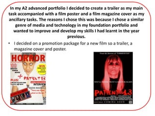
1. In my A2 advanced portfolio I decided to create a trailer as my main
task accompanied with a film poster and a film magazine cover as my
ancillary tasks. The reasons I chose this was because I chose a similar
genre of media and technology in my foundation portfolio and
wanted to improve and develop my skills I had learnt in the year
previous.
• I decided on a promotion package for a new film so a trailer, a
magazine cover and poster.
2. Evaluation
Q1. IN WHAT WAYS DOES YOUR
MEDIA PRODUCT USE, DEVELOP OR
CHALLENGE FORMS AND
CONVENTIONS OF REAL MEDIA
PRODUCTS?
3. Typical conventions of a Film Trailer
From my extensive research I realised that the most common forms and conventions in horror film trailers were:
Sound
• Horror trailers always use tense non-diegetic music throughout accompanied with discordant sounds and drums.
The music usually starts of melodic and soft and then crescendo which in a sense increases with the terror.
I decided to use the following track by called ‘Bring me To Life’ by Evanescence as this following the typical
conventions of horror trailer music. However, I developed the traditional convention
Mise-en-scene
• They always start using high-key lighting lulling the audience into a false sense of security as an optimistic atmosphere is implied. They
then usually dramatically switch and use low-key lighting, fog, mist or any other gloomy element to make an eerie atmosphere and
have the audience on the edge of their seats. I decided to follow this typical convention in my trailer as I felt it was important in a
trailers structure in gripping the audience in. I therefore felt it was vital to implement this technique into my own so I could hopefully
create the same effect.
• Horror trailers always use typical horror iconography such as blood, isolated houses and knives etc. I made use of all these typical
props and settings so that my trailer was immediately recognisable to the audience.
They always aim to build curiosity and anticipation by teasing the audience giving them little dialogue and just the main elements of the plot.
• Horror trailers always speed up towards the end, show the climax (usually something that shocks the audience and then show images
of despair.
Editing
• In my trailer, I frequently made use of the fade to black transition as this is vital in achieving the necessary tense I atmosphere that
draw the audience in. I also used this effect in my trailer as it made the editing more easier as I was able to break up scenes and make it
more dramatic.
Within the first minute and a half the trailer is light
But as the speed is increased and the tension mounts the lighting
is switched to low-key. I also implemented this technique in my
trailer…
4. Typical Conventions of a Film Poster
Famous
director/
producer
Dominant Image
Title
Website
Institution logo
Release date
Bankable actor
5. My Film Poster
Dominant Image
• The image always dominates the page allowing the audience
to focus on the most significant part of the poster. It acts as
the most powerful part in attracting an audience. I followed
this typical convention so that the character is in central
focus by also situating in centre frame again reinforces the
significance of her in the film’s plot.
• The image always features a character who makes direct eye
contact with the reader building a relationship with them
making them feel as if the poster is directed at them.
• In terms of non-verbal communication, horror poster actors
always have vacant, serious and shocking expressions on
their faces is one creating an atmosphere of unease for the
reader. I also followed this convention to make my dominant
image more effective.
• Dominant images are almost always edited in post-
production to emphasis specific features on a face and
intensify the horror, I edited the image of my actress so that
she now has unnatural looking eyes suggest a supernatural
theme and link the poster more to the horror genre. This is a
common convention and clever marketing technique in
horror posters, it ensures that passers- by are drawn in by
the image and curious about the poster. I also edited it so
that the image was tinted red which links in with my colour
scheme and immediately allows the reader to associate the
poster with horror.
• Actors are always framed in medium close up, close up and
extreme close up shots. I followed this convention by
framing my actor in a medium close up shot which allows
the reader to see her non-verbal communication. I followed
the convention of a typical dark background which creates
enigma and is typical of a horror poster which combined
with the out of focus effect on the image creates a sense of
disorientation within the reader
• In terms of mise-en-scene , the low-key lighting contrasts
with the along with the dark eyes and dark costume of the
actress connotes something sinister. I ensured that the
costume the actress wore was black as this colour is almost
always used in the horror genre. It connotes seriousness,
death and mystery.
Title
Tagline
Director
Dominant Image
Website
Institution logo
Release Date QR Code
6. continued…
Text
• I followed typical conventions of horror poster text by using a only a minimal amount of information , it is always simple yet
effective. I decided to follow this because
• The text is a bold and clear, allowing the poster’s vital information to be noticed at a distance. I kept the text simple , not
including too much text allowing the image and title to speak for itself. The film’s institution ‘Twisted Pictures’ logo has been
placed at the bottom, where you would find them on most film posters. This lets my reader aware of the institutions involved
and is a vital convention for a film poster. The text tends to follow the typical horror colour scheme of black, red and white
which would indicate immediately to the reader what type of genre this film belongs to.
• I also decided to use the typical convention where posters use the words ‘Coming Soon’ as it creates a sense of enigma and
encourages the audience to want to find out more about the film and it’s specific release date although it still indicates that it
will be available to watch in the near future.
Title
• In terms of typography, I have ensured the title is in a large bold eerie font that looks as if it would typically be used in the
horror genre. The fact that it is in the conventional colour red connotes blood, murder and danger, allowing the reader to
instantly associate this film with a negative plot filled of despair and terror.
Tagline
• The tagline ‘You’ll never trust another doctor again’ is effective as it is in direct address to the reader. The word ‘You’ll’ allows
the reader to feel a sense of involvement and that the poster is directed to them encouraging them to want to watch the film.
This mode of address is always used on posters. Also, the fact that it says that after watching the film you won’t trust your
doctor implies that something is seriously wrong with the doctors in the film. Doctors are usually in positions of authority and
trust and are here too help so this pejorative association is enough to build reader curiosity as to why we will lose trust in
them. Also, the fact that it is coloured white and contrasts with the background, overlapped over the main image
(conventional) allows it to be easily attractive and easily read.
Website
• I decided follow conventions by including a website in which readers would use to find out more about the film. This is vital in
ensuring audience anticipation. I developed this convention by also giving my readers a more up to date way of gaining
information about the film.
• decided to include a QR code because they are a new form of technology that allow iPhone and Android smartphone users
(which are particularly prevalent in this day and age amongst young people) to scan the image and be directed to additional
information about the film. This is a quick and efficient way to learn more about the film being promoted as opposed to the
more traditional way of browsing a website specific to the film. This particular technology is an example of synergy as it
involves institutions and loads of various forms of other technology working together to produce a more effective product for
the audience. I also included this on the poster because it appeals to my teenage target audience who are much more
technology savvy enabling the maximum audience reach.
7. I have learned from my research that…
Layout
• Dominant image as the central focus of poster
• Title overlapping dominant image in centre bottom of poster
• Institutional information at very bottom of poster- smaller font
Title
• -Have a large and bold or an eerie typography
• - Almost always the colour red
• -Always attractive so that it is noticed immediately by reader.
Iconography
• - Typical horror iconography such as blood, isolated houses and knives etc.
Colour Scheme
• The colours most commonly associated with horror posters are almost always red, black and white.
Dominant Image
• -Always dark and enigmatic
• -Always direct eye contact with reader to draw them in
• - Usually always of protagonists or antagonists
Mode of address
• Always quite formal language never colloquial
• Always use the word ‘you’ as a form of direct address to draw in reader and make them feel targeted by the horror in the poster.
Taglines
• Horror film posters very often play on famous sayings and twist the meanings to draw the audience in. They aim to build curiosity and
anticipation. For instance;
• This tagline plays on the well-known saying ‘Dead and Gone’.
• This tagline plays on the biblical quote ‘Love thy neighbour’
Release Date
• The release dates are often on a significant date which aims to target maximum audience reach or exploit public holidays or occasions
etc. They also often use ‘Coming Soon’ as this creates enigma and encourages the reader to want to research the film.
8. Typical conventions for a film magazine
Coverline
Puff
Skyline
Masthead
Date
Pull Quote
Anchorage Text
Barcode
Dominant Image
9. My Film MagazineMasthead
• Firstly, my film poster makes use of the main magazine convention
which is the masthead. It consists of the words ’Total Horror‘ and
is situated at the top of the page in the centre showing it’s
importance. This is also the conventional position for a magazines'
masthead, I decided to situate it there as it makes it easier for
potential readers to immediately categorise it as a magazine.
• I decided to follow typical conventions of a film magazine for my
masthead because it ensured that the masthead stood out and
could be seen from afar so that potential readers would
immediately aware of the brand name. I deliberately designed it
in a large, bold typography and coloured it red which matches the
magazine’s colour scheme. Consistency in a colour scheme is
always used in magazine front covers- especially bright colours as
they are more eye-catching.
Dominant Image
• The second convention I make use of in this media product is the
dominant image. This is vital and is usually the second aspect of the
cover the reader notices. Mine consists of a nurse, the antagonist
of the film, who is situated in a mid-shot in center frame and
dominates a great deal of the cover. I decided to follow the
traditonal convention of making image overlapped by the
masthead showing its importance. She has direct eye contact with
the reader, although her eyes have been edited in post production
to look more scary and therefore link in with the horror genre. The
eye contact draws potential readers in making them feel targeted.
In terms of her non-verbal communication, she is faintly smiling
with a evil look on her face which could be perceived as sadistic it
creates a sense of uneasiness in the reader. In terms of mise-en-
scene, there is high-key lighting which sets the mood for the
reader almost creating a sense of a clinical/ hospital like setting
linking in with the plot. I have challenged conventional ideas of
dominant images in the horror genre as they usually make use of
low-key lighting which gives it a more sinister feel. I decided to use
the opposite because high-key lighting creates a sense of optimism,
it is almost giving my readers a sense of false hope. Also, the
character is dressed in a nurse costume which allows the reader to
be aware of who she is immediately without having watched the
film. In terms of gender representation, she is given a stereotypical
gendered occupation which conforms to society’s norms therefore
creating giving the image a sense of verisimilitude.
Anchorage Text
• The anchorage text focuses on the interview inside the magazine
with the featured actress. It is made effective by a ‘pull quote’
which is a quote that is pulled from the article to draw the reader’s
attention to the main feature and encourage them to buy it. In this
case, it says ‘There was a real ghost on set’. This shocks the reader
and creates a sense of curiousity. The anchorage text is large and
white, it overlaps and contrasts against the dominant image so that
it stand out. I decided to use this typical convention as a way of
futher presuading portential readers to purchase my magazine. The
pull quote acts as a tease and bulds anticipation.
Masthead
Skyline
Date
Dominant Image
Puff
Coverline
Pull Quote
Barcode
Anchorage Text
Website
QR Code
10. continued…
Coverlines
• I decided to follow typical conventions of emphasising particular words and numbers in the coverlines to make my cover more attractive. I
deliberately emphasised the ’100′ and the ‘PLUS’ by making the typography larger and bolder typography , it also conforms with the
conventional look of a film magazine.
Puff
I decided to follow typical conventions of a film magazine and having a puff on my cover because puffs are vital in encouraging the reader to buy the
magazine as they entice them with free gifts and other incentives.