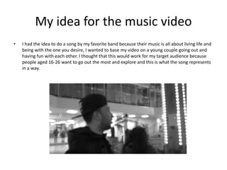
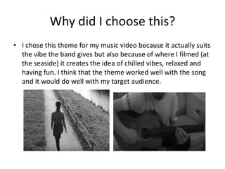
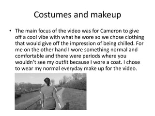
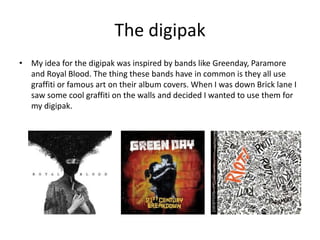
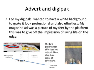
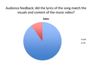
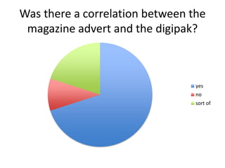
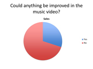
The document discusses the creative process behind a student's music video project. It describes the student's idea for the music video theme of a young couple going out and having fun, to match the vibe of the band. It also discusses choosing locations by the seaside, costumes to give a "cool vibe", and everyday makeup. The document then covers the inspiration for the digipak design from bands using graffiti art and the design choices. It analyzes audience feedback surveys that indicated the video, advertising, and packaging matched each other well and received mainly positive ratings.
A Critique of the Proposed National Education Policy Reform
Effectiveness of main product and texts
1. How effective is the combination of
your main product and ancillary
texts(magazine advert, digpiak)
Evaluation question 2
2. My idea for the music video
• I had the idea to do a song by my favorite band because their music is all about living life and
being with the one you desire, I wanted to base my video on a young couple going out and
having fun with each other. I thought that this would work for my target audience because
people aged 16-26 want to go out the most and explore and this is what the song represents
in a way.
3. Why did I choose this?
• I chose this theme for my music video because it actually suits
the vibe the band gives but also because of where I filmed (at
the seaside) it creates the idea of chilled vibes, relaxed and
having fun. I think that the theme worked well with the song
and it would do well with my target audience.
4. Costumes and makeup
• The main focus of the video was for Cameron to give
off a cool vibe with what he wore so we chose clothing
that would give off the impression of being chilled. For
me on the other hand I wore something normal and
comfortable and there were periods where you
wouldn’t see my outfit because I wore a coat. I chose
to wear my normal everyday make up for the video.
5. The digipak
• My idea for the digipak was inspired by bands like Greenday, Paramore
and Royal Blood. The thing these bands have in common is they all use
graffiti or famous art on their album covers. When I was down Brick lane I
saw some cool graffiti on the walls and decided I wanted to use them for
my digipak.
6. Advert and digipak
• For my digipak I wanted to have a white background
to make it look professional and also effortless. My
magazine ad was a picture of my feet by the platform
this was to give off the impression of living life on the
edge.
The two
pictures look
effortless and
relaxed. They
also show
sense of
adventure.
Quotes from
the song
7. Audience feedback; did the lyrics of the song match the
visuals and content of the music video?
Sales
yes
no
8. Was there a correlation between the
magazine advert and the digipak?
yes
no
sort of
10. How many stars would you rate the
magazine ad and digipak together?
0 2 4 6 8 10 12 14
5
4
3
2
1
11. Overall opinion on audience feedback
• As a whole the audience feedback has proven
that my music video, digipak and magazine ad
all worked very well with each other. I also
have learned so new techniques and been
given advice on what to do in future so I am
happy with the outcome of the feedback. I
received mainly 4 and 5s on my ratings which
meant the majority of the audience liked my
products.