
Recommended
More Related Content
Viewers also liked
Similar to Masthead analysis
Similar to Masthead analysis (20)
Recently uploaded
Recently uploaded (20)
Masthead analysis
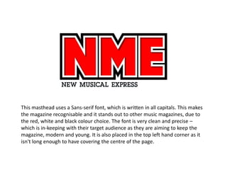
- 1. This masthead uses a Sans-serif font, which is written in all capitals. This makes the magazine recognisable and it stands out to other music magazines, due to the red, white and black colour choice. The font is very clean and precise – which is in-keeping with their target audience as they are aiming to keep the magazine, modern and young. It is also placed in the top left hand corner as it isn't long enough to have covering the centre of the page.
- 2. As Q magazine is very historic, it shows this by not having any other wording around it – and is easily spotted by the red background and the white font. There is a slight shadowing effect, which other music magazines don’t do. They tend to keep their text flat on the page, and not giving it a 3D look. Also, like NME it is placed in the top left hand corner due to the lack of characters – although it is made up by having bold features.
- 3. Kerrang is an onompatopoeia, therefore it explains why it has a smashed look – and can explain why they choose to display artists in their magazine who listen to edgy music. As the colour scheme is black and white – it does stand out against other music magazines; due to their competitors having red. Also the Sans-serif texts makes it easy to recognise and is also unique.