
Recommended
More Related Content
What's hot
What's hot (17)
Viewers also liked
Similar to Front cover analysis
Similar to Front cover analysis (20)
Recently uploaded
Recently uploaded (20)
Front cover analysis
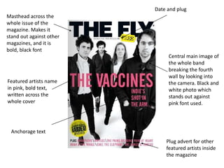
- 1. Masthead across the whole issue of the magazine. Makes it stand out against other magazines, and it is bold, black font Central main image of the whole band breaking the fourth wall by looking into the camera. Black and white photo which stands out against pink font used. Featured artists name in pink, bold text, written across the whole cover Date and plug Plug advert for other featured artists inside the magazine Anchorage text
- 2. Masthead not in left hand corner, but central on the page. Allows the audience to clearly see what magazine it is Artists name in bold, black font in the centre – below masthead Date of publication Central main image of the featured artist. Some of the band are looking directly into the camera lense, breaking the fourth wall. Also the band are in a location, whereas other issues are based on simple coloured backgrounds in a studio Pull quote from inside the featured interview from the band – makes readers interested in what they have to say about their time in music
- 3. Masthead is dominant and in the top left hand corner. Which makes it very clear and easy to read, also it gives and indication of what the house style is like Price, barcode and date Pull quote from an interview inside to magazine. Featured artists name in black, stands out against the other pieces of texts on the cover Central main cover image of the featured artist. Looking slightly away from the camera lense. Plug adverts for featured bands and artists. By putting the names of the artists in bold in bright red allows the audience to see who is featured inside, without having to buy it in the shop