SlideShare a Scribd company logo
1 of 14
How does your media
product represent particular
social groups?
My age group in particular
• To appeal to my main target market (both genders aged between 16 and 25) whom like the
indie sub genre, I have tried to use a variety of features in my magazine which will appeal to
the wide target market.
• First of all, I chose to use a gender neutral color scheme, the reason for this is so that I didn't
automatically make my target market smaller than it had to be. If I was to create a smaller
target market, the magazine wouldn’t be suitable for certain production companies as the
target market would be far to small. I also chose a green and white house style as they were
typical stereotypes of the indie sub genre, as Perkin’s said “stereotypes are not simple” I
continued this color scheme throughout my magazine- this is because it would then become
an associate of the indie sub genre.
I also chose to use green and white as they are quite natural and tranquil colors- another main
theme of the indie genre. I also chose to use quite a grungy masthead, this is because, at the
moment for indie, the grunge look is really in- i.e. mixing clothing from both now with the 80’s
and 90’s to create fun and unusual looks, this also meant that I would give my magazine a unique
appeal- like my Masthead and title of my magazine “Unique” magazine.
The “UN” also corresponded with “University” picked up from my client profile- this created a
direct link between university students and my magazine. Also, my magazine features a lot of
light reading, and university students whom have to do lots of work wouldn’t want to then have
to continue the heavy reading once they got into a magazine- the use of less font would make
the reading more lighthearted and more enjoyable for the University students. This links with the
fact stereotypes are not simple, as I hadn’t noticed the “UN” logo- until I heard the information
from my target market research.
The light hearted nature is also reinforced by the use of pictures- this is because pictures are
often used to appeal to a younger audience as they give them an idea of context.
Class andWealth
University students: features a sleek color scheme with a neat finish, also features reference to young
artists and upcoming events such as festivals- whom are often aimed at the university age group
Working Class: Links to different artists struggling in their working background but appreciate where they
come from, creates an association as something that the members of the working class can relate to.This
links to O’Sullivan. However, this magazine wouldn't’t appeal to working class as much as it would appeal
to the working class as much as the university students, due to the overall higher class feel of the
magazine. If I was to repeat this process, I would possibly use more grungy and casual articles or a front
cover to make it appeal less formal.
Really wealthy: mentions expensive events such as festivals- which not everybody can afford to
go to and also features a collection column- showing the really wealthy what items of music
memorabilia they can afford to own- once again difficult for some lower wealth families to
afford.
Less Wealthy: reference to clothing- low priced, affordable clothing that are available to the
mass market, hence making the clothing accessible to a large variety of people, this could also
be seen as creating a link between the less wealthy people and the more wealthy people.
Location
• Towns: reference to shopping in the high street- along with living in a town
creates shopping perks- this therefore makes the magazine more relatable for
people living in the high street as they are able to visit the shops easily due to how
close the locations are.
Rural: lots of reference to rural settings- all the images within my magazine are
taking in quite rural settings- however I still tried to create variety in my rural
setting, such as one of my images was taken at a reservoir, however this could be
perceived as a seaside setting- making links to people who live near the seaside. I
also took some images near hilly areas- making reference to your stereotypical
country side- this means that my magazine would be accessible to your
stereotypical people who live in the countryside. I then also took pictures in a
garden, the use of a garden could create links between rural people- whom have a
garden- but they are often bigger and more wooded, as well as towns people- who
could have a garden but they are often smaller. This therefore creates a subtle link
to the two- making it relatable for both social groups.The use of stereotypes
therefore links to Perkins as the stereotype makes the magazine more accessible to
a wider audience.
Communities and Fan Bases
• Fan bases: I have used simple clothing for my main artists, this is because I
wanted to make the clothing relatable and easy to replicate- by doing this it
means that many fan bases can replicate the looks of their favorite artists which
they quite often want to do as they want to look and feel like their favorite artists.
Housewives and single parents: I have featured lifestyle columns such as
fashion- this is because fashion columns are quite often aimed at the primarily
female market- this means that by aiming at housewives- these columns
feature a range of clothing that are aimed at a variety of people- hence
creating a type of fashion for everyone. I have also featured quizzes and
horoscopes- which are typical of lifestyle magazines- due to the fact that
many people do quizzes for the sheer humorous element- this also makes my
magazine more relatable.
Children: Quizzes and horoscopes are also aimed at children, this is because
they are interactive and “fun”- by using quizzes and horoscopes, the
magazine also becomes interactive- and can therefore be done by a large
group of people, not just one individual.
Continued …• Teens: I have mentioned current artists in my magazine, by using current artists (such as ed
sheeran) the articles become more interesting for teenagers who want to find out
everything about their favorite artist, this also makes the magazine more attractive to
teenagers. I have also featured “new music” by doing this, the magazine becomes more
attractive as teenagers often get bored of one type of music, this therefore means that
teenagers can get an insight into new music and what they want to listen to next.
• Homosexuality and heterosexuality: I have tried to feature a gender neutral color scheme of
green, this is because it meant that I wasn’t being gender bias to one particular gender, the
gender neutral color scheme also meant that I widened my target market as it was more
accessible to more genders.
Both the old and young: I have featured a mixture of both new and slightly older artists- such as Ed sheeran
compared with Oasis- by doing this, the magazine becomes more accessible as it appeals to a wider group of people
and widens the music genres featured.
Cultural Groups and ethnicities: In my magazine, I have tried to make it quite generic in terms of cultural groups and
ethnicities, this is because I wouldn’t want the magazine to be seen as offensive to anyone- this once again widens
my target market and audience for my magazine. Although Dyer said a star is an image not a real people, we all
aspire to be like our favorite celebrities.
Males and Females: I have used a gender neutral color scheme, this is because it meant that the magazine isn't
gender bias and would therefore appeal to a larger group of people. I also used both male and female models to
reinforce this, particularly with my female model, I tried to use Mulvey’s male gaze effect- this is as eye contact
meant that the magazine was more attractive and would therefore appeal more within the text. However, within my
magazine I used a much younger male model- which I would change due to the fact that it doesn't’t adhere to the
female gaze theory. Instead, if I was to repeat this process, I would use an older model- between the ages of 18 and
21.
I chose to use a grungy type font, this is
because the in style for my age group at the
minute within indie fashion is grunge- by doing
this, I establish a link with what my market
want with the magazine.
I chose this image as it creates eye contact
between the magazine viewer and the
magazine- immediately making the magazine
more engaging- this Links to Laura Mulvey’s
male gaze effect and immediately attracts a
male audience
I chose to use a green and white font, this
is because it was gender neutral and
therefore meant that my magazine
appealed to all genders and sexualities-
green is also a natural colour and natural
is a connotation of indie- enhancing
Perkin-s theory that “stereotypes are not
simple”
I chose to use QR codes within my
magazine, this is because it made the
magazine more interactive and appealed
to my audience who were more
interested in the online world than the
real world
I used a banner across the top of my magazine, this is because it is the first thing
that you see on a magazine rack, by featuring new bands and artists- it creates a
point of interest for my target market- I also made the banner slightly opaque
so that you could see the image behind it, creating more visual appeal.
I used both green and pink fonts this is
because it made the magazine gender
neutral and didn’t target a specific
gender- hence widening the target
market of my magazine.
I used reference to Glastonbury.
This is because festivals are
popular with teenagers-
particularly more wealthy people-
creating reference to different
social classes.
I used a polaroid format
for my images, this is
because a trademark for
indie is vintage influences
and polaroid's are an
older form of producing
photographs.This is a
stereotype of Indie and
links to Perkins theory
that “stereotypes are not
simple”.
Within my magazine, I
chose to use the
trademark of UN, this is
because it made a link
with university students
which was noticed in my
target market research,
this therefore influenced
me to use this as my
house style. I chose to use a pin board type
format within my contents page,
this is because I liked the
youthful appearance and it made
links with my youthful target
market.
I chose to feature free
downloads within my magazine,
this is because it is a major
influence for my generation to
buy a magazine- they know they
are going to get something back.
I chose to feature a new
album section, this is
because people who are
interested in the indie
genre like to listen to new
music, to make sure that
the music that they are
listening to isn’t
“Mainstream” and is
Unique- another influence
to my masthead and house
style
I used QR codes within my
magazine, this is because they
created links with social media-
this is a keen effect of my
generation who like social media.
I used UN as my house style
because it linked to University
students- who are a key part of
my target market for my
magazine.
I used a Pug with Glastonbury
within my magazine, this is
because university students
commonly enjoy festivals-as a
stereotype- linking to Perkins
theory of “stereotypes are not
simple”
I used polaroid
format once again
for my images,
further creating a
house style- the
polaroid format is
also heavily indie
and vintage- a
typical stereotype-
as Perkins said
Stereotypes are not
simple- I have
learnt about all the
sections that are
built in to create a
particular
stereotype, the
stereotype itself is
not simple- its
made up of
different
components.
I featured a competition within my
magazine, this is because it is an
element that influences people to buy a
magazine- due to the fact that they
have an opportunity to gain something
back from the magazine.
I used a wooden background
for this, this is as it influenced
the pin board type feel to the
rest of the magazine and
created an unusual effect to
the double page spread
I once again used the
green and black font,
this is because it
maintained the
gender neutral feel to
my magazine so I
wasn’t being gender
bias to anyone.
I used a pop art style
image for my magazine,
this is because it made
my magazine unique,
and the use of bright
colours made the
overall images more
bright, appealing and
visually attractive to my
target audience.

More Related Content

What's hot

Media question 2
Media question 2Media question 2
Media question 2bellaorwin
 
How does ur media represent...
How does ur media represent...How does ur media represent...
How does ur media represent...SophieMoody1
 
Question 2 : How does your media product represent particular social groups?
Question 2 : How does your media product represent particular social groups? Question 2 : How does your media product represent particular social groups?
Question 2 : How does your media product represent particular social groups? EstherY7865
 
Costumes and props
Costumes and props Costumes and props
Costumes and props tomngai_17
 
Evaluation question 5.
Evaluation question 5.Evaluation question 5.
Evaluation question 5.aimskardash14
 
Media evaluation
Media  evaluationMedia  evaluation
Media evaluationemmhel
 
Evaluation question 2
Evaluation question 2Evaluation question 2
Evaluation question 2sophieb96x
 
My preliminary task
My preliminary taskMy preliminary task
My preliminary taskAmanda Geijs
 
Evaluation 2 : How does your media product represent particular social groups?
Evaluation 2 : How does your media product represent particular social groups?Evaluation 2 : How does your media product represent particular social groups?
Evaluation 2 : How does your media product represent particular social groups? Rebekahhooper16
 
Evaluation question
Evaluation questionEvaluation question
Evaluation questionlwica1999
 
Evaluation question 1
Evaluation question 1Evaluation question 1
Evaluation question 1samfairhead
 

What's hot (20)

Log Book
Log BookLog Book
Log Book
 
Evaluation
EvaluationEvaluation
Evaluation
 
Media question 2
Media question 2Media question 2
Media question 2
 
How does ur media represent...
How does ur media represent...How does ur media represent...
How does ur media represent...
 
Question 2 : How does your media product represent particular social groups?
Question 2 : How does your media product represent particular social groups? Question 2 : How does your media product represent particular social groups?
Question 2 : How does your media product represent particular social groups?
 
Q2
Q2Q2
Q2
 
Costumes and props
Costumes and props Costumes and props
Costumes and props
 
Evaluation question 5.
Evaluation question 5.Evaluation question 5.
Evaluation question 5.
 
question 5
question 5question 5
question 5
 
Media evaluation
Media  evaluationMedia  evaluation
Media evaluation
 
Evaluation question 2
Evaluation question 2Evaluation question 2
Evaluation question 2
 
My preliminary task
My preliminary taskMy preliminary task
My preliminary task
 
Question 1
Question 1Question 1
Question 1
 
Evaluation 2 : How does your media product represent particular social groups?
Evaluation 2 : How does your media product represent particular social groups?Evaluation 2 : How does your media product represent particular social groups?
Evaluation 2 : How does your media product represent particular social groups?
 
Evaluation question
Evaluation questionEvaluation question
Evaluation question
 
7
77
7
 
Q1.pps
Q1.ppsQ1.pps
Q1.pps
 
Evaluation question 1
Evaluation question 1Evaluation question 1
Evaluation question 1
 
Evaluation
EvaluationEvaluation
Evaluation
 
Evaluation
EvaluationEvaluation
Evaluation
 

Viewers also liked

Evaluation: Question 3
Evaluation: Question 3Evaluation: Question 3
Evaluation: Question 3jessskinn
 
Front Cover Analysis
Front Cover AnalysisFront Cover Analysis
Front Cover Analysisjessskinn
 
Codes and conventions
Codes and conventionsCodes and conventions
Codes and conventionsrobbiehall
 
Contents Page Research 2 - Brass Band World February 2014
Contents Page Research 2 - Brass Band World February 2014Contents Page Research 2 - Brass Band World February 2014
Contents Page Research 2 - Brass Band World February 2014robbiehall
 
Response to question 3
Response to question 3Response to question 3
Response to question 3SamMoverley301
 

Viewers also liked (9)

Instituton 2
Instituton 2Instituton 2
Instituton 2
 
Response to question 3
Response to question 3Response to question 3
Response to question 3
 
Evaluation: Question 3
Evaluation: Question 3Evaluation: Question 3
Evaluation: Question 3
 
Front Cover Analysis
Front Cover AnalysisFront Cover Analysis
Front Cover Analysis
 
Institutions Research
Institutions ResearchInstitutions Research
Institutions Research
 
Codes and conventions
Codes and conventionsCodes and conventions
Codes and conventions
 
Contents Page Research 2 - Brass Band World February 2014
Contents Page Research 2 - Brass Band World February 2014Contents Page Research 2 - Brass Band World February 2014
Contents Page Research 2 - Brass Band World February 2014
 
Eval q3
Eval q3Eval q3
Eval q3
 
Response to question 3
Response to question 3Response to question 3
Response to question 3
 

Similar to Question 2

Similar to Question 2 (20)

Question 2 analysis
Question 2 analysisQuestion 2 analysis
Question 2 analysis
 
Evaluation
EvaluationEvaluation
Evaluation
 
Evaluation
EvaluationEvaluation
Evaluation
 
Question 5
Question 5Question 5
Question 5
 
Media evauation
Media evauationMedia evauation
Media evauation
 
Evaluation
EvaluationEvaluation
Evaluation
 
My eveluation
My eveluationMy eveluation
My eveluation
 
Evaluation
EvaluationEvaluation
Evaluation
 
Evaluation of music magazine
Evaluation of music magazineEvaluation of music magazine
Evaluation of music magazine
 
Evaluation
EvaluationEvaluation
Evaluation
 
Question 2 Evaluation
Question 2 EvaluationQuestion 2 Evaluation
Question 2 Evaluation
 
Evaluation (Q4)
Evaluation (Q4)Evaluation (Q4)
Evaluation (Q4)
 
Evaluation
EvaluationEvaluation
Evaluation
 
Media evaluation
Media evaluationMedia evaluation
Media evaluation
 
Media evaluationnnn
Media evaluationnnnMedia evaluationnnn
Media evaluationnnn
 
Evaluation for music magazine.
Evaluation for music magazine.Evaluation for music magazine.
Evaluation for music magazine.
 
Music magazine analysis
Music magazine analysisMusic magazine analysis
Music magazine analysis
 
Media
MediaMedia
Media
 
Question 4
Question 4Question 4
Question 4
 
AS Media Final Evaluation
AS Media  Final EvaluationAS Media  Final Evaluation
AS Media Final Evaluation
 

Recently uploaded

DATA STRUCTURE AND ALGORITHM for beginners
DATA STRUCTURE AND ALGORITHM for beginnersDATA STRUCTURE AND ALGORITHM for beginners
DATA STRUCTURE AND ALGORITHM for beginnersSabitha Banu
 
Pharmacognosy Flower 3. Compositae 2023.pdf
Pharmacognosy Flower 3. Compositae 2023.pdfPharmacognosy Flower 3. Compositae 2023.pdf
Pharmacognosy Flower 3. Compositae 2023.pdfMahmoud M. Sallam
 
Types of Journalistic Writing Grade 8.pptx
Types of Journalistic Writing Grade 8.pptxTypes of Journalistic Writing Grade 8.pptx
Types of Journalistic Writing Grade 8.pptxEyham Joco
 
18-04-UA_REPORT_MEDIALITERAСY_INDEX-DM_23-1-final-eng.pdf
18-04-UA_REPORT_MEDIALITERAСY_INDEX-DM_23-1-final-eng.pdf18-04-UA_REPORT_MEDIALITERAСY_INDEX-DM_23-1-final-eng.pdf
18-04-UA_REPORT_MEDIALITERAСY_INDEX-DM_23-1-final-eng.pdfssuser54595a
 
Roles & Responsibilities in Pharmacovigilance
Roles & Responsibilities in PharmacovigilanceRoles & Responsibilities in Pharmacovigilance
Roles & Responsibilities in PharmacovigilanceSamikshaHamane
 
ECONOMIC CONTEXT - LONG FORM TV DRAMA - PPT
ECONOMIC CONTEXT - LONG FORM TV DRAMA - PPTECONOMIC CONTEXT - LONG FORM TV DRAMA - PPT
ECONOMIC CONTEXT - LONG FORM TV DRAMA - PPTiammrhaywood
 
EPANDING THE CONTENT OF AN OUTLINE using notes.pptx
EPANDING THE CONTENT OF AN OUTLINE using notes.pptxEPANDING THE CONTENT OF AN OUTLINE using notes.pptx
EPANDING THE CONTENT OF AN OUTLINE using notes.pptxRaymartEstabillo3
 
History Class XII Ch. 3 Kinship, Caste and Class (1).pptx
History Class XII Ch. 3 Kinship, Caste and Class (1).pptxHistory Class XII Ch. 3 Kinship, Caste and Class (1).pptx
History Class XII Ch. 3 Kinship, Caste and Class (1).pptxsocialsciencegdgrohi
 
Introduction to ArtificiaI Intelligence in Higher Education
Introduction to ArtificiaI Intelligence in Higher EducationIntroduction to ArtificiaI Intelligence in Higher Education
Introduction to ArtificiaI Intelligence in Higher Educationpboyjonauth
 
MARGINALIZATION (Different learners in Marginalized Group
MARGINALIZATION (Different learners in Marginalized GroupMARGINALIZATION (Different learners in Marginalized Group
MARGINALIZATION (Different learners in Marginalized GroupJonathanParaisoCruz
 
Organic Name Reactions for the students and aspirants of Chemistry12th.pptx
Organic Name Reactions  for the students and aspirants of Chemistry12th.pptxOrganic Name Reactions  for the students and aspirants of Chemistry12th.pptx
Organic Name Reactions for the students and aspirants of Chemistry12th.pptxVS Mahajan Coaching Centre
 
CELL CYCLE Division Science 8 quarter IV.pptx
CELL CYCLE Division Science 8 quarter IV.pptxCELL CYCLE Division Science 8 quarter IV.pptx
CELL CYCLE Division Science 8 quarter IV.pptxJiesonDelaCerna
 
Full Stack Web Development Course for Beginners
Full Stack Web Development Course  for BeginnersFull Stack Web Development Course  for Beginners
Full Stack Web Development Course for BeginnersSabitha Banu
 
“Oh GOSH! Reflecting on Hackteria's Collaborative Practices in a Global Do-It...
“Oh GOSH! Reflecting on Hackteria's Collaborative Practices in a Global Do-It...“Oh GOSH! Reflecting on Hackteria's Collaborative Practices in a Global Do-It...
“Oh GOSH! Reflecting on Hackteria's Collaborative Practices in a Global Do-It...Marc Dusseiller Dusjagr
 
Software Engineering Methodologies (overview)
Software Engineering Methodologies (overview)Software Engineering Methodologies (overview)
Software Engineering Methodologies (overview)eniolaolutunde
 
Employee wellbeing at the workplace.pptx
Employee wellbeing at the workplace.pptxEmployee wellbeing at the workplace.pptx
Employee wellbeing at the workplace.pptxNirmalaLoungPoorunde1
 
Capitol Tech U Doctoral Presentation - April 2024.pptx
Capitol Tech U Doctoral Presentation - April 2024.pptxCapitol Tech U Doctoral Presentation - April 2024.pptx
Capitol Tech U Doctoral Presentation - April 2024.pptxCapitolTechU
 
Meghan Sutherland In Media Res Media Component
Meghan Sutherland In Media Res Media ComponentMeghan Sutherland In Media Res Media Component
Meghan Sutherland In Media Res Media ComponentInMediaRes1
 

Recently uploaded (20)

DATA STRUCTURE AND ALGORITHM for beginners
DATA STRUCTURE AND ALGORITHM for beginnersDATA STRUCTURE AND ALGORITHM for beginners
DATA STRUCTURE AND ALGORITHM for beginners
 
Pharmacognosy Flower 3. Compositae 2023.pdf
Pharmacognosy Flower 3. Compositae 2023.pdfPharmacognosy Flower 3. Compositae 2023.pdf
Pharmacognosy Flower 3. Compositae 2023.pdf
 
Types of Journalistic Writing Grade 8.pptx
Types of Journalistic Writing Grade 8.pptxTypes of Journalistic Writing Grade 8.pptx
Types of Journalistic Writing Grade 8.pptx
 
18-04-UA_REPORT_MEDIALITERAСY_INDEX-DM_23-1-final-eng.pdf
18-04-UA_REPORT_MEDIALITERAСY_INDEX-DM_23-1-final-eng.pdf18-04-UA_REPORT_MEDIALITERAСY_INDEX-DM_23-1-final-eng.pdf
18-04-UA_REPORT_MEDIALITERAСY_INDEX-DM_23-1-final-eng.pdf
 
Roles & Responsibilities in Pharmacovigilance
Roles & Responsibilities in PharmacovigilanceRoles & Responsibilities in Pharmacovigilance
Roles & Responsibilities in Pharmacovigilance
 
ECONOMIC CONTEXT - LONG FORM TV DRAMA - PPT
ECONOMIC CONTEXT - LONG FORM TV DRAMA - PPTECONOMIC CONTEXT - LONG FORM TV DRAMA - PPT
ECONOMIC CONTEXT - LONG FORM TV DRAMA - PPT
 
OS-operating systems- ch04 (Threads) ...
OS-operating systems- ch04 (Threads) ...OS-operating systems- ch04 (Threads) ...
OS-operating systems- ch04 (Threads) ...
 
EPANDING THE CONTENT OF AN OUTLINE using notes.pptx
EPANDING THE CONTENT OF AN OUTLINE using notes.pptxEPANDING THE CONTENT OF AN OUTLINE using notes.pptx
EPANDING THE CONTENT OF AN OUTLINE using notes.pptx
 
History Class XII Ch. 3 Kinship, Caste and Class (1).pptx
History Class XII Ch. 3 Kinship, Caste and Class (1).pptxHistory Class XII Ch. 3 Kinship, Caste and Class (1).pptx
History Class XII Ch. 3 Kinship, Caste and Class (1).pptx
 
Introduction to ArtificiaI Intelligence in Higher Education
Introduction to ArtificiaI Intelligence in Higher EducationIntroduction to ArtificiaI Intelligence in Higher Education
Introduction to ArtificiaI Intelligence in Higher Education
 
MARGINALIZATION (Different learners in Marginalized Group
MARGINALIZATION (Different learners in Marginalized GroupMARGINALIZATION (Different learners in Marginalized Group
MARGINALIZATION (Different learners in Marginalized Group
 
Organic Name Reactions for the students and aspirants of Chemistry12th.pptx
Organic Name Reactions  for the students and aspirants of Chemistry12th.pptxOrganic Name Reactions  for the students and aspirants of Chemistry12th.pptx
Organic Name Reactions for the students and aspirants of Chemistry12th.pptx
 
ESSENTIAL of (CS/IT/IS) class 06 (database)
ESSENTIAL of (CS/IT/IS) class 06 (database)ESSENTIAL of (CS/IT/IS) class 06 (database)
ESSENTIAL of (CS/IT/IS) class 06 (database)
 
CELL CYCLE Division Science 8 quarter IV.pptx
CELL CYCLE Division Science 8 quarter IV.pptxCELL CYCLE Division Science 8 quarter IV.pptx
CELL CYCLE Division Science 8 quarter IV.pptx
 
Full Stack Web Development Course for Beginners
Full Stack Web Development Course  for BeginnersFull Stack Web Development Course  for Beginners
Full Stack Web Development Course for Beginners
 
“Oh GOSH! Reflecting on Hackteria's Collaborative Practices in a Global Do-It...
“Oh GOSH! Reflecting on Hackteria's Collaborative Practices in a Global Do-It...“Oh GOSH! Reflecting on Hackteria's Collaborative Practices in a Global Do-It...
“Oh GOSH! Reflecting on Hackteria's Collaborative Practices in a Global Do-It...
 
Software Engineering Methodologies (overview)
Software Engineering Methodologies (overview)Software Engineering Methodologies (overview)
Software Engineering Methodologies (overview)
 
Employee wellbeing at the workplace.pptx
Employee wellbeing at the workplace.pptxEmployee wellbeing at the workplace.pptx
Employee wellbeing at the workplace.pptx
 
Capitol Tech U Doctoral Presentation - April 2024.pptx
Capitol Tech U Doctoral Presentation - April 2024.pptxCapitol Tech U Doctoral Presentation - April 2024.pptx
Capitol Tech U Doctoral Presentation - April 2024.pptx
 
Meghan Sutherland In Media Res Media Component
Meghan Sutherland In Media Res Media ComponentMeghan Sutherland In Media Res Media Component
Meghan Sutherland In Media Res Media Component
 

Question 2

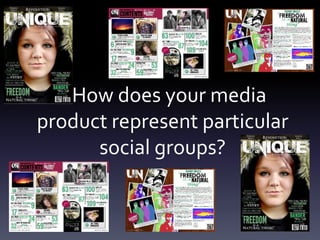
  • 1. How does your media product represent particular social groups?
  • 2. My age group in particular • To appeal to my main target market (both genders aged between 16 and 25) whom like the indie sub genre, I have tried to use a variety of features in my magazine which will appeal to the wide target market. • First of all, I chose to use a gender neutral color scheme, the reason for this is so that I didn't automatically make my target market smaller than it had to be. If I was to create a smaller target market, the magazine wouldn’t be suitable for certain production companies as the target market would be far to small. I also chose a green and white house style as they were typical stereotypes of the indie sub genre, as Perkin’s said “stereotypes are not simple” I continued this color scheme throughout my magazine- this is because it would then become an associate of the indie sub genre.
  • 3. I also chose to use green and white as they are quite natural and tranquil colors- another main theme of the indie genre. I also chose to use quite a grungy masthead, this is because, at the moment for indie, the grunge look is really in- i.e. mixing clothing from both now with the 80’s and 90’s to create fun and unusual looks, this also meant that I would give my magazine a unique appeal- like my Masthead and title of my magazine “Unique” magazine. The “UN” also corresponded with “University” picked up from my client profile- this created a direct link between university students and my magazine. Also, my magazine features a lot of light reading, and university students whom have to do lots of work wouldn’t want to then have to continue the heavy reading once they got into a magazine- the use of less font would make the reading more lighthearted and more enjoyable for the University students. This links with the fact stereotypes are not simple, as I hadn’t noticed the “UN” logo- until I heard the information from my target market research. The light hearted nature is also reinforced by the use of pictures- this is because pictures are often used to appeal to a younger audience as they give them an idea of context.
  • 4. Class andWealth University students: features a sleek color scheme with a neat finish, also features reference to young artists and upcoming events such as festivals- whom are often aimed at the university age group Working Class: Links to different artists struggling in their working background but appreciate where they come from, creates an association as something that the members of the working class can relate to.This links to O’Sullivan. However, this magazine wouldn't’t appeal to working class as much as it would appeal to the working class as much as the university students, due to the overall higher class feel of the magazine. If I was to repeat this process, I would possibly use more grungy and casual articles or a front cover to make it appeal less formal.
  • 5. Really wealthy: mentions expensive events such as festivals- which not everybody can afford to go to and also features a collection column- showing the really wealthy what items of music memorabilia they can afford to own- once again difficult for some lower wealth families to afford. Less Wealthy: reference to clothing- low priced, affordable clothing that are available to the mass market, hence making the clothing accessible to a large variety of people, this could also be seen as creating a link between the less wealthy people and the more wealthy people.
  • 6. Location • Towns: reference to shopping in the high street- along with living in a town creates shopping perks- this therefore makes the magazine more relatable for people living in the high street as they are able to visit the shops easily due to how close the locations are.
  • 7. Rural: lots of reference to rural settings- all the images within my magazine are taking in quite rural settings- however I still tried to create variety in my rural setting, such as one of my images was taken at a reservoir, however this could be perceived as a seaside setting- making links to people who live near the seaside. I also took some images near hilly areas- making reference to your stereotypical country side- this means that my magazine would be accessible to your stereotypical people who live in the countryside. I then also took pictures in a garden, the use of a garden could create links between rural people- whom have a garden- but they are often bigger and more wooded, as well as towns people- who could have a garden but they are often smaller. This therefore creates a subtle link to the two- making it relatable for both social groups.The use of stereotypes therefore links to Perkins as the stereotype makes the magazine more accessible to a wider audience.
  • 8. Communities and Fan Bases • Fan bases: I have used simple clothing for my main artists, this is because I wanted to make the clothing relatable and easy to replicate- by doing this it means that many fan bases can replicate the looks of their favorite artists which they quite often want to do as they want to look and feel like their favorite artists.
  • 9. Housewives and single parents: I have featured lifestyle columns such as fashion- this is because fashion columns are quite often aimed at the primarily female market- this means that by aiming at housewives- these columns feature a range of clothing that are aimed at a variety of people- hence creating a type of fashion for everyone. I have also featured quizzes and horoscopes- which are typical of lifestyle magazines- due to the fact that many people do quizzes for the sheer humorous element- this also makes my magazine more relatable. Children: Quizzes and horoscopes are also aimed at children, this is because they are interactive and “fun”- by using quizzes and horoscopes, the magazine also becomes interactive- and can therefore be done by a large group of people, not just one individual.
  • 10. Continued …• Teens: I have mentioned current artists in my magazine, by using current artists (such as ed sheeran) the articles become more interesting for teenagers who want to find out everything about their favorite artist, this also makes the magazine more attractive to teenagers. I have also featured “new music” by doing this, the magazine becomes more attractive as teenagers often get bored of one type of music, this therefore means that teenagers can get an insight into new music and what they want to listen to next. • Homosexuality and heterosexuality: I have tried to feature a gender neutral color scheme of green, this is because it meant that I wasn’t being gender bias to one particular gender, the gender neutral color scheme also meant that I widened my target market as it was more accessible to more genders.
  • 11. Both the old and young: I have featured a mixture of both new and slightly older artists- such as Ed sheeran compared with Oasis- by doing this, the magazine becomes more accessible as it appeals to a wider group of people and widens the music genres featured. Cultural Groups and ethnicities: In my magazine, I have tried to make it quite generic in terms of cultural groups and ethnicities, this is because I wouldn’t want the magazine to be seen as offensive to anyone- this once again widens my target market and audience for my magazine. Although Dyer said a star is an image not a real people, we all aspire to be like our favorite celebrities. Males and Females: I have used a gender neutral color scheme, this is because it meant that the magazine isn't gender bias and would therefore appeal to a larger group of people. I also used both male and female models to reinforce this, particularly with my female model, I tried to use Mulvey’s male gaze effect- this is as eye contact meant that the magazine was more attractive and would therefore appeal more within the text. However, within my magazine I used a much younger male model- which I would change due to the fact that it doesn't’t adhere to the female gaze theory. Instead, if I was to repeat this process, I would use an older model- between the ages of 18 and 21.
  • 12. I chose to use a grungy type font, this is because the in style for my age group at the minute within indie fashion is grunge- by doing this, I establish a link with what my market want with the magazine. I chose this image as it creates eye contact between the magazine viewer and the magazine- immediately making the magazine more engaging- this Links to Laura Mulvey’s male gaze effect and immediately attracts a male audience I chose to use a green and white font, this is because it was gender neutral and therefore meant that my magazine appealed to all genders and sexualities- green is also a natural colour and natural is a connotation of indie- enhancing Perkin-s theory that “stereotypes are not simple” I chose to use QR codes within my magazine, this is because it made the magazine more interactive and appealed to my audience who were more interested in the online world than the real world I used a banner across the top of my magazine, this is because it is the first thing that you see on a magazine rack, by featuring new bands and artists- it creates a point of interest for my target market- I also made the banner slightly opaque so that you could see the image behind it, creating more visual appeal.
  • 13. I used both green and pink fonts this is because it made the magazine gender neutral and didn’t target a specific gender- hence widening the target market of my magazine. I used reference to Glastonbury. This is because festivals are popular with teenagers- particularly more wealthy people- creating reference to different social classes. I used a polaroid format for my images, this is because a trademark for indie is vintage influences and polaroid's are an older form of producing photographs.This is a stereotype of Indie and links to Perkins theory that “stereotypes are not simple”. Within my magazine, I chose to use the trademark of UN, this is because it made a link with university students which was noticed in my target market research, this therefore influenced me to use this as my house style. I chose to use a pin board type format within my contents page, this is because I liked the youthful appearance and it made links with my youthful target market. I chose to feature free downloads within my magazine, this is because it is a major influence for my generation to buy a magazine- they know they are going to get something back. I chose to feature a new album section, this is because people who are interested in the indie genre like to listen to new music, to make sure that the music that they are listening to isn’t “Mainstream” and is Unique- another influence to my masthead and house style
  • 14. I used QR codes within my magazine, this is because they created links with social media- this is a keen effect of my generation who like social media. I used UN as my house style because it linked to University students- who are a key part of my target market for my magazine. I used a Pug with Glastonbury within my magazine, this is because university students commonly enjoy festivals-as a stereotype- linking to Perkins theory of “stereotypes are not simple” I used polaroid format once again for my images, further creating a house style- the polaroid format is also heavily indie and vintage- a typical stereotype- as Perkins said Stereotypes are not simple- I have learnt about all the sections that are built in to create a particular stereotype, the stereotype itself is not simple- its made up of different components. I featured a competition within my magazine, this is because it is an element that influences people to buy a magazine- due to the fact that they have an opportunity to gain something back from the magazine. I used a wooden background for this, this is as it influenced the pin board type feel to the rest of the magazine and created an unusual effect to the double page spread I once again used the green and black font, this is because it maintained the gender neutral feel to my magazine so I wasn’t being gender bias to anyone. I used a pop art style image for my magazine, this is because it made my magazine unique, and the use of bright colours made the overall images more bright, appealing and visually attractive to my target audience.