(DIVYA) Dhanori Call Girls Just Call 7001035870 [ Cash on Delivery ] Pune Esc...
Reaching 16-25 year olds with indie rock magazine
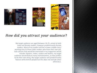
1. My target audience are aged between 16-25, aimed at both
male and female readers, however predominantly female
readers. Most of my readers will be in lower middle class/
working class to those older readers who have their own job.
Sub cultures that would be interested in my magazines would
include: Hipsters, indies, rockers and skaters, my target
audience would feature many mainstreamers, as they prefers
to do their own thing. My target audience will predominantly
feature white British people but this does not exclude other
ethnicity's.
2. The use of house colours of yellow
and black help connote the indie
rock theme, but were also
suggested by members of my target
audience. The two colours connote
panic, as they are colours used for
warnings, which fits in with the rock
genre.
I kept the background as it connotes
danger which contrasts with the
popular beliefs of women not being
risk takers. Therefore making is
aesthetically pleasing to the
readers.
This particular cover line may
attract members of my target
audience who have tattoos as this is
a common characteristic of
hipsters/indies.
The Main image used is of a
medium shot of a young attractive
girl, this will attract my target
audience as certain members will
be attracted to her and other may
be inspired by her.
I named the member of my band
‘Cara Blake’ which is a short name
that’s easily remembered, which
the audience can identify and
automatically know who she is.
I included a cover line about
festivals which will attract the TA as
they are of lower middle class, and
into indie music so want to spend
their money on festivals
I included the price at the bottom
by the barcode as they can clearly
see the reasonable price of the
magazine and will therefore be
attracted to buy it.
From my research I know that my
readers like to be up to date with
the rock industry, so by offering
‘exclusive interviews’ this will
attract them to read as they will feel
as if they cant get this information
anywhere else.
I used a footer on my magazine as its quick and easy for
readers to see what's included in the magazine, which is
helpful for some of my target audiences busy lifestyle
which is all things they would like.
3. I followed on the house colours on
to my contents page so the
magazine had a professional look,
this also makes the colours
recognisable and unique to my
magazine.
I followed the masthead on to the
contents page which constantly
reminds the target audience that
the quality they are reading is
exclusive to this magazine, I also
slanted it which makes it look
quirky which is a stereotype of
indie rock.
I used an image of a Gibson guitar,
which is a very expensive
instrument, it also shows the
audience the kind of music the
magazine features, and the image
will attract them to buy the
magazine as they may be in with a
chance of winning the guitar.
The models I chose for my images
are wearing quite casual/unique
clothing which the audience will be
able to relate to, As most indie
hipster people mix and match
clothing to make it unique.
I have followed on the font from my contents
page to give it a more professional look, but
also because the stencil like font connotes the
rebellious rock theme.
To back the images up I have used
a washed out image of a brick
wall, this fits in with the hipster
style, and indie rock theme as
they are not interested in fancy
new things, but more into vintage
things, this will therefore attract
them to buy my magazine.
I have used both images of male
and female models on my content,
this further supports that my
magazine is aimed at both male and
female readers. Both models
attractive which will draw people in
to read of both genders.
I have included a little bit of
information about each article I
have in my magazine, this
summarises the article which is
appropriate for the younger
members on my target audience
who don’t want to read large
amounts. It also makes them
intrigued to read on.
The use of direct address in my
images attracts the readers as they
feel more involved and at a similar
level to the singers in my magazine
4. I have used a pull quote in the
bottom left hand corner, this
will attract my target audience
as it is an important/
interesting quote will which
will encourage them to read
the whole article.
The model I used is wearing indie/hipster clothes, with
converse, which are skater shoes. Here I have combined
clothing from all aspects of the sub-cultures that may
read my magazine, which gives them a sense of solidarity.
She is also giving a half smile and posing, which shows her
to be in control which female readers may like as it isn't
common to feature a female artist in a rock magazine.
The whole double page
spread I have kept quite
dark which shows
aspects of the rock
genre. The background
of the main image is of
a run down building
area, which is unique
which fits with the
indie rock genre,
showing women to be
rebellious, but also
hinting a sense of
mystery
The format of my article is
question and answer, I chose
to use this format because
considering the age group of
my target audience , which is
16-25, most of these are still
in some sort of education. So
want quick fast/ interesting
information. I felt a question
and answer helped deliver
that. This allowed them to
pick and choose the
questions they wanted to
read.
I have used the main image of main singer Cara Blake,
from the rock band MAYHEM, I chose to use this image as
most of my readers may be female so will be able to
relate to her, as she may be of similar age, Male readers
may also be attracted to her. The band iv used is also
popular so will attract readers for that fact.