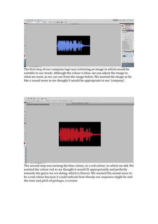
1. The first step of our company logo was retrieving an image in which would be
suitable to our needs. Although the colour is blue, we can adjust the image to
what we want, as we can see from the image below. We wanted the image so be
like a sound wave as we thought it would be appropriate to our ‘company’.
The second step was turning the blue colour, to a red colour, in which we did. We
wanted the colour red as we thought it would fit appropriately and perfectly
towards the genre we are doing, which is Horror. We wanted the sound wave to
be a red colour because it could indicate how bloody our sequence might be and
the tone and pitch of perhaps, a scream.
2. We wanted our company name to stand out so we decided to make the colour of
the writing a white. It stands out on top of red and this makes our company name
known as it stands out to the audience.
FINAL PRODUCT.