
Recommended
More Related Content
What's hot
What's hot (18)
Similar to Nme dps
Similar to Nme dps (20)
Recently uploaded
Recently uploaded (20)
Nme dps
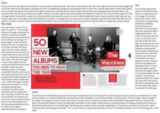
- 1. Colour As we can see fromthis page there are only three colours used, red, black and white. This creates a very simplistic feel within the magazineand makes the whole page stand out. On the whole of the right page the background is only red, highlighting the page and making people look at it more. This is the title page whereit shows whatis going to be covered on the page as the only text on the page is the title and a brief description of what its about. Also the title has a bold background of whitein blocks. This makes the title stand out more and attract the readers attention. The other page has justa white background making it not stand out as much as the other page. This is the firstpage where it shows thefirstreview of the 50 albums NME recommends the readers to read. The white background makes it easier to see the smaller black text and easier to read. Also on this page a red box with white text is included. This highlights the information to the readers meaning its important information that NME wantthe audience to read as it could be important and relevant information. This is also done with the name of the band so its easy for readers to identify who’s being reviewed. Main Image The main image is a picture of the band ‘The vaccines’. Itis the largest feature on the page conveying it has a greater importance among the other things featured and also brings a lot of attention to the page. The whole image is in black and white whereas the restof the page has a lot of colour involved. This could show that in the modern world of colour and vibrancy the vaccines still bring an older feel to music and are more of a vintage band representing older culture. Also the only image on the contents page was of the vaccines and they are the first album that NME readers wanttheir audience to listen to. This again shows NMEthinks the vaccines are a very important band that has a lot of prospects for the upcoming year and they know the readers will like their music. Within the image the whole band looks very dazed or as if they are deeply thinking about something. This backs up the description with the image which says ‘ recording an album that aims to cast off their retro styling’s once and for all. They are really working to get rid of their stereotyped music and thinking extremely hard of how to create a new image for themselves with this new album. Font On the double page spread only two main fonts are seen. There is no stylised font seen on the page, this could be because the readers aren’t interested in the page looking aesthetically appealing anymorethey are just interested in the information about the new albums NME is suggesting to listen to. The same font and styled title that is seen on the front cover is also seen on the title of this page. This is because this is the page that the frontcover was headlining, making people want to read the double page spread more as it’s the most important part of the issue. The headline is also block background colour, making it stand out more against the background colour. The sub title of the page is also the same font justslightly smaller. This shows thereaders that the headline is the next more important thing for the readers and makes them look at that title next, providing them with the information they need to know about the whole page. Layout The whole layout of the double page spread is fairly simple and generally a very formallayout. This makes the page very easy to read and understand for the reader but also relates to the audiences simple life’s and how they are only interested in music and their how life revolves around it. The main image is laid out straight in the middle of the page but is closer to the top, this makes the picture stand out well but also leaves room at the bottom of the page for the main text about the band. The text about the band is only on the right page underneath the main image, making it easier to know which parts of the page are talking about the band as the headline of the vaccines is on the right page. The left page has only been used to show title of page being ‘ 50 new albums you need to hear this year’ with a small description about the page underneath. This is so the readers can easily know whatthey are about to read without having to search the whole page for a small detail.