
Recommended
More Related Content
What's hot
What's hot (20)
Viewers also liked
Viewers also liked (18)
Similar to Magazine analysis
Similar to Magazine analysis (20)
Recently uploaded
Recently uploaded (20)
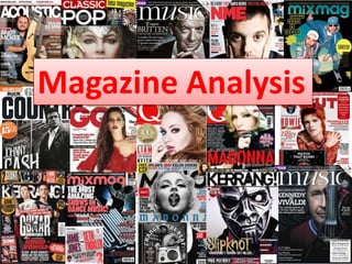
Magazine analysis
- 2. Date and Price- €4.99,it was hard to see becoause the magazine isn’t cheap and that isn’t so positive. So this is a higher class magazine Masthead: They use the same logo on all of their magazines red and white in left corner. This is a constant on Q magazine. Barcode: every magazine must have a barcod so you can buy the magazine. Main image: Is a long sho, beause you can see all of the persons. There is one man in the front, thst maybe is more about in the magazine. Buzz word: words like ”exclusive ” is used to draw attention to readers. Here i think they get free cd when you buy the magzine. That isa very good idea to get people to bu the magazine.Sub Heading: that not quite that but its the first thing I saw, that is becuseo of it’s so big, but It don’t tell anything about that Q magazine Layout: all the text is shaped on the side of the image.almost all the text is places on the people but tle masthead and sub image is behind. Sub image: there is a big interview when there is a image of the artist interview with famous people. Plug: there are numbers and word, so you know whats inn the magazine without opening it.
- 3. Date: since it is one year old, it not up to date. But that doesn’t matter because it’s about old artists. This page is in the beginning of the magazine and you can see which page the artist are on. Header: is in bold font so its easy to see which artists that are in the magazine. Review: has a black frame around so it separate from the rest of the page and it’s easy to find. Because review is something people is very interested in, and maybe only wants to read that. Layout: is very clean and on line, and to brake that rythm, they have used round bobbles in strong colours with the page number. So it makes it more readable and easy to find. Each page/artist is separated lack thin lines, so even if you don’t know who everybody is, you can see that the first image belongs to page 12. Image: it is image of all the artist represented to give more information about who they are. I think Noel Gallagher is more covered than the others in the magazine, since his image is much bigger. More people are interested in him. Bottom line: is separate from the rest of the page with a black line which continue on the rest of the page. Logo: is there to show which magazine this contents page belongs to They have used it in the masthead.
- 4. Title: work as a introduction “his name is Prince… and”. Is in bold white and to make more suitable for the image, there is a pink pattern on the text. That makes it more soft and calm. Image: it’s a photo of Prince on stage, and it fills 2/3 of the pages. To use a big photo makes the audience to look quick trough and can see the page. Puff: this means that it extra about Prince. I think there is more than just this page. Layout: is very clean with image on left and text on right. And they have used the preamble to cut that straight line trough the page. Preamble: Is in bold and bigger size than the other text to easy see what the article is about. Colours: They have used purple and pink so there must be more woman that reads it than men. Text : is small and clean. I think this text is presented in a way that people who is like Prince or want to know more read, so the generation who knew about prince or very music interested people. Other people read the bigger text ,title and look at images. You get a lot of information just looking at that too.
- 5. Date and price: it’s from Nov 2015 so it’s new and it costs €4.99. so it’s a bit expensive probably more geared towards working people or more affluent students. Splash image: is a group image of the beatles in black and white which I feel reflects the era the Beatles came from. Puff: Free cd is a good thing so thats why they use eyecatching colours like red and yellow and with a font that draws attention. Masthead: the MOJO logo in white, so it blends in with the rest of cover. Its behind the main image. So it looks like it belongs there. Barcode: have to be there, so it’s not to big so it disturbe but easy to find. And placed down in the corner where the eye look last. splash feature: It’s easy to see that this is a magzine where a big part is about the beatles. So it’s more interesting to the people that maybe grew up with the Beatles. Gifts: In almost all the MOJO magazines there a cd that you get when you buy the magazine. This seems to be a trademark and may account for the higher price. Colours: so as not to do the magazine in just black and white and boring they have used strong colours like red and yellow. On sub headings which draws your eyes to it. Sub image: to make it not to look as a The Beatles magazine only about the Beatles they have used another image, with warm colours and another person.
- 6. Logo: to recognise the magazine on the content page they have mojo’s masthead with same font as the rest of the page. Image: Is a man which most likely is on one of the pages inside the magazine. Because the image have an unusual angle, it doesn’t make it boring. Even if he Is just standing there. Bottom line: even if it’s separated from the rest of the page it still the same colours and font. The quote look more handwritten than the rest of the page, which communicate more as a quote. Colours: yellow, black and red. They have used yellow to make more interesting, but is hard to see the letters. I would have been better with red, like his suit. Font: don’t know which one, but they have used bold and big letter on the different subject. Layout: One image on the right , and the feature shaped on the side. The features and the cover story is the category which is presented with a yellow thin line and with yellow title. Top line: to black lines, which make a border with the date and number of magazine.
- 7. Image: Black and white , I think it is a old band that not longer famous but very interested people know about them. Bottom line: square pattern to make a style to the pages. I think about cars and more man related. Title: bold big font, where they separate the word “yourself” to get so all the text is on the same line and don’t go any longer than the text below. Layout: the layout is clean and remind me of the 60’s because of the colours, image and font. Colours: There is not used colour on this page, instead they have used big letter and contrast to attract the reader.
- 8. Masthead: Is whit with a rough font, which mean that Kerrang is more cool and maybe more interesting for teenager than older adults. Splash Image: is a long shot of some artist in Halloween costumes which fits with the month. And the rest oft the magazine. Cover line: is the band’s on the image name and logo, with white and big letters. The masthead is bigger, but the magazine main focus is about that band. Puff: On the cover page is usual used a lot of puff to drag readers attention by writing interesting lines, bold and colourful letters. Plug: small image of Kurt Cobain so it’s easier to see what the magazine is about. And his hair is pink so it communicate with the rest of the magazine and the young readers. Top strip: look like there is something torn off of the cover and the top strip is the first page in the magazine. Bottom strip: Here is the same as the top strip, but smaller. Inside there is stuff you can win. A front cover is going to tell what is inside, but this makes it more clear what is inside, when its torn off. Date and price: Nov 2015,Halloween is over, they have a Halloween inspired front cover. The price is 2.30 pounds, so it not that expensive, that makes it easier for younger people to buy it. Colours: They have used strong and eye catching colours like red and yellow a lot.
- 9. Colours: Black, white, red and yellow. To not make it boring it is yellow on the headings and red on the numbers. That makes it easier to find and for all ages and gender. Images: To make it more interesting than just text, they have brought image from the magazine to the content page. Sub headings: if there is something special you are interested they have put all the pages in different categories (news, albums, shots etc.) Heading: to continue the style of the magazine o Kerrang they have used a font that is that is similar to the the logo, with dust around it. Not a glamour's magazine, but a cheaper one. Plug: text by editor to the readers. They haven't used lines to separate like the other magazines. They have placed the image so it’s easy to see that it doesn’t belong to the rest of the page. Plug: help from.. Since there isn’t any image, they have used a grey colour and a banner with yellow title. Look like a award to the people that helped. And the grey to make a box.
- 10. Splash Image: Is over the two pages, and that makes more personally and since the background is green like her hair and clothes it gives more of her as a person, make the image more pure but still tough like her. Title: pretty white font on the vulnerability of the first sentence. Bold and yellow that show that is strong words. “never, again” This is word she stand by. Sub image: even if she is the main artist on this page, it’s important to show the band she is in. Note don’t know if it’s the same theme, but break the pattern on the page, but its white, same as some parts of the title. Theme heading: This text is on every page to tell you which part if the magazine you are in. Colours: They have used green, yellow and white. Same colours the image have. They have used white and yellow to make the magazine more bright, because the page is kind of dark. And the yellow letters makes it more fun to look at. More colours is better.
- 11. Summary • What the front pages have in common: masthead, plug, cover lines, price and date, image. • What the contents pages have in common: numbers, image or images, sub heading. • What double page spread have in common: one big image, interview, heading, page number.