Making communications land - Are they received and understood as intended? we...
Code and conventions - double page spread
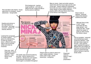
1. Pink background - reaches
target audience - soft color so
allows the text, image and title to
be the centre of attentionPink and black color theme - house
style which is consistent - brand
awareness - recognizable
Heading and picture is
the main feature of
this article - very large
and bold - catches the
reaches attention
Mise en scene - black and white costume
which links with the house style and the color
of the logo - vibrant makeup to emphasise
femininity and reach a target audience - funky
clothe design to grab readers attention -
jewelry adds to the pop theme which links
to the theme of the magazine Direct mode of
address - personal
relationship between
audience and artist
Although there is lots
of text - image
dominates the two
page spread - over
writing the title - image
allows the reader to
grasp an idea of what
the article is about
Vibrant colors on artist to stand out -
catch readers attention - house
colors used in logo - brand
awareness - recognition
Leading/intro paragraph
to intrigue readers -
gives an understanding
of what the article is
about - different size and
style of text to promote
article and show its
emphasis
Drop cap - bold -
beginning of column
so grabs readers
attention - color
theme of the
article
The article uses personal quotes by
the artist - bold so stands out to
audience - attracts fans and readers
bcos personal information - color
theme again is consistent throughout
Pull out quotation - personal
and entertaining to grab
audiences attention - bold
text also draws reader to
the text - color scheme
again repeated throughout -
attracts fans and readers as
well bcos connects with the
artist on a personal level
without having to read the
whole article
Organized
columns -
easier to read -
overall
presentation
2. Code and Conventions of Billboard double page spread
- The image is the main feature of the double page spread, although it isn’t centered and commonly like other music mags eg.
NME on the right hand side, it still catches the attention of the audience with its vibrant colours, funky patterns and unique
accessories. This is definitely a common convention used in magazines to really captivate the audience, I would like to
incorporate these ideas in my own magazine.
- Colors from the Billboard logo have been used in this article for example; the Title, the background color and subheadings.
This creates a great deal of consistency, which is pleasing for the readers eye, therefore resulting in multiple sales of the
magazine.
- Although this two page spread is a perfect example of a pop article and really reaches the target audience by color scheming
and the involvement of eye catching images, I personally don’t want to use this style in my magazine as I believe that the
genre of this article is bubblegum pop for ages ranging from 6-16 whereas I want my style and audience to be slightly more
mature.
- However, a feature i would definitely apply to my magazine would be writing the text in columns as this allows it to be easier
to read.