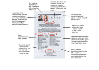
1. Contents title - funky font
- repeats through the
magazine - creates
consistency which allows
readers to recognize the
brand
Clear
organisation of
page numbers
Conventional grid
- clearly divides
into sections -
neat and well
structured makes
it easier to read
Images are similar
colour scheme with high
contrast making them
seem more colorful than
they are - contrasts with
the white background -
making is stand out -
features of the magazine -
Mini headings
(highlighted in
red) - represents
different sections
in the issue
The images are
conventionally laid -
square - adds to simplicity
and accuracy
Main colour theme
is black and white
- making it easily
to read - colors
stand out
More important information
about the article is in bold -
stands out to reader - gives
them an understanding of
what the article is about
Font is constant
throughout apart from the
title - creates a
continuation and makes it
seem sophisticated and
more structured
2. Codes and Conventions of clash - contents
- Clash magazine has a very simple contents page making it aesthetically pleasing and organized so the audience can easily
direct themselves through the article.
- Although the images are small they stand out because they are more colorful than the white wash background, this
promotes the cover story and makes the artists importance obvious.
- A consistent font is used throughout which makes the contents page look more professional. The title ‘contents’ is in a
different font to make it stand out from the rest of the page, furthermore, the more important bits of information about the
article plus the subheadings are in bold which stands out and catches the readers eye, causing them to become intrigued,
therefore reading the article.
- The magazine uses the same colour scheme in every magazine and throughout all its articles. Black and white are the most
common house colors, this is used to determine brand awareness and make the magazine easy to spot and recognize.