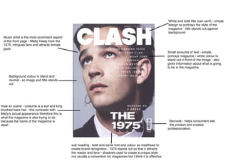
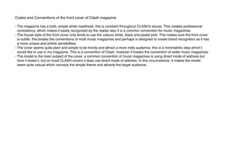
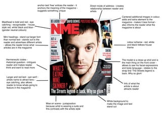
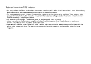
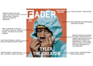
The document analyzes the codes and conventions used in the front covers of several music magazines:
- Clash magazine uses a simple white title and images to attract readers. It contrasts images with actual appearances.
- NME uses a bold red masthead, consistent colors, and multiple images/text to provide information and intrigue readers.
- Fader features a prominent artist with minimal text to sell copies using the artist's popularity. It uses a personal image.
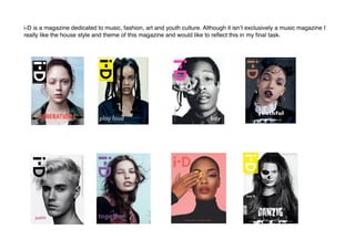
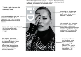
- i-D uses a simple black and white image of a fashionable model to attract its target audience of fashion-interested youth.