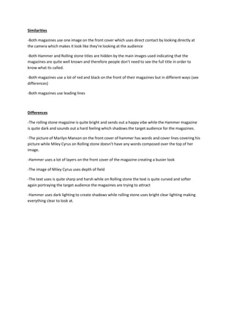
1. Similarities
-Both magazines use one image on the front cover which uses direct contact by looking directly at
the camera which makes it look like they’re looking at the audience
-Both Hammer and Rolling stone titles are hidden by the main images used indicating that the
magazines are quite well known and therefore people don’t need to see the full title in order to
know what its called.
-Both magazines use a lot of red and black on the front of their magazines but in different ways (see
differences)
-Both magazines use leading lines
Differences
-The rolling stone magazine is quite bright and sends out a happy vibe while the Hammer magazine
is quite dark and sounds out a hard feeling which shadows the target audience for the magazines.
-The picture of Marilyn Manson on the front cover of hammer has words and cover lines covering his
picture while Miley Cyrus on Rolling stone doesn’t have any words composed over the top of her
image.
-Hammer uses a lot of layers on the front cover of the magazine creating a busier look
-The image of Miley Cyrus uses depth of field
-The text uses is quite sharp and harsh while on Rolling stone the text is quite curved and softer
again portraying the target audience the magazines are trying to attract
-Hammer uses dark lighting to create shadows while rolling stone uses bright clear lighting making
everything clear to look at.