This is a picture of the lead singer from fall out boy taken by todd owyoung
Final double page
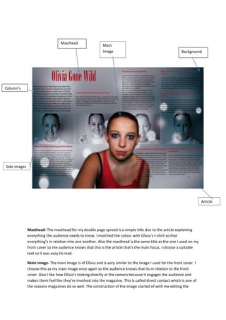
1. Masthead- The masthead for my double page spread is a simple title due to the article explaining
everything the audience needs to know. I matched the colour with Olivia’s t-shirt so that
everything’s in relation into one another. Also the masthead is the same title as the one I used on my
front cover so the audience knows that this is the article that’s the main focus. I choose a suitable
text so it was easy to read.
Main Image- The main image is of Olivia and is very similar to the image I used for the front cover. I
choose this as my main image once again so the audience knows that its in relation to the front
cover. Also I like how Olivia’s looking directly at the camera because it engages the audience and
makes them feel like they’re involved into the magazine. This is called direct contact which is one of
the reasons magazines do so well. The construction of the image started of with me editing the
Masthead
Column’s
Background
Main
Image
Article
Side images
2. background out. I then made Olivia’s eyes a lighter shade of blue to make them stand out. I softened
the edges to make it less obvious that it’s been composed on top if the background.
Background- For the background I wanted to add a texture look so I created a new layer and
changed the mode to overlay, With a transparent background, I added small circles around the page
followed by Gaussian blur as an effect to reduce the sharpness of the image and to blend it in with
the background. I then experimented with different colour corrections before deciding on a blue
colour to match my magazines front cover.
Side Images- For my side images I took four images of Olivia which I opened on a new document on
photoshop. I then placed them side by side using the scaling tool to resize the images appropriately.
I then merged the different layers I was working on followed by pasting the finished result onto my
double page spread document. I then changed the mode of the image to soft light and resized to fit
the background width of the double page spread.
Columns- I kept the columns similar to ones that id see in a more professional magazine so it makes
the standard of my magazine. Columns also make it easier to read for the audience and makes the
overall article easier to read.
Article- I produced my article in Microsoft word and then copied and pasted it in Photoshop. I
started of with an introduction to inform the audience who the articles going to be about. I
researched similar articles which gave me an idea on how to write mine and how to make it
interesting. I think the images break the text up and don’t make it as boring to read.