
Recommended
More Related Content
What's hot
What's hot (20)
Similar to Magazine cover analysis nme
Similar to Magazine cover analysis nme (20)
More from cherellelouise
More from cherellelouise (14)
Magazine cover analysis nme
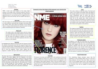
- 1. Salford City College Eccles Centre AS Media Studies Foundation Portfolio Masthead Comment on how the design of the magazine cover attracts the Colour ‘NME’ is short and would appeal to the young target target audience The colour scheme is bold and classic, The black and audience. In the right corner so that the audience’s eyes are white is very modern and simple which will appeal to naturally drawn to it. It’s bold and blocky and simple which the younger audience. It is easy to read so the audience appeals because it’s neat and tidy and so it suggests that the know immediately what it’s about and will be magazine is also neat and tidy, and very modern and easy to influenced to buy it. The colour also clashes with the read. bold red of the models hair, which attracts the audience’s attention immediately as it stands out and is Main image very vibrant. The cover uses mostly white text, but the The main image is of a well-known celebrity which would appeal use of black on her name makes it stand out more that to a mass-audience, especially older teenagers and young adults. she’s famous and appeals to the audience. The model's direct gaze holds the attention of the audience. There is a sharp contrast between her pale face and her red hair which immediately grabs the audience’s attention. Typefaces The magazine typefaces are all capital letters, which give the impression that the names of the artists Model credit and the features are being screamed/shouted at the The model credit is the models name, and she is famous audience, which will attract their attention as it so it would appeal to the target audience. The font is black stands out. The words are blocky yet sharp which is opposed to the white font on the front cover so it stands stylish and modern and will appeal to an up-to-date out and draws the audience’s attention to the models younger audience of teenagers-young adults. name. It is also very big, which emphasizes that she’s a big person i.e. she’s famous. Photography Lighting The lighting is very light airy which gives the impression Cover lines that the magazine is simple and clean. The models pale face By highlighting the different musicians that the magazine includes is light which suggests that she is nice and will attract the the audience immediately know that the magazine targets fans of audience’s attention that she’s open and friendly. The rock/indie and pop music. Listing popular artists can appeal to the lighting also shines on her red hair, which makes it stand audience as they are likely to see an artist that they like and would out and will appeal to the audience as it is vibrant and like to read the magazine. “Music Today” implies that the bright, and the red will stand out against her pale face and magazine is modern and up to date which would appeal to the draw the audience’s attention to the magazine. young adults. Main cover line Design Principles Used? The main cover line is a quote from the model on the cover of the House Style magazine. The quote suggests that the magazine is all about The layout is very basic and simple; there is the masthead in the top left The Guttenberg Design principle means that the artists opinions and would include a majority of them. By having corner so people are drawn to it. There is a list of artist names on the masthead is in the strongest fallow area so it’s the first the world FLORENCE bigger that her quote it appeals to the side which shows the audience what kind of genre the magazine is and thing audiences will see. They then follow across the audience as she is a famous artists and a majority of young adults will appeal to their target audience. There is also the models name in cover to the strongest fallow area in the bottom right will be interested to read about her. The quote says “I would never had got through the x factor auditions.” This contains the big, capital letters which will appeal to a mass audience as it is a popular corner where the bar code is, meaning they immediately name of a famous talent show that will intrigue the young person, and a quote, which gives the cover character and will appeal to see Florence’s face and are appeals to purchase the audience and make them want to read what is mentioned. the audience more. magazine.