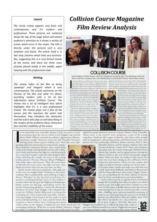
1. Layout
The movie review appears very basic and
contemporary and it’s modern and
professional. Three pictures are scattered
along the top of the page which will attract
audience’s attention as it shows a variety of
scenes which occur in the movie. The title is
directly under the pictures and is very
simplistic and bland. The article itself is in
two long columns which look very businesslike, suggesting this is a very formal review
of the movie, and there are three more
pictures placed neatly in the middle, again
keeping with the professional-style.
Writing
The review refers to the film as being
‘powerful’ and ‘elegant’ which is very
contemporary. The article comments on the
themes of the film and what it’s about,
providing readers with a lot of key
information about ‘Collision Course.’ The
review has a lot of intelligent lexis which
highlights that it’s is a very professional
review. The review plays out a few of the
scenes and the reactions the writer had
themselves, they introduce the characters
and the actors who play as well describing to
the readers of the problems these characters
face and the credibility of the actors.
Collision Course Magazine
Film Review Analysis