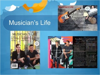
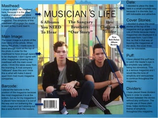
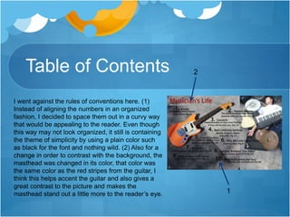
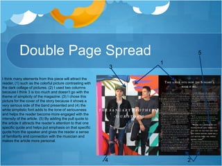
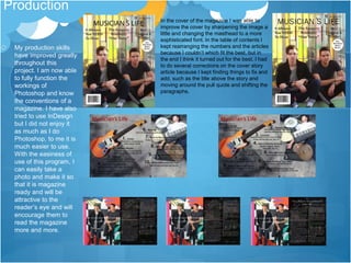
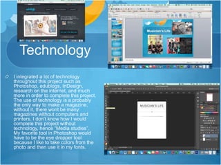
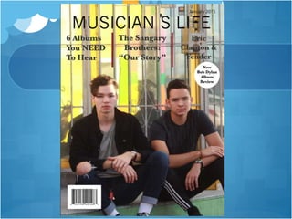
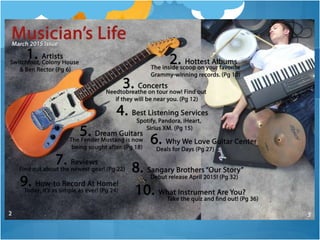
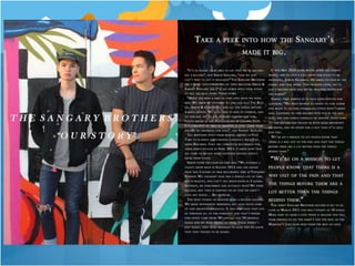
3. House Style
The colors that I have decided to use through my magazine are some
very unique colors for this genre. I used a dark red for masthead in the
table of contents. I also used the same dark red for the cover story
divider’s on the cover page. The only other colors that I used for the
fonts were black and white. I used the white on the table of contents
page because I thought that it tended to show up the best with the
photos that were behind it. I used a plain black font on the front cover
page in order to continue with the simplicity of the main cover and not
to make the reader dizzy with many colors annoying them.
4. Critical Reflection Questions
#1
My product challenges the conventions of a magazine by ignoring
the rule of thirds and keeping a majority of the cover lines towards
the top of the magazine. By doing this, it will attract the reader’s
attention because many magazines are stacked upon each other
in a staircase fashion and this will allow for the reader to always
see the featured articles in the magazine and be enticed to buy it in
order to learn more. My magazine will be different from many
magazines because they do not analyze and get a personal
interview of how the life of that specific artist came to be. Many
music magazines just talk about music but don’t really talk about
the person behind the music, this magazine will help fill that gap for
this missing criteria.
5. Masthead:
I chose to place the masthead
here, because it is the most
logical and appropriate place
according to the conventions of a
magazine. The simplicity of this
masthead will engage the reader
to want to buy it and read it.
Date:
I decided to place the date
here in a small simplistic way
because it is discrete, but
still noticeable and attractive.
Cover Stories:
I decided to place the cover
stories at the top of the
magazine and go against the
rule of thirds because many
magazines are displayed in a
staircase form. I put it like
this, so that in that way of
layering the magazines at
the store, the cover lines
may be noticeable.
Puff:
I have placed this puff here
to catch the reader’s eye in
a simplistic way without
being too obnoxious. This
is a serious magazine and I
would like the tone of
simplicity and seriousness
to continue throughout the
magazine.
Main Image:
The cover image is a photo of the
main story of the article. When
taking this photo, I made sure to
leave enough room at the top of
the photo in order for the
masthead to have enough space
to be displayed. I don’t agree with
other magazines covering their
masthead with the main cover
photo. I think this takes away from
the branding. A rival company
“billboard” does this and I think
this is what will make it stand
apart from rival music magazine
companies.
Barcode:
I placed the barcode in this
position of the magazine because
like most magazines it is at the
bottom, but as for my magazine it
is placed here because it is out of
the way and not bothering the
main image and isn’t sticking out
like a sore thumb to the readers.
Dividers:
I have placed these dividers
here in order to create a
division between the stories
without any confusion. The
simple use of these plain
lines, helps reinforce the
theme of simplicity
throughout this magazine.
6. Table of Contents
I went against the rules of conventions here. (1)
Instead of aligning the numbers in an organized
fashion, I decided to space them out in a curvy way
that would be appealing to the reader. Even though
this way may not look organized, it still is containing
the theme of simplicity by using a plain color such
as black for the font and nothing wild. (2) Also for a
change in order to contrast with the background, the
masthead was changed in its color, that color was
the same color as the red stripes from the guitar, I
think this helps accent the guitar and also gives a
great contrast to the picture and makes the
masthead stand out a little more to the reader’s eye.
2
1
7. Double Page Spread
I think many elements from this piece will attract the
reader, (1) such as the colorful picture contrasting with
the dark collage of pictures. (2) I used two columns
because I think 3 is too much and doesn’t go with the
theme of simplicity of the magazine. (3) I chose this
picture for the cover of the story because it shows a
very serious side of the band presented and (4) the
white simplistic font adds to the tone of seriousness
and helps the reader become more engaged with the
intensity of the article. (5) By adding the pull quote to
the article it attracts the reader’s attention to that one
specific quote and helps put emphasis on that specific
quote from the speaker and gives the reader a sense
of familiarity and connection with the musician and
makes the article more personal.
1
2
3
4
5
8. Engaging the Audience
My magazine will engage the audience by making each article
very interesting with facts and stories about all the famous
artists who have made it big in the music industry. Other music
magazines such as “billboard” just give the charts and the
popular music, but don’t actually sit down and get the story
behind the music with the artist. My magazine will tackle this
issue and resolve this problem by interviews new and old
artists each week about their personal life and music career of
how they came to be in the music industry and the road it took
to get there, these are all exciting things that viewers are
looking for in a music magazine and would love to read about
their favorite artists.
9. Production
My production skills
have improved greatly
throughout this
project. I am now able
to fully function the
workings of
Photoshop and know
the conventions of a
magazine. I have also
tried to use InDesign
but I did not enjoy it
as much as I do
Photoshop, to me it is
much easier to use.
With the easiness of
use of this program, I
can easily take a
photo and make it so
that it is magazine
ready and will be
attractive to the
reader’s eye and will
encourage them to
read the magazine
more and more.
In the cover of the magazine I was able to
improve the cover by sharpening the image a
little and changing the masthead to a more
sophisticated font. In the table of contents I
kept rearranging the numbers and the articles
because I couldn’t which fit the best, but in
the end I think it turned out for the best. I had
to do several corrections on the cover story
article because I kept finding things to fix and
add, such as the title above the story and
moving around the pull quote and shifting the
paragraphs.
10. Technology
I integrated a lot of technology
throughout this project such as
Photoshop, edublogs, InDesign,
research on the internet, and much
more in order to complete this project.
The use of technology is a probably
the only way to make a magazine,
without it, there wont be many
magazines without computers and
printers. I don’t know how I would
complete this project without
technology, hence “Media studies”.
My favorite tool in Photoshop would
have to be the eye dropper tool
because I like to take colors from the
photo and then use it in my fonts.