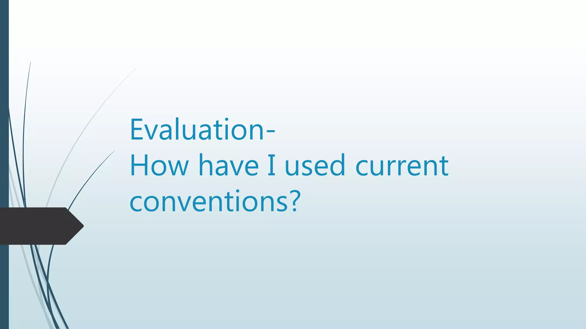
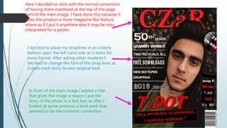
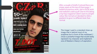
Evaluation-
How have I used current
conventions?
Here I decided to stick with the normal convention
of having there masthead at the top of the page
behind the main image. I have done this because it
gives the product a more magazine like feature,
where as if I put it anywhere else it may be miss
interpreted for a poster.
I decided to place my straplines in an orderly
fashion upon the left hand side as it looks lot
more formal. After asking other students I
decided to change the font of the strap lines as
it gives each story its own original look.
In front of the main image I added a title
that gives the image a reason I put the
story of the photo in a text box as after I
looked at some previous a level work that
seemed to be the common convention.
After a couple of drafts I noticed there was
empty space at the top of there page. I
looked at previous work i did in GCSE work
and realised I used a puff. Due to this being
a hip hop magazine I didn’t want it a bright
colour like normal so I decided to Add a
gradient to give it a different look than
normal.
The image I used is a standard close up
image that is behind most of my
straplines but in front of the masthead. I
chose a powerful image that would easily
represent my character and implement
one of Maslow's theory's of aspiration.

Evaluation

  • 1.
    Evaluation- How have Iused current conventions?
  • 2.
    Here I decidedto stick with the normal convention of having there masthead at the top of the page behind the main image. I have done this because it gives the product a more magazine like feature, where as if I put it anywhere else it may be miss interpreted for a poster. I decided to place my straplines in an orderly fashion upon the left hand side as it looks lot more formal. After asking other students I decided to change the font of the strap lines as it gives each story its own original look. In front of the main image I added a title that gives the image a reason I put the story of the photo in a text box as after I looked at some previous a level work that seemed to be the common convention.
  • 3.
    After a coupleof drafts I noticed there was empty space at the top of there page. I looked at previous work i did in GCSE work and realised I used a puff. Due to this being a hip hop magazine I didn’t want it a bright colour like normal so I decided to Add a gradient to give it a different look than normal. The image I used is a standard close up image that is behind most of my straplines but in front of the masthead. I chose a powerful image that would easily represent my character and implement one of Maslow's theory's of aspiration.