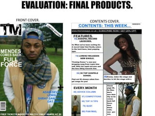
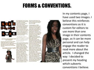
The document evaluates the final products of a student including a front cover, contents cover, and double page spread. It discusses how the student both reinforced and subverted conventions in their work. The front cover name was shortened from "The Message" to "TM" to trademark it like other magazines. The front cover image stuck to the convention of a mid-close up shot but subverted it with an unusual mis-en-scene with bright lighting that complemented the model's clothing. Consistency of style was also reinforced with a color scheme of white, turquoise, and black. However, adding a "limited edition" banner subverted conventions from analyzed magazines.