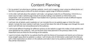
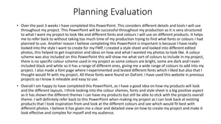
Production Planning
Olivia Waller
Production Planning Introduction
• Throughout the next 2 weeks, I will be looking into planning which needs to be planned before I start my
final production. It is important to consider planning because it can assist me if I come across any obstacles I
could face in the production of my project. It also helps me to get a clear understanding on what I want and
don’t want to use in my final project. I will look into a variety of different ideas such as, image styles, colour
schemes and fonts and decide what I want to use for my final production.
• The research I will be producing will be through a PowerPoint, I will gather this information online and
offline. An example of this is fonts, I will include pre-existing examples but also examples that are seen
online. This will help me to look into different insights on how to produce my product and make it look
professional.
• Whilst gathering my planning, I will look into some companies featured in previous work, as they are
important and will help me to build up to my final production. This includes, York Art Gallery and Castle Fine
Art. These are gallery websites which include a similar theme and layout as I want to achieve for my
products.
• Overall I am looking forward to planning, I believe it has potential to achieve the production steps I will need
to follow throughout my production. Another reason I am excited to complete this PowerPoint as it helps me
to look through different types of pre-existing products and create different slides to find the perfect final
designs for my FMP.
Locations
Location 1
Distance – York college is approximately 12 miles from my location (20 minutes). To access college I can
drive so I will drive myself to college, park in a local car park, Park and Ride and walk over to college.
Cost – With me parking at park and ride it means I have to get a bus, I usually have to get a bus over to
Tesco’s, luckily because it is so close it is cheap and only costs £1.20 so that is the cost I will need for travel.
With doing college all day, it means I need to have lunch so either I will bring my own food to eat but
occasionally I go and buy food from Tesco’s this again is cheap so if I am buying lunch it will cost £3 so
overall the day could cost me £4.20.
Location 2
This is my house this my house, so not travel will be needed for this location as I live here.
There will be no overall cost as everything is free. I will be using this location to take some
photos for my project but also doing work outside of college.
Overall I am delighted to of conducted planning on the locations that I will be featuring in my final project. Looking into
the distance and cost I am able to plan out my day and keep it at a low cost.
Time Availability
• Erin – Erin has a part time job that she works on the days she is not at college, so planning time to take photos with Erin
was difficult as she doesn’t have a lot of free time. However we go to college together and are in the same class so we
decided that closer to the end of the day would be best as it gives us chance to complete work at the start of the day. The
day we are planning to take photos is 11th March as this is when we are back in college and it means I am getting photos
taken in plenty of time for the production.
• Ruby – Ruby is my sister, she has school everyday so finding free for her was also a challenge, she is in year 10 so it is a big
year for her as she is starting her GCSE’s so she has work that needs doing outside of school. However because we live
together it makes it a bit easier as we have the weekends. We both have part time jobs which we both work on a Saturday
but Sundays we are both free so this is a good time for us to take photos.
• Me – With COVID being around it makes it harder for me to meet up with people and use them as my models as many of
my friends are keeping safe and not meeting people so using myself makes it easier for me to achieve photos for my
project. I have college 3 days a week and work 3 days a week so I barely have free time as well as my previous models,
however I usually have nights free and Sundays so this will be the best times for me to take photos. With nights being a
free time for me it means the lighting will be darker then usual, I have a ring light that I can use to get the best lighting
possible, I will need to set this up so I will have to fit this all in the time I have so i’m not leaving it too late to take my
photos. Sundays are a free day also, I have the whole day free so this will be the best day for me to take photos as it gives
me loads of time to get the best photos I can and I can also get my sister to help me out as this is a day she also has free so
I will be able to get the angles I need for my photos.
Font
Basic Sans Serif
Fonts
Various Fonts
Groovy Fonts
Fonts Planning
• After looking into different fonts for my productions, I used DaFont as the main resource of finding these fonts as they
have a huge variation of different fonts to find anything I want.
• The first section I looked into was Basic Sans Serif, I need to include these fonts onto my website to makes it look
professional and effective. The 4 that I have included in this slide are my favourite ones and the ones that I think will look
the best for my website. “Big Noodle Titling” will look good as a title or subheadings for my website as it will be bold and
eye-catching for the audience. I like “Loves” as writing for a quick description of what my website will be about, I think it is
simple but looks smart and will keep my website looking ‘classy’ and professional.
• I also looked into more exciting fonts that I can include on my book cover, as I wanted the title to be more exciting and
grab the attention of my audience when they see it. The 2 that I have included on this slide are the ones I am most likely to
choose. I think they both stand out and are very eye-catching for the audience. “Bubbleboddy” is bold and thick, I do think
that it is too round on the edges of the font, however I think it looks good, with my project being more on the crazy and
unusual side I think it will suit this font. “Sparkling Bright” this is my favourite one out of the two, I think this one looks
more sophisticated and definitely fits with the fine art theme as it looks more professional. It still has quite a strange style
to it which I like as it fits with my edited photos.
Colour scheme
Colour Scheme Planning
• The colour scheme that I am planning on using is very colourful and bright. I chose this colour scheme as I
think it helps to stand out. The main colours are reds, blues and pinks as these are fun and bright for the
project.
• I have also included some black and white schemes as I didn’t want my whole project to be colour, I wanted
to include some black and white as a contrast towards the colourful ones. I believe that having more simple
coloured photos helps the project to come off as more professional and effective then just having a bunch of
multicoloured photos all put together.
• With me editing my photos I am able to make them however I like, having this large colour scheme on the
previous slide will help me see which colours go together and which ones don’t to make sure all my photos
go together and look clean.
• Overall I have looked at a variety of different colours, and I will use a selection of them throughout my
project.
Style Sheet
Style Sheet Planning
• In this section of the PowerPoint I have looked into different photos I like the look of that I could use for
inspiration for my project. All of them include the same theme as they all look creepy and unique.
• I have looked into existing products that follow a similar colour scheme as I looked into in the previous slide,
some of the photos are colourful and others are in black and white. This helps with my product as this is the
similar theme I am using for my products.
• All the shots are all the same, they are close up shots. I want to use close up shots for my project as I feel
there is a lot of cool stuff that you can do onto faces and can make each one look different.
• I will only include portrait photos in my project as I think they look effective, when looking into Fine Art they
are mostly portraits so I wanted to stay with theme as I wanted it to link with Fine Art.
• The theme I have chosen is achievable for my to create, I will use different tutorials to create my project.
• Overall I like the look of my style sheet as it follows the same theme I want to achieve for my project, this
has helped me to get a overall view of how I could make my photos look and helps with inspiration for my
photos and editing.
Content Planning
• For my project I am planning on making a website, merch and a magazine cover using my edited photos as I
feel this is a good way to show off my work and gives a good range of different products.
• In this slide I will talk about the website I will make. I am going to make this on Photoshop, I think this is a
easier way to make a website page instead of actually making a real website as I think that is very
complicated. I will use previous website I have looked into in previous research to look at different layouts
and how I want to present my work.
• I will look into all details used in websites so I can recreate this on my website page as I think the more
details I include the more realistic it will look. E.g scroll bar down the side of the page, even though this wont
work it will still look real and professional to the audience.
• I will include different headings for different sections on the website as again this makes it look realistic and
more detailed for the audience. I will use the fonts that I have planned in the previous slides in this
PowerPoint and use these for the writing on the website.
• I want to include a big title for my website that fits with the theme of my project and stands out so that you
know straight away what my website is a about. I will include a bit of information underneath this title just
with a little explanation on what is in the website and make it clear to my audience whether it is something
they will be interested in.
Content Planning
• Next I will look into my merchandise I am planning on making. I would ideally like to make 3 different types
of merchandise. In my experiments I looked at watercolour effects and I thought that this style of photo
would look good on a tote bag. Tote bags are very trendy and are sold in many places currently so I would
like to stick with the trends so that it is appealing to my audience and something they would use and enjoy.
• I want to include one of my photos on a T-shirt but use it on the back of the shirt. This makes it more simple
in the front for a more subtle look and then with the photo being on the back it makes it more exciting. I
think this design will make it more wearable for my audience and something they will enjoy.
• The last product I want to make is a hoodie. I am going to include a black and white photo on the front of
this hoodie so I think including different colours for the base colour of the hoodie will be exciting for the
audience meaning they can choose what they would prefer. The colours I will use for the hoodies is pink,
blue, red, white and black. I think these colours are bright and main colours people would chose so this will
suit them and appeal well to my audience.
Content Planning
• The last content I will be talking about is a magazine cover. I am going to create a front cover for Fine Art or
Photography. In my research PowerPoint I looked into books and magazines so I will look back on this
research to see how I want it to look.
• I will use my best edited photo as the main cover as I think this is the best way to show this off. I want to
include different subheadings on the cover to make sure it looks realistic and professional. I will use the fonts
that I have planned in previous slides, I want it to be eye-catching and grab attention for my audience.
• A barcode will be needed for this as it will look better, I will get this off the internet. This is adding detail to
my cover, it isn’t the main focus but it adds detail and will help to make it look real and something my
audience will be interested in.
• I want the photo to be the main focus so I will keep the subheadings more simple, they need to be eye
catching but not too much so the focus is taken off the photo I have edited.
Layout/Experiments
FINE ART PHOTOGRAPHY.
Thiswebsiteoffers adigitalgalleryexperienceof differenteditedportraitsthat willsuit allaudiences.
Takealookaroundourexhibition
Fine Art
Photography
Still Life | Portrait | Edits
VEE
SPEERS
OLEG
DOU
Layout/Experiments Planning
• After looking through my content planning and how I wanted to plan my products to look, I decided to look at potential
layouts. I did this by looking online as examples of different websites, merchandise and magazine cover and used these as
inspiration for experiments on how I can present my products. I think this is good to look in to as it helps to give me a
visual representation and structure of each product I will produce for my FMP. I completed the experiments just on
PowerPoint as I thought this would give me a rough idea and I wanted to spend more time on the main planning of the
project. I think what I created on the previous slide gives me a good look on how I can improve my products and the
different details I can add to make it look better and complex.
• The layout designs I featured are the 3 products I am planning on making. I got the photos off google as it gave me simple
designs and layouts that I could take inspiration from. As I mentioned previously I made the experiments on PowerPoint as
I wanted it to be a rough mock-up of my products. This helped to show the different things I need to add for the making of
my project and different tools I can use for production.
• Overall I like the mock-ups I created in the previous slides, I think it gave me help on how to set out my project and
products. The products I have decided to make have a very generic layout however I thought it would be helpful to look in
to them and see the different details I can include to make it look complex and realistc.
Planning Evaluation
• Over the past 3 weeks I have completed this PowerPoint. This considers different details and tools I will use
throughout my project. This PowerPoint will be successful throughout my production as it is very structured
to what I want my project to look like and different fonts and colours I will use on different products. It helps
me to refer back to without taking too much time of my production trying to find what fonts or colours I had
planned to use. Another reason I believe completing this PowerPoint is important is because I have really
looked into the style I want to create for my FMP, I created a style sheet and looked into different edited
photos, this helped to get inspiration and ideas on how and what I wanted my photos to look like. A colour
scheme was also included on this PowerPoint this will show me what sort of colours to include in my project,
there is no specific colour scheme used in my project as some colours are bright, some are dark and I even
included black and white so it has a range of different ones, giving me a wide range of colours to add into my
project. I also made a font page where I experimented and tested different fonts which I liked but also that I
thought would fit with my project. All these fonts were found on DaFont. I have used this website in previous
projects so I know it relieable and easy to use.
• Overall I am happy to have completed this PowerPoint, as I have a good idea on how my products will look
and the different layouts. I think looking into the colour shemes, fonts and style sheet is a big positive aspect
as it has shown the different themes I can have my products but still be able to stick with the projects overall
theme. I will definitely refer back to this PowerPoint when making my project as I can look back at existing
products that I took inspiration from and look at the different colours and see which would fit best with
different photos. I believe it has given me a clear and detailed view on how to create my project and make it
look effective and complex for myself and my audience.

Planning

  • 1.
  • 2.
    Production Planning Introduction •Throughout the next 2 weeks, I will be looking into planning which needs to be planned before I start my final production. It is important to consider planning because it can assist me if I come across any obstacles I could face in the production of my project. It also helps me to get a clear understanding on what I want and don’t want to use in my final project. I will look into a variety of different ideas such as, image styles, colour schemes and fonts and decide what I want to use for my final production. • The research I will be producing will be through a PowerPoint, I will gather this information online and offline. An example of this is fonts, I will include pre-existing examples but also examples that are seen online. This will help me to look into different insights on how to produce my product and make it look professional. • Whilst gathering my planning, I will look into some companies featured in previous work, as they are important and will help me to build up to my final production. This includes, York Art Gallery and Castle Fine Art. These are gallery websites which include a similar theme and layout as I want to achieve for my products. • Overall I am looking forward to planning, I believe it has potential to achieve the production steps I will need to follow throughout my production. Another reason I am excited to complete this PowerPoint as it helps me to look through different types of pre-existing products and create different slides to find the perfect final designs for my FMP.
  • 3.
    Locations Location 1 Distance –York college is approximately 12 miles from my location (20 minutes). To access college I can drive so I will drive myself to college, park in a local car park, Park and Ride and walk over to college. Cost – With me parking at park and ride it means I have to get a bus, I usually have to get a bus over to Tesco’s, luckily because it is so close it is cheap and only costs £1.20 so that is the cost I will need for travel. With doing college all day, it means I need to have lunch so either I will bring my own food to eat but occasionally I go and buy food from Tesco’s this again is cheap so if I am buying lunch it will cost £3 so overall the day could cost me £4.20. Location 2 This is my house this my house, so not travel will be needed for this location as I live here. There will be no overall cost as everything is free. I will be using this location to take some photos for my project but also doing work outside of college. Overall I am delighted to of conducted planning on the locations that I will be featuring in my final project. Looking into the distance and cost I am able to plan out my day and keep it at a low cost.
  • 4.
    Time Availability • Erin– Erin has a part time job that she works on the days she is not at college, so planning time to take photos with Erin was difficult as she doesn’t have a lot of free time. However we go to college together and are in the same class so we decided that closer to the end of the day would be best as it gives us chance to complete work at the start of the day. The day we are planning to take photos is 11th March as this is when we are back in college and it means I am getting photos taken in plenty of time for the production. • Ruby – Ruby is my sister, she has school everyday so finding free for her was also a challenge, she is in year 10 so it is a big year for her as she is starting her GCSE’s so she has work that needs doing outside of school. However because we live together it makes it a bit easier as we have the weekends. We both have part time jobs which we both work on a Saturday but Sundays we are both free so this is a good time for us to take photos. • Me – With COVID being around it makes it harder for me to meet up with people and use them as my models as many of my friends are keeping safe and not meeting people so using myself makes it easier for me to achieve photos for my project. I have college 3 days a week and work 3 days a week so I barely have free time as well as my previous models, however I usually have nights free and Sundays so this will be the best times for me to take photos. With nights being a free time for me it means the lighting will be darker then usual, I have a ring light that I can use to get the best lighting possible, I will need to set this up so I will have to fit this all in the time I have so i’m not leaving it too late to take my photos. Sundays are a free day also, I have the whole day free so this will be the best day for me to take photos as it gives me loads of time to get the best photos I can and I can also get my sister to help me out as this is a day she also has free so I will be able to get the angles I need for my photos.
  • 5.
  • 6.
  • 7.
    Fonts Planning • Afterlooking into different fonts for my productions, I used DaFont as the main resource of finding these fonts as they have a huge variation of different fonts to find anything I want. • The first section I looked into was Basic Sans Serif, I need to include these fonts onto my website to makes it look professional and effective. The 4 that I have included in this slide are my favourite ones and the ones that I think will look the best for my website. “Big Noodle Titling” will look good as a title or subheadings for my website as it will be bold and eye-catching for the audience. I like “Loves” as writing for a quick description of what my website will be about, I think it is simple but looks smart and will keep my website looking ‘classy’ and professional. • I also looked into more exciting fonts that I can include on my book cover, as I wanted the title to be more exciting and grab the attention of my audience when they see it. The 2 that I have included on this slide are the ones I am most likely to choose. I think they both stand out and are very eye-catching for the audience. “Bubbleboddy” is bold and thick, I do think that it is too round on the edges of the font, however I think it looks good, with my project being more on the crazy and unusual side I think it will suit this font. “Sparkling Bright” this is my favourite one out of the two, I think this one looks more sophisticated and definitely fits with the fine art theme as it looks more professional. It still has quite a strange style to it which I like as it fits with my edited photos.
  • 8.
  • 9.
    Colour Scheme Planning •The colour scheme that I am planning on using is very colourful and bright. I chose this colour scheme as I think it helps to stand out. The main colours are reds, blues and pinks as these are fun and bright for the project. • I have also included some black and white schemes as I didn’t want my whole project to be colour, I wanted to include some black and white as a contrast towards the colourful ones. I believe that having more simple coloured photos helps the project to come off as more professional and effective then just having a bunch of multicoloured photos all put together. • With me editing my photos I am able to make them however I like, having this large colour scheme on the previous slide will help me see which colours go together and which ones don’t to make sure all my photos go together and look clean. • Overall I have looked at a variety of different colours, and I will use a selection of them throughout my project.
  • 10.
  • 11.
    Style Sheet Planning •In this section of the PowerPoint I have looked into different photos I like the look of that I could use for inspiration for my project. All of them include the same theme as they all look creepy and unique. • I have looked into existing products that follow a similar colour scheme as I looked into in the previous slide, some of the photos are colourful and others are in black and white. This helps with my product as this is the similar theme I am using for my products. • All the shots are all the same, they are close up shots. I want to use close up shots for my project as I feel there is a lot of cool stuff that you can do onto faces and can make each one look different. • I will only include portrait photos in my project as I think they look effective, when looking into Fine Art they are mostly portraits so I wanted to stay with theme as I wanted it to link with Fine Art. • The theme I have chosen is achievable for my to create, I will use different tutorials to create my project. • Overall I like the look of my style sheet as it follows the same theme I want to achieve for my project, this has helped me to get a overall view of how I could make my photos look and helps with inspiration for my photos and editing.
  • 12.
    Content Planning • Formy project I am planning on making a website, merch and a magazine cover using my edited photos as I feel this is a good way to show off my work and gives a good range of different products. • In this slide I will talk about the website I will make. I am going to make this on Photoshop, I think this is a easier way to make a website page instead of actually making a real website as I think that is very complicated. I will use previous website I have looked into in previous research to look at different layouts and how I want to present my work. • I will look into all details used in websites so I can recreate this on my website page as I think the more details I include the more realistic it will look. E.g scroll bar down the side of the page, even though this wont work it will still look real and professional to the audience. • I will include different headings for different sections on the website as again this makes it look realistic and more detailed for the audience. I will use the fonts that I have planned in the previous slides in this PowerPoint and use these for the writing on the website. • I want to include a big title for my website that fits with the theme of my project and stands out so that you know straight away what my website is a about. I will include a bit of information underneath this title just with a little explanation on what is in the website and make it clear to my audience whether it is something they will be interested in.
  • 13.
    Content Planning • NextI will look into my merchandise I am planning on making. I would ideally like to make 3 different types of merchandise. In my experiments I looked at watercolour effects and I thought that this style of photo would look good on a tote bag. Tote bags are very trendy and are sold in many places currently so I would like to stick with the trends so that it is appealing to my audience and something they would use and enjoy. • I want to include one of my photos on a T-shirt but use it on the back of the shirt. This makes it more simple in the front for a more subtle look and then with the photo being on the back it makes it more exciting. I think this design will make it more wearable for my audience and something they will enjoy. • The last product I want to make is a hoodie. I am going to include a black and white photo on the front of this hoodie so I think including different colours for the base colour of the hoodie will be exciting for the audience meaning they can choose what they would prefer. The colours I will use for the hoodies is pink, blue, red, white and black. I think these colours are bright and main colours people would chose so this will suit them and appeal well to my audience.
  • 14.
    Content Planning • Thelast content I will be talking about is a magazine cover. I am going to create a front cover for Fine Art or Photography. In my research PowerPoint I looked into books and magazines so I will look back on this research to see how I want it to look. • I will use my best edited photo as the main cover as I think this is the best way to show this off. I want to include different subheadings on the cover to make sure it looks realistic and professional. I will use the fonts that I have planned in previous slides, I want it to be eye-catching and grab attention for my audience. • A barcode will be needed for this as it will look better, I will get this off the internet. This is adding detail to my cover, it isn’t the main focus but it adds detail and will help to make it look real and something my audience will be interested in. • I want the photo to be the main focus so I will keep the subheadings more simple, they need to be eye catching but not too much so the focus is taken off the photo I have edited.
  • 15.
    Layout/Experiments FINE ART PHOTOGRAPHY. Thiswebsiteoffersadigitalgalleryexperienceof differenteditedportraitsthat willsuit allaudiences. Takealookaroundourexhibition Fine Art Photography Still Life | Portrait | Edits VEE SPEERS OLEG DOU
  • 16.
    Layout/Experiments Planning • Afterlooking through my content planning and how I wanted to plan my products to look, I decided to look at potential layouts. I did this by looking online as examples of different websites, merchandise and magazine cover and used these as inspiration for experiments on how I can present my products. I think this is good to look in to as it helps to give me a visual representation and structure of each product I will produce for my FMP. I completed the experiments just on PowerPoint as I thought this would give me a rough idea and I wanted to spend more time on the main planning of the project. I think what I created on the previous slide gives me a good look on how I can improve my products and the different details I can add to make it look better and complex. • The layout designs I featured are the 3 products I am planning on making. I got the photos off google as it gave me simple designs and layouts that I could take inspiration from. As I mentioned previously I made the experiments on PowerPoint as I wanted it to be a rough mock-up of my products. This helped to show the different things I need to add for the making of my project and different tools I can use for production. • Overall I like the mock-ups I created in the previous slides, I think it gave me help on how to set out my project and products. The products I have decided to make have a very generic layout however I thought it would be helpful to look in to them and see the different details I can include to make it look complex and realistc.
  • 17.
    Planning Evaluation • Overthe past 3 weeks I have completed this PowerPoint. This considers different details and tools I will use throughout my project. This PowerPoint will be successful throughout my production as it is very structured to what I want my project to look like and different fonts and colours I will use on different products. It helps me to refer back to without taking too much time of my production trying to find what fonts or colours I had planned to use. Another reason I believe completing this PowerPoint is important is because I have really looked into the style I want to create for my FMP, I created a style sheet and looked into different edited photos, this helped to get inspiration and ideas on how and what I wanted my photos to look like. A colour scheme was also included on this PowerPoint this will show me what sort of colours to include in my project, there is no specific colour scheme used in my project as some colours are bright, some are dark and I even included black and white so it has a range of different ones, giving me a wide range of colours to add into my project. I also made a font page where I experimented and tested different fonts which I liked but also that I thought would fit with my project. All these fonts were found on DaFont. I have used this website in previous projects so I know it relieable and easy to use. • Overall I am happy to have completed this PowerPoint, as I have a good idea on how my products will look and the different layouts. I think looking into the colour shemes, fonts and style sheet is a big positive aspect as it has shown the different themes I can have my products but still be able to stick with the projects overall theme. I will definitely refer back to this PowerPoint when making my project as I can look back at existing products that I took inspiration from and look at the different colours and see which would fit best with different photos. I believe it has given me a clear and detailed view on how to create my project and make it look effective and complex for myself and my audience.