The document discusses design elements common to magazines, including using 2-3 contrasting colors, black and white backgrounds, small page numbers in a contrasting color, the largest title font at the top of the page, a 3-4 column structure to separate articles, small pictures relating to nearby articles, headings above columns and pages to structure content, simple small readable fonts, and issue numbers and magazine names at the top of pages.
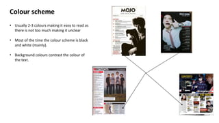
1. Colour scheme
• Usually 2-3 colours making it easy to read as
there is not too much making it unclear
• Most of the time the colour scheme is black
and white (mainly).
• Background colours contrast the colour of
the text.
2. Page numbers
• Usually small and positioned next to the
information
• Sometimes a different colour to the
other text making it stand out
• Sometimes bigger than the information
next to it.
• Shows the reader which page the
information is on.
3. Title “contents”
• Usually at the top of the page
• Largest font
• Contrasting colour to the background
• Easy to see
• Identifies what page it is.
4. Columns
• Gives the page structure.
• Separates feature articles from regular
articles.
• Mainly 3/4 columns but are 2 in some
magazines.
• Makes the page easier to read/navigate
through.
5. Pictures that anchor articles
• Usually quite small
• Relates to the information beside it
• Usually of different well known bands/artists
6. Headings: regular/feature
• Positioned above the page numbers and
information.
• Clearly tells the reader what is within that column
• Helps with structure
7. Font
• Simple and easy to read
• Quite small
• Different colour to the page numbers
8. Issue no.
• Usually at the top of the page – next
to title
• Quite small
• Tells the reader when the magazine
was published
9. Magazine name
• Easily noticeable
• Contrasting colour to background
• Tells reader what magazine it is