Download as PDF, PPTX


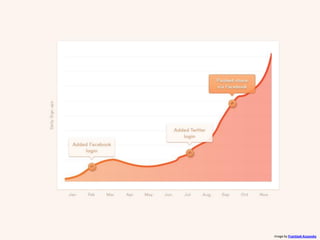
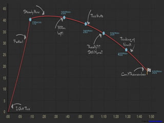


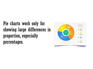
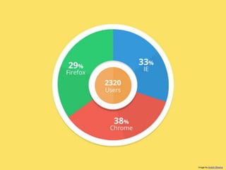
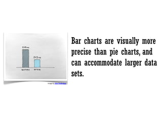
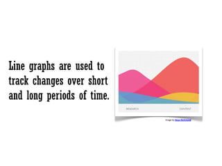


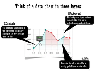
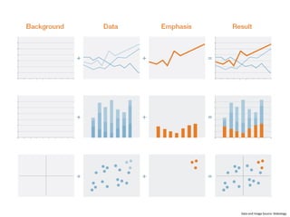


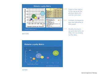


The document provides principles for presenting data in the clearest way possible: tell the truth and ensure credibility with data; get to the main point by drawing meaning from the data; pick the right tool like pie, bar, or line graphs depending on the data; highlight what's important by keeping slides focused on conclusions, not all data; and keep visuals simple to avoid distractions.