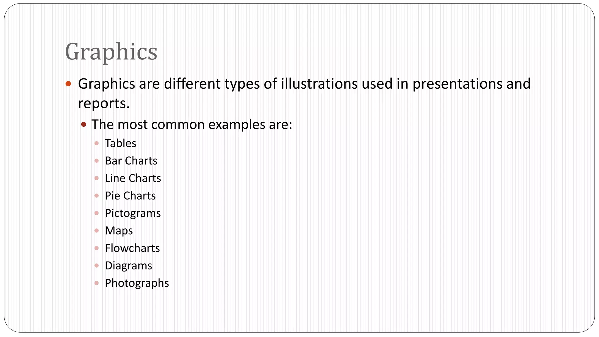
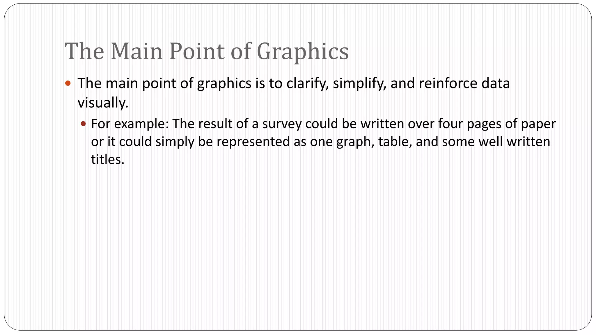
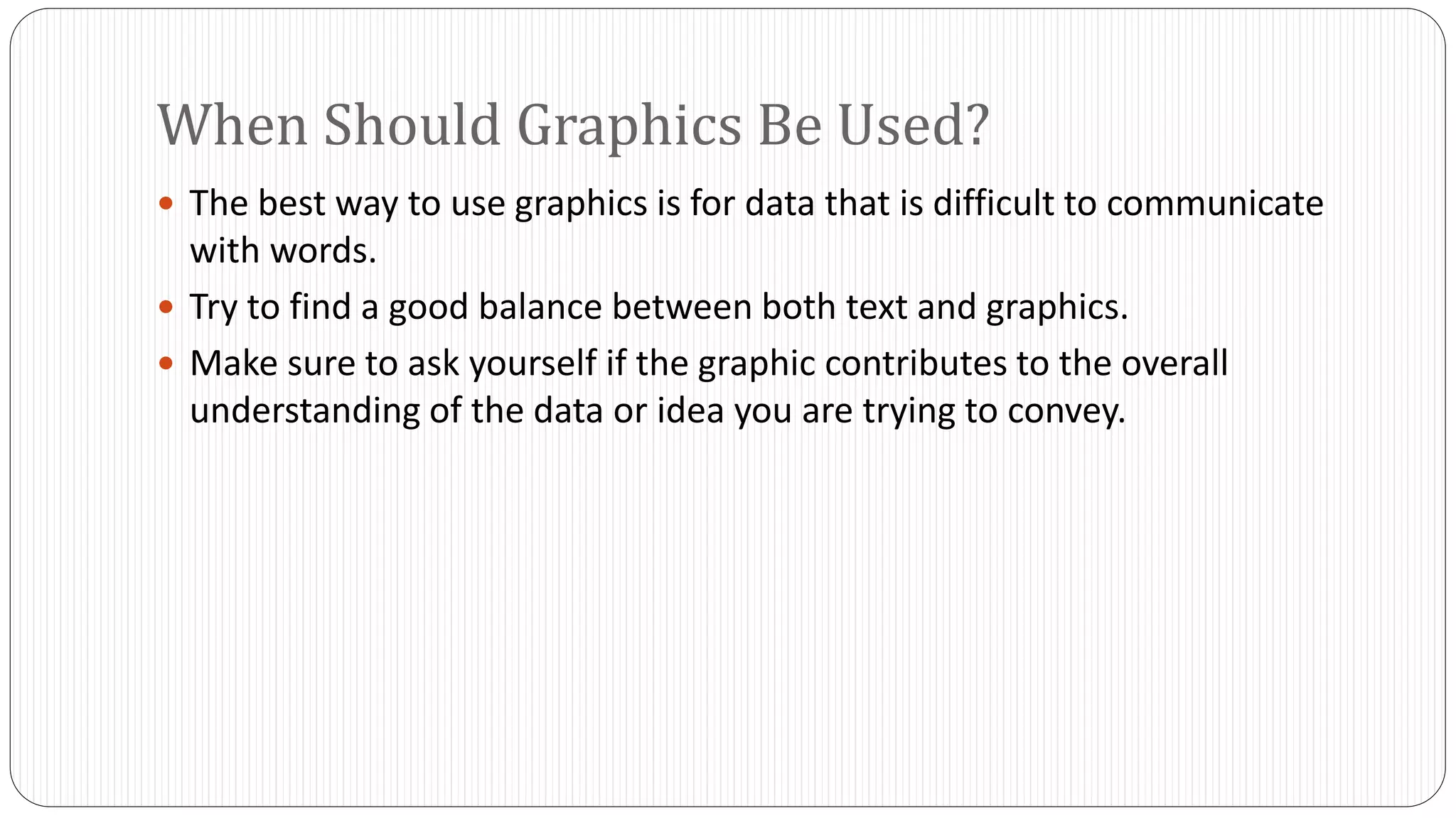
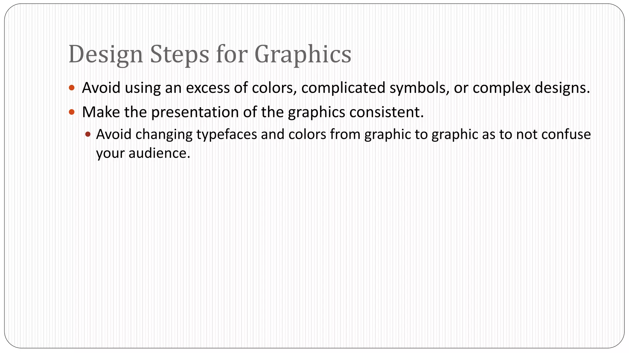
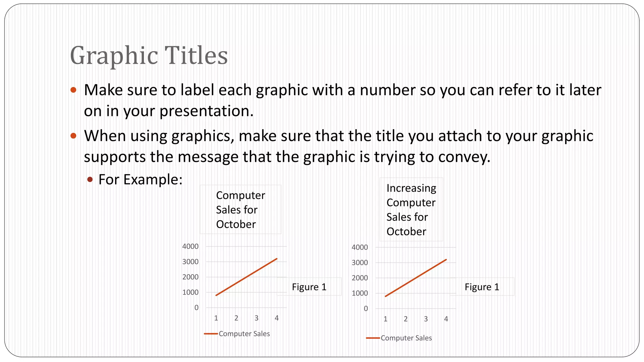
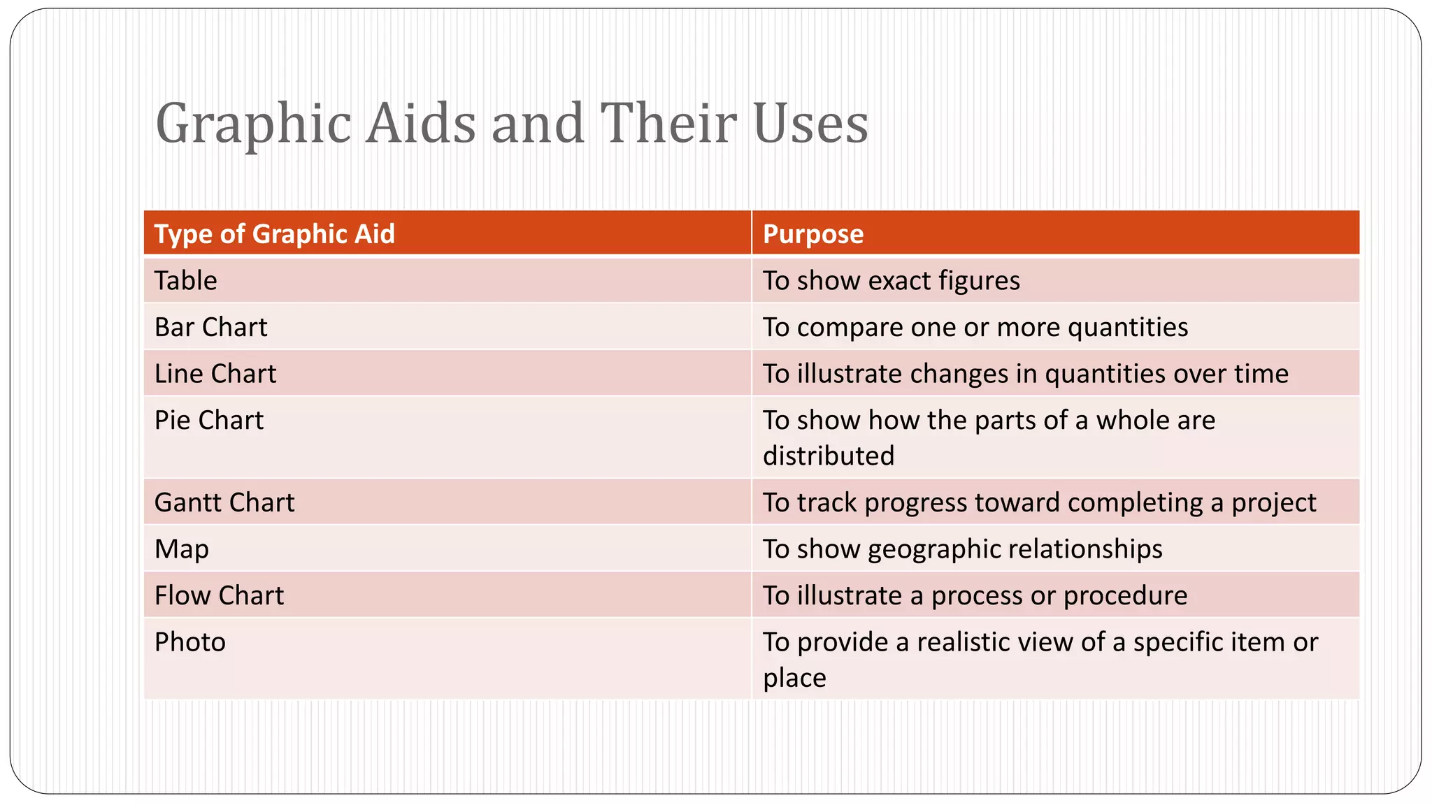
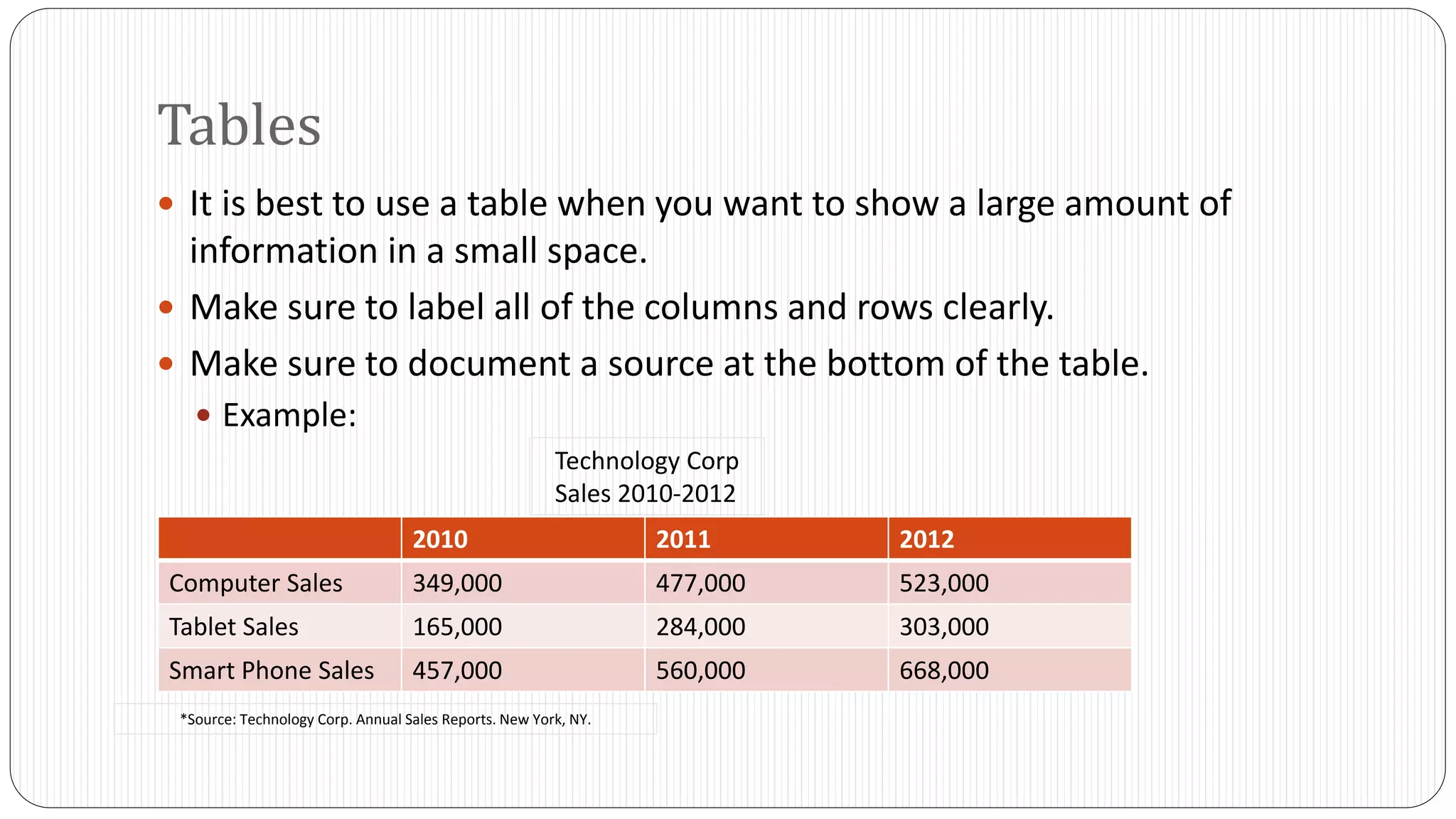
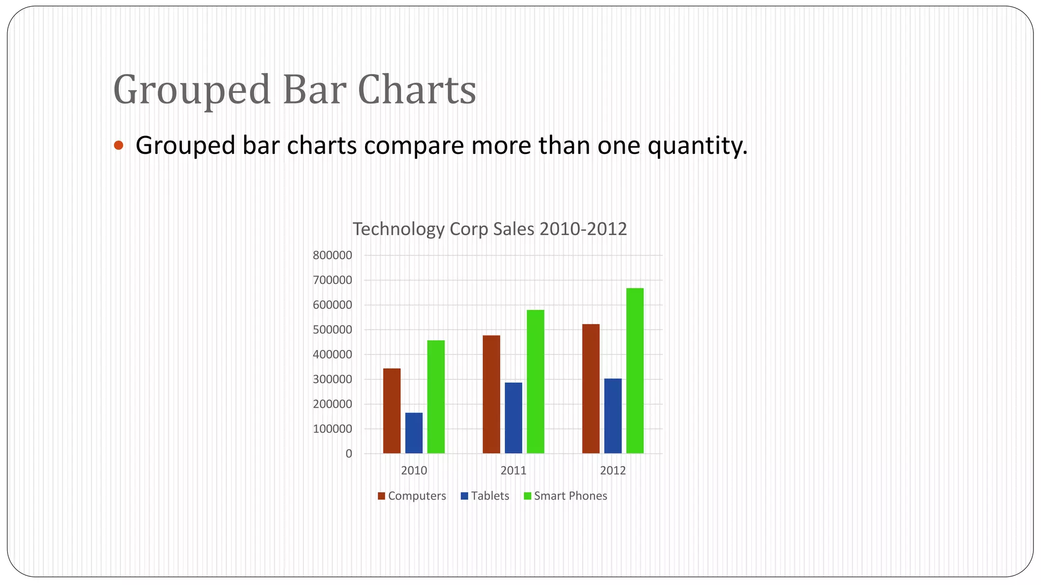
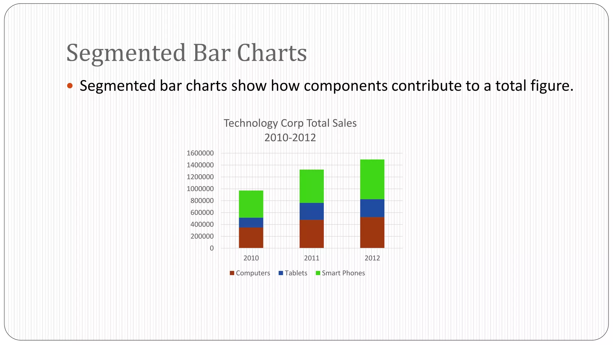
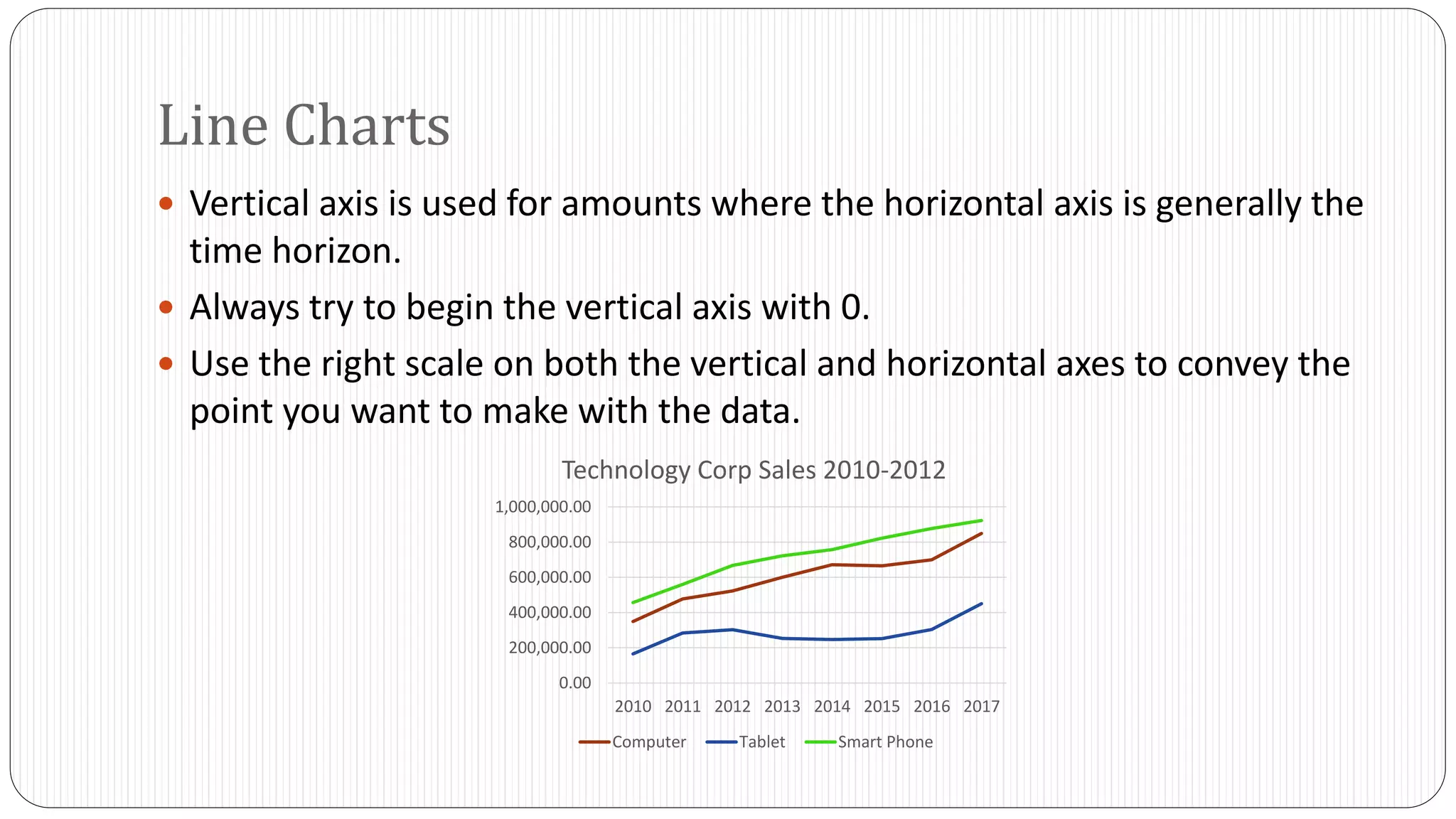
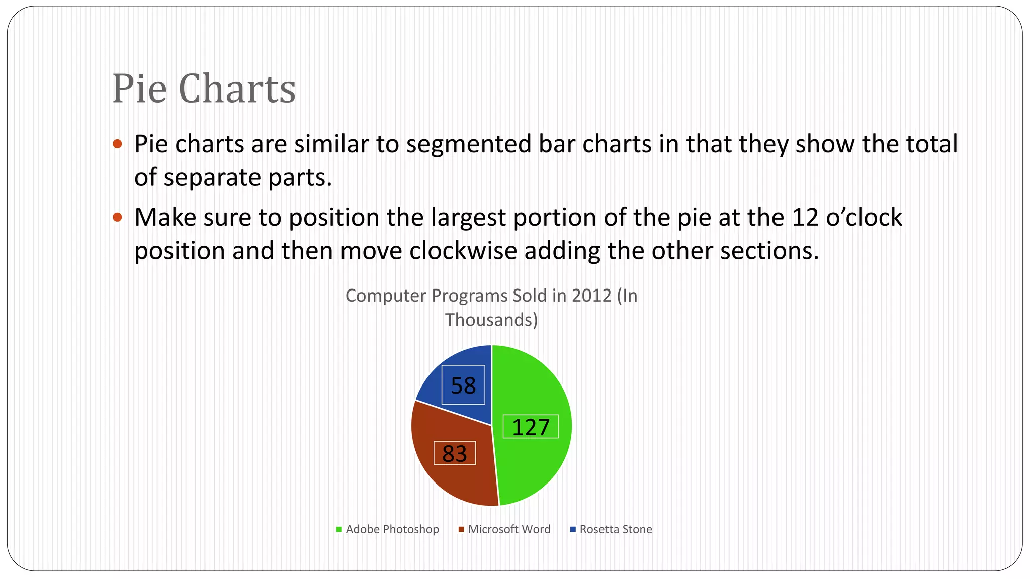
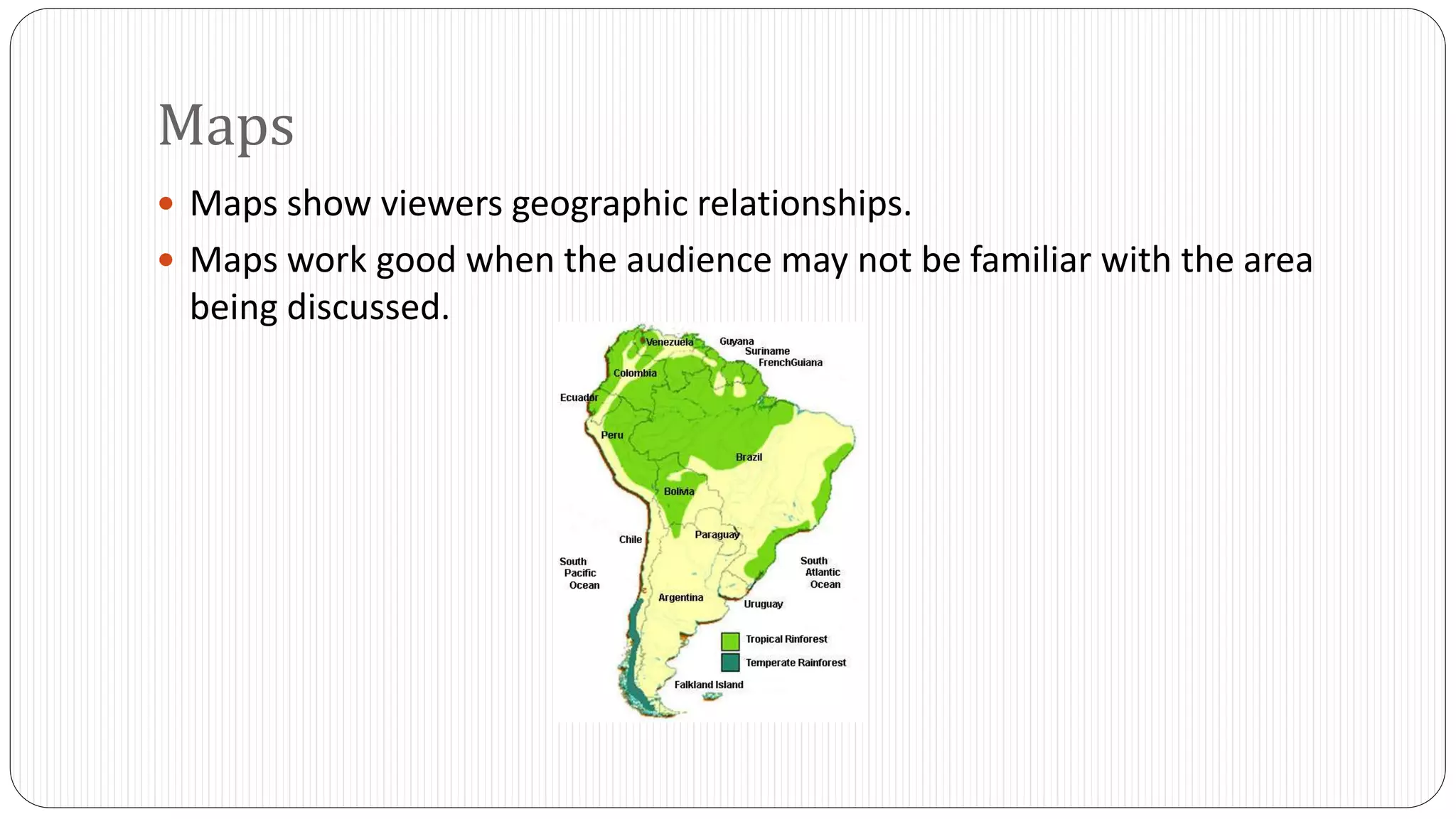
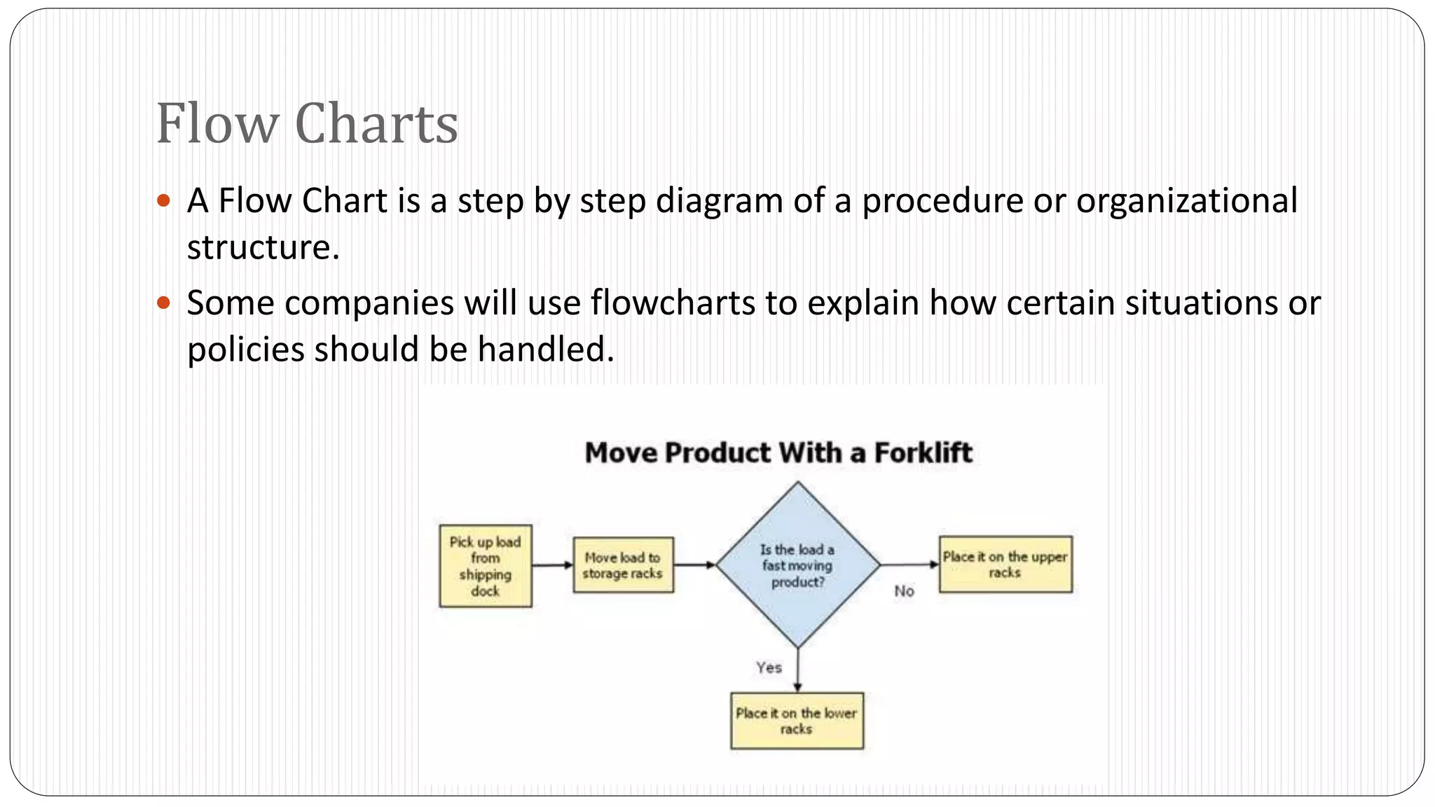
Communicating Quantitative Information 
By Tyler Steketee 
BIS 101 
“We remember more of what we both see and 
hear than of what we receive through only one 
sensory channel. When text and graphics are 
combined, retention goes up an average of 
42.3%.”
Key Points 
 What is Common Language? 
 What are graphics? 
 When should they be used? 
 Design tips 
 Different types of graphics
Common Language 
 Common Language is defined as language that reduces difficult figures to 
the common denominators of language and ideas. 
 This basically means that when presenting, make information as easy as 
possible to understand.
Common Language 
 Combining and condensing information is the best way to address large 
groups of people. 
 People typically would like to see proportions or ratios that are best 
represented as a percentage. 
 Approximations are also useful. 
 For example: 46% of Americans like pizza can be stated as, “Approximately 
half of Americans like pizza.”
Graphics 
 Graphics are different types of illustrations used in presentations and 
reports. 
 The most common examples are: 
 Tables 
 Bar Charts 
 Line Charts 
 Pie Charts 
 Pictograms 
 Maps 
 Flowcharts 
 Diagrams 
 Photographs
The Main Point of Graphics 
 The main point of graphics is to clarify, simplify, and reinforce data 
visually. 
 For example: The result of a survey could be written over four pages of paper 
or it could simply be represented as one graph, table, and some well written 
titles.
When Should Graphics Be Used? 
 The best way to use graphics is for data that is difficult to communicate 
with words. 
 Try to find a good balance between both text and graphics. 
 Make sure to ask yourself if the graphic contributes to the overall 
understanding of the data or idea you are trying to convey.
Design Steps for Graphics 
 Avoid using an excess of colors, complicated symbols, or complex designs. 
 Make the presentation of the graphics consistent. 
 Avoid changing typefaces and colors from graphic to graphic as to not confuse 
your audience.
Design Steps for Graphics 
 Make sure that your presentation is easily viewed and visible to the entire 
audience. 
 Most importantly, make sure that your graphic data is honest. 
 Visual data can be easily distorted.
Graphic Titles 
 Make sure to label each graphic with a number so you can refer to it later 
on in your presentation. 
 When using graphics, make sure that the title you attach to your graphic 
supports the message that the graphic is trying to convey. 
 For Example: 
4000 
3000 
2000 
1000 
0 
1 2 3 4 
Computer Sales 
4000 
3000 
2000 
1000 
0 
1 2 3 4 
Computer Sales 
Computer 
Sales for 
October 
Increasing 
Computer 
Sales for 
October 
Figure 1 Figure 1
Selecting the Right Graphic Aid 
 When selecting graphic aids, pick the one that will display your data most 
effectively. 
 If you are in a situation where you are working for a company, make sure 
you follow the company’s policy for designing graphics if any.
Graphic Aids and Their Uses 
Type of Graphic Aid Purpose 
Table To show exact figures 
Bar Chart To compare one or more quantities 
Line Chart To illustrate changes in quantities over time 
Pie Chart To show how the parts of a whole are 
distributed 
Gantt Chart To track progress toward completing a project 
Map To show geographic relationships 
Flow Chart To illustrate a process or procedure 
Photo To provide a realistic view of a specific item or 
place
Tables 
 It is best to use a table when you want to show a large amount of 
information in a small space. 
 Make sure to label all of the columns and rows clearly. 
 Make sure to document a source at the bottom of the table. 
 Example: 
Technology Corp 
Sales 2010-2012 
2010 2011 2012 
Computer Sales 349,000 477,000 523,000 
Tablet Sales 165,000 284,000 303,000 
Smart Phone Sales 457,000 560,000 668,000 
*Source: Technology Corp. Annual Sales Reports. New York, NY.
Grouped Bar Charts 
 Grouped bar charts compare more than one quantity. 
800000 
700000 
600000 
500000 
400000 
300000 
200000 
100000 
0 
Technology Corp Sales 2010-2012 
2010 2011 2012 
Computers Tablets Smart Phones
Segmented Bar Charts 
 Segmented bar charts show how components contribute to a total figure. 
1600000 
1400000 
1200000 
1000000 
800000 
600000 
400000 
200000 
0 
Technology Corp Total Sales 
2010-2012 
2010 2011 2012 
Computers Tablets Smart Phones
Line Charts 
 Vertical axis is used for amounts where the horizontal axis is generally the 
time horizon. 
 Always try to begin the vertical axis with 0. 
 Use the right scale on both the vertical and horizontal axes to convey the 
point you want to make with the data. 
Technology Corp Sales 2010-2012 
1,000,000.00 
800,000.00 
600,000.00 
400,000.00 
200,000.00 
0.00 
2010 2011 2012 2013 2014 2015 2016 2017 
Computer Tablet Smart Phone
Pie Charts 
 Pie charts are similar to segmented bar charts in that they show the total 
of separate parts. 
 Make sure to position the largest portion of the pie at the 12 o’clock 
position and then move clockwise adding the other sections. 
Computer Programs Sold in 2012 (In 
Thousands) 
127 
58 
83 
Adobe Photoshop Microsoft Word Rosetta Stone
Maps 
 Maps show viewers geographic relationships. 
 Maps work good when the audience may not be familiar with the area 
being discussed.
Flow Charts 
 A Flow Chart is a step by step diagram of a procedure or organizational 
structure. 
 Some companies will use flowcharts to explain how certain situations or 
policies should be handled.
Conclusion 
 What did we discuss? 
 Common Language 
 Graphics 
 When they should be used 
 Design tips 
 The different types of graphics

Communicating quantitative information (pecha kucha)

  • 1.
    Communicating Quantitative Information By Tyler Steketee BIS 101 “We remember more of what we both see and hear than of what we receive through only one sensory channel. When text and graphics are combined, retention goes up an average of 42.3%.”
  • 2.
    Key Points What is Common Language?  What are graphics?  When should they be used?  Design tips  Different types of graphics
  • 3.
    Common Language Common Language is defined as language that reduces difficult figures to the common denominators of language and ideas.  This basically means that when presenting, make information as easy as possible to understand.
  • 4.
    Common Language Combining and condensing information is the best way to address large groups of people.  People typically would like to see proportions or ratios that are best represented as a percentage.  Approximations are also useful.  For example: 46% of Americans like pizza can be stated as, “Approximately half of Americans like pizza.”
  • 5.
    Graphics  Graphicsare different types of illustrations used in presentations and reports.  The most common examples are:  Tables  Bar Charts  Line Charts  Pie Charts  Pictograms  Maps  Flowcharts  Diagrams  Photographs
  • 6.
    The Main Pointof Graphics  The main point of graphics is to clarify, simplify, and reinforce data visually.  For example: The result of a survey could be written over four pages of paper or it could simply be represented as one graph, table, and some well written titles.
  • 7.
    When Should GraphicsBe Used?  The best way to use graphics is for data that is difficult to communicate with words.  Try to find a good balance between both text and graphics.  Make sure to ask yourself if the graphic contributes to the overall understanding of the data or idea you are trying to convey.
  • 8.
    Design Steps forGraphics  Avoid using an excess of colors, complicated symbols, or complex designs.  Make the presentation of the graphics consistent.  Avoid changing typefaces and colors from graphic to graphic as to not confuse your audience.
  • 9.
    Design Steps forGraphics  Make sure that your presentation is easily viewed and visible to the entire audience.  Most importantly, make sure that your graphic data is honest.  Visual data can be easily distorted.
  • 10.
    Graphic Titles Make sure to label each graphic with a number so you can refer to it later on in your presentation.  When using graphics, make sure that the title you attach to your graphic supports the message that the graphic is trying to convey.  For Example: 4000 3000 2000 1000 0 1 2 3 4 Computer Sales 4000 3000 2000 1000 0 1 2 3 4 Computer Sales Computer Sales for October Increasing Computer Sales for October Figure 1 Figure 1
  • 11.
    Selecting the RightGraphic Aid  When selecting graphic aids, pick the one that will display your data most effectively.  If you are in a situation where you are working for a company, make sure you follow the company’s policy for designing graphics if any.
  • 12.
    Graphic Aids andTheir Uses Type of Graphic Aid Purpose Table To show exact figures Bar Chart To compare one or more quantities Line Chart To illustrate changes in quantities over time Pie Chart To show how the parts of a whole are distributed Gantt Chart To track progress toward completing a project Map To show geographic relationships Flow Chart To illustrate a process or procedure Photo To provide a realistic view of a specific item or place
  • 13.
    Tables  Itis best to use a table when you want to show a large amount of information in a small space.  Make sure to label all of the columns and rows clearly.  Make sure to document a source at the bottom of the table.  Example: Technology Corp Sales 2010-2012 2010 2011 2012 Computer Sales 349,000 477,000 523,000 Tablet Sales 165,000 284,000 303,000 Smart Phone Sales 457,000 560,000 668,000 *Source: Technology Corp. Annual Sales Reports. New York, NY.
  • 14.
    Grouped Bar Charts  Grouped bar charts compare more than one quantity. 800000 700000 600000 500000 400000 300000 200000 100000 0 Technology Corp Sales 2010-2012 2010 2011 2012 Computers Tablets Smart Phones
  • 15.
    Segmented Bar Charts  Segmented bar charts show how components contribute to a total figure. 1600000 1400000 1200000 1000000 800000 600000 400000 200000 0 Technology Corp Total Sales 2010-2012 2010 2011 2012 Computers Tablets Smart Phones
  • 16.
    Line Charts Vertical axis is used for amounts where the horizontal axis is generally the time horizon.  Always try to begin the vertical axis with 0.  Use the right scale on both the vertical and horizontal axes to convey the point you want to make with the data. Technology Corp Sales 2010-2012 1,000,000.00 800,000.00 600,000.00 400,000.00 200,000.00 0.00 2010 2011 2012 2013 2014 2015 2016 2017 Computer Tablet Smart Phone
  • 17.
    Pie Charts Pie charts are similar to segmented bar charts in that they show the total of separate parts.  Make sure to position the largest portion of the pie at the 12 o’clock position and then move clockwise adding the other sections. Computer Programs Sold in 2012 (In Thousands) 127 58 83 Adobe Photoshop Microsoft Word Rosetta Stone
  • 18.
    Maps  Mapsshow viewers geographic relationships.  Maps work good when the audience may not be familiar with the area being discussed.
  • 19.
    Flow Charts A Flow Chart is a step by step diagram of a procedure or organizational structure.  Some companies will use flowcharts to explain how certain situations or policies should be handled.
  • 20.
    Conclusion  Whatdid we discuss?  Common Language  Graphics  When they should be used  Design tips  The different types of graphics