
Recommended
More Related Content
What's hot
What's hot (20)
Viewers also liked
Viewers also liked (20)
Similar to Textual analysis
Similar to Textual analysis (20)
Recently uploaded
Recently uploaded (20)
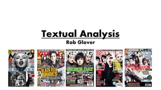
Textual analysis
- 2. Q Cover Analysis: -Plug used as a way to get the potential buyer to want the magazine and what is inside, in this case ‘an exclusive CD’ which immediately draws in the attention of the audience. -Use of a barcode, a common convention of magazines that allows the customer to purchase the product. -Date and price placed in small discreet text next to the barcode to avoid making the price too obvious at least at first before the reader has had time to be convinced by the key selling points of the product. -Main image showing Dave Grohl, surrounded by the other 4 members of the Foo Fighters directly addressing the reader/audience through the use of eye contact that helps to give the magazine a more personal and informal feel making the audience feel more connected. -Use of the masthead/Q logo helps to give the magazine identity with a bold and striking image to be recognised by, it appears as a key feature on all covers so that the audience can differentiate between different magazines, it is placed below the plug so that that is what immediately tempts and draws into buying the product. -Use of a sub image that advertises what else other than what is pictured in the main image and headline, this is done to give the audience a further insight in regards to the contents. -Use of a buzz word excites the consumer making them feel that there is something significant inside and that they are the first ones to know.
- 3. Kerrang! Cover Analysis: -There is the use of a plug on the header of the cover to immediately draw the readers attention to what they will get from within the magazine, in this case ‘6 scorching "posters’. The use of the term ‘scorching’ (to describe the images) helps to intrigue and tempt the reader into their purchase. -Date and price placed discreetly in a small text size below the main headlines, buzz word, and masthead to make sure that the audience look elsewhere before looking at the price, by which time they will have had chance to be persuaded by the key selling points of the magazine. -Main image showing two of the six members of Linkin Park, and like in the previous cover the image directly addresses the audience as the people in the picture look forwards involving the reader therefore strengthening the magazine’s connection with it’s audience. -Use of ‘scorching’ as a buzz word that makes the reader want to buy the product so that they can see what is inside. -Use of a barcode which is a common convention in all magazines that lets the reader make their purchase. -Use of the Kerrang! masthead/logo helps to identify the magazine to the reader who has to come to recognise it by this, it appears as a key feature on all covers so that the audience can differentiate between different magazines and also helps to put continuity into the covers. -Use of sub image and sub header to advertise the other stories that the contents will be covering.
- 4. NME Cover Analysis: -No use of a Plug maybe because of a difference in median age/audience in comparison to both Q and Kerrang! This could potentially mean that the magazines appeals less to possible readers/buyers as there is no buzz word or exclusive piece of content. -Use of a barcode, which is typical of magazine covers and allows the customer to purchase the product. -Date and price placed in small text to the right of the barcode to avoid making the price too obvious before the reader has had time to be convinced by the key selling points of the product if there are any. However NME recently became free and therefore would no longer have a price printed on it. -Main image showing American rock band, Julian Casablancas and the Voidz. The way the audience is addressed is slightly less direct than on the covers of Q and Kerrang! and as a consequence of this the magazine has a less personal feel to it which means the audience may feel less involved. -Use of the masthead/NME logo or icon to help the audience recognise and identify the magazine when it is in the company of rival products and also to tempt the reader into buying the product itself. -Use of a sub image to show what else other than what is shown by both the main image and its headline, this is done to give the audience a better idea of what they are buying.
- 5. Q Contents Analysis: -Font sizes vary between the headers advertising the subject of the story and the small amount of information below each heading in smaller text, this is done to make sure that the reader knows the main contents of the magazine before navigating through to find particular articles of more interest. -No use of columns but instead a more grid like format that allows each subject to have its own area of the contents accompanied by a photograph of the artist. -Use of photographs to show the reader who each of the artists mentioned in the magazine are and what they look like. -Use of large coloured page number icons to help the reader locate specific stories and navigate to certain pages rather than having to scan through and search for their desired article. -Use of continuity in the branding of the magazine with the red ‘Q’ logo, a constant feature across the contents page that gives the magazine identity making sure that it looks similar on each page so that it has a recognisable format. -Amount of text is largely minimised and the images take up most of the space on the page, the text is also only used when necessary and is not made overly obvious, except in the case of the headers.
- 6. Kerrang! Contents Analysis: -Font sizes differ between the bold headers and the detailed text in the small articles in the columns across the right hand side although the majority of text is in a small font size that is maybe slightly too small to be immediately noticeable and therefore won’t immediately draw the reader in to any section of the magazine in particular. The section headings are highlighted in yellow text so that they stand out from the rest of the subheadings. -Use of columns makes for a more organised format to the contents page and makes it easier to read through as the different stories are split into sections under the headings of ‘news’, ‘features’, ‘albums; etc. -Use of images that vary in size to show the significance/importance of each article help to show the audience the subject of the articles and how or what is the main focus of the reading. . -Use of bigger page number icons in white over the images of the bigger articles to contrast with the backgrounds to help the reader find specific stories efficiently and navigate to certain pages instead of aimlessly scanning through. -No real use of branding like on the Q contents page, this means it is less noticeably part of the Kerrang! brand itself and it looks like it could be part of any other music magazine. -Uses a large amount of text in comparison to how little was used in the Q contents page, the use of lots of text takes away some of the simplicity that is needed in a contents page as there is even short articles in the right hand column of the page.
- 7. NME Contents Analysis: -Font sizes vary from the thick white text in the black boxes that make up the headers and the smaller thin black text below that explains what the feature involves. -Use of three separate columns to give the page a simple and organised look with enough white space to avoid it looking cramped and messy. -Use of only a single image that makes it look slightly more bare than the other contents pages of Q and Kerrang! which contained more photographs therefore looking more full and appealing to the audience. -Use of small white page numbers over the black rectangle backgrounds of the articles on both the features and regulars lists to allow the reader to locate the stories that are of more interest to them than others that they would have had to scan through had the page numbers not been clearly labelled. -Small use of branding like on the Q contents page giving the magazines more brand awareness and builds up it’s identity for which it wants to be recognised. -Uses a large amount of text in comparison to others and this means that it is not as visually pleasing as those with lots of images and it requires more attention from the audience as the text is smaller and much more discreetly presented.
- 8. Q Double Page Spread Analysis: -There is roughly a 50-50 split between the use of text and images with the left hand side of the page being filled by one large image of ‘Prince’ with the right hand side taken up by text. -Very small margin of both tracking and leading with the lines and letters very close together on the page. -The text uses a small font size in the main columns of text with larger and bolder lettering being used to the right of and over the image. -The fonts vary in style with the text that is over the image and to the right of the image above the main body of the text in a straight bold font and the main text in a thin font that is visibly different. -The text is split into two columns within the white border separating this and the image showing the subject of the text. The use of columns gives the double page spread a more formal and neatly presented format than if it were to be randomly spread out across the page in small paragraphs. -Use of only one large image showing ‘prince’.
- 9. Kerrang! Double Page Spread Analysis: -There is a 70% to 30% split, with the larger percentage being filled by text with only one real image except the background itself. -There is a small margin of leading between each line of text which are very close together on the page. -Use of a small font size in the main body of the text excluding the introductory letters that open each paragraph (capitals in yellow). -Use of a large image of ‘Jenna McDougall’ as the background rather than just a block colour. -The fonts vary in both style and size in particular with the text to the left of the big image when it goes from lower case italics to bold non italic capital letters and then to upper case italics. The switch between text also involves a change colours, going from white to yellow, and back again. -Use of another smaller picture to side of text to add to the visual side of the double page spread. -The text is written in three columns to give it an organised and neatly presented format however the text in the third column is set out differently in a piece of paper in the bottom right.
- 10. -The fonts differ in style from the different more bold font that opens each story within the article and the different font used in each column containing the main body of the text. The use of the bigger and bolder font to open each story allows the reader to navigate across the double page spread instead of having to read everything in order to find what they wanted. -The text is written into six separate columns that span across the entire spread and as a result of this it looks slightly more disorganised than both Q and Kerrang! as the text is less contained and not kept in such a small and concentrated area. NME Double Page Spread Analysis: -The text is relatively dominant on the page with around 75% to 25% split that means other than the three main images, the section at the bottom goes largely unnoticed as text fills the page. -There is again like in Q and Kerrrang!, a very small margin of leading and tracking. -In the majority of the text a small font size is used except on the captions of the images and the starting S of the first paragraph -Use of three medium sized images to make the spread more visually appealing.