
Recommended
More Related Content
What's hot
What's hot (17)
Viewers also liked
Viewers also liked (20)
Similar to Potential Masthead Styles, Sizes and Colours
Similar to Potential Masthead Styles, Sizes and Colours (20)
Recently uploaded
Recently uploaded (20)
Potential Masthead Styles, Sizes and Colours
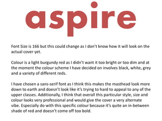
- 1. aspire Font Size is 166 but this could change as I don’t know how it will look on the actual cover yet. Colour is a light burgundy red as I didn’t want it too bright or too dim and at the moment the colour scheme I have decided on involves black, white, grey and a variety of different reds. I have chosen a sans-serif font as I think this makes the masthead look more down to earth and doesn’t look like it’s trying to hard to appeal to any of the upper classes. Additionally, I think that overall this particular style, size and colour looks very professional and would give the cover a very alternate vibe. Especially do with this specific colour because it’s quite an in-between shade of red and doesn’t come off too bold.
- 2. AspireFont Size is 166 however, this will probably change because I don’t know how any of the mastheads will look on the cover itself yet. Colour is a very bright red and I thought I would at least consider this colour in case I do decide that I want the main focus to be on the title itself. I have chosen a sans-serif font once again as I still think that this makes the masthead look more down to earth and again doesn’t look like it’s trying to hard to appeal to any of the upper classes. This particular colour brightens the page instantly and if this works with the type of image I choose to go on the front cover then I would definitely like something like this in order to make the whole page pop and stand out more.
- 3. ASPIRE Font Size is 115, although this is quite likely to change (probably to a bigger size) due to the fact I don’t know how much room or how it will sit on the front cover of the magazine. Colour is quite a light grey right now as I didn’t want the title to be too bright because I want the majority of the attention to be on the main cover image. I have serif font this time for a change as I think this makes the masthead look far more professional and makes the masthead seem a bit more upmarket and if this is the look I want to go for, as I’m undecided at the moment. Additionally, although this font is of a slightly different style than the first two fonts, I still think that general style, size and especially the colour looks very professional and would give the cover a very alternate vibe.
- 4. aspireFont Size is 138 but this could change as I don’t know how it will look on the actual cover yet. Colour is just plain black for the mean time as I didn’t want it too bright or too ‘in your face’. At the moment the colour scheme I have decided on involves black, white, grey and a variety of different reds but this could change and colours could be added or taken away. I have chosen a serif font again as I still think this makes the masthead look a lot neater and that there is actually effort and a long thought process behind finding the right style. Whilst I really like the fact this style is all in capitals, I think that the sans-serif font may be my less preferred style of font due to the fact that I don’t think its going to work with the type of specific audience I am trying to appeal to, this being fairly alternative instead of mainstream.
- 5. AspireFont Size is 149 but yet again this will probably change because I don’t know how any of the mastheads will look on the cover itself yet. Colour is quite a bright and vibrant red because wanted it to be considerably bright and bold. Currently, the colour scheme I have decided on involves black, white, grey and a variety of different reds and this particular title fits in with this. I have chosen a sans-serif font as some of the other fonts because I still think this makes the masthead look more down to earth and doesn’t look like it’s trying to hard to appeal to any of the upper classes. Additionally, I think that overall this particular style, size and colour looks very professional and would give the cover a very alternate vibe. Especially do with the spacing and structure of the font as it appears to be slightly leaning which I think makes it look like it has quite a fun nature.