
Recommended
More Related Content
What's hot
What's hot (20)
Viewers also liked
Viewers also liked (16)
Similar to Font analysis
Similar to Font analysis (20)
More from Levita123
More from Levita123 (13)
Recently uploaded
Recently uploaded (20)
Font analysis
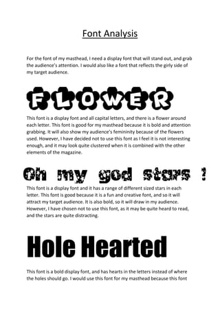
- 1. Font Analysis For the font of my masthead, I need a display font that will stand out, and grab the audience’s attention. I would also like a font that reflects the girly side of my target audience. This font is a display font and all capital letters, and there is a flower around each letter. This font is good for my masthead because it is bold and attention grabbing. It will also show my audience’s femininity because of the flowers used. However, I have decided not to use this font as I feel it is not interesting enough, and it may look quite clustered when it is combined with the other elements of the magazine. This font is a display font and it has a range of different sized stars in each letter. This font is good because it is a fun and creative font, and so it will attract my target audience. It is also bold, so it will draw in my audience. However, I have chosen not to use this font, as it may be quite heard to read, and the stars are quite distracting. Hole Hearted This font is a bold display font, and has hearts in the letters instead of where the holes should go. I would use this font for my masthead because this font
- 2. clearly represents the teenage nature of my audience, with the bold letters and the hearts. This is also typical of many pop magazines. It looks quite cheerful and fun, and my audience will be able to identify with the fun style of it. It is also a display type font, so it will grab my audience’s attention. It is also curvy, so shows the femininity of my audience. For my main sell-line, I would like a font that is attention grabbing, but one that does not overshadow the masthead. This font will still need to be fun and exciting, and should make the audience want to read the information. POPLAR STD I have decided to use this font for my main sell line because it is a display font, so it will stand out, however, it will not outshine my masthead. I think this font is mostly sharp and square, however the letter ‘r’ is curved. This suggests that my articles will be professional, with a hint of femininity and fun. I will also be using this font for my double page spread, to create a link and a sense of professionalism.