
Recommended
More Related Content
What's hot
What's hot (20)
Viewers also liked
Viewers also liked (20)
Similar to Digipack analysis 3
Similar to Digipack analysis 3 (20)
Recently uploaded
Recently uploaded (20)
Digipack analysis 3
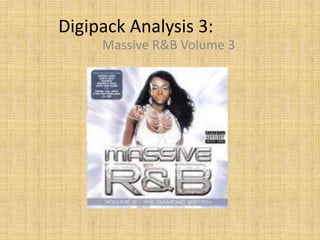
- 1. Digipack Analysis 3: Massive R&B Volume 3
- 2. Front The main image is not of a specific artist as this is a general R&B album but has a girl wearing a top with jewellery on top of it. This girl may simply represent the genre and what it is about. The clothes she wears and her pose can attract male attention (male gaze). A female presence in front of the album in general can also attract female attention too. The image is placed in the centre of the album meaning people are likely to see this image first. The front cover of this album uses colours of blue and white for the back ground. These two colours work well together as both colours are light. The title uses a big size font with a grey colour and black boarder line/stroke. The use of grey compliments the background colours as they are totally different colours so don’t clash with each other. The use of the stroke and big font makes it clear for the audience to read. A footer is used to show what edition and volume this album is as there a previous editions that have been released.
- 3. Back The back of the CD has the track list for all the songs on the album. Like most other albums this is conventional. At the bottom of the album there is a barcode and all the small print writing (consisting of all names of record labels, distribution companies and other organisations involved.) This is a typical convention in all albums. The fact there is no image on the back suggests that the track list is the more important for the audience. It may also be because this is a album consisting of mix of R&B songs and does not solely focus on one artist but many artists of the genre.. The background colour is a mix of purple and white (both colours used on the front). This shows that the album is clearly sticking to a colour theme. This background colour makes the black font stand out and clearer to read. The layout of this back cover is kept simple with the track list taking up the majority of space and the barcode/small print filling up the rest of the space at the bottom.
- 4. Spine The spine of the album is kept in a typically conventional way. The title ‘MASSIVE R&B’ is kept in the same font and style as the front cover. This is then followed by ‘VOLUME 2 – DIAMOND EDITION’ in a smaller print. The unique code is also placed on the right of the spine. The font colour is the same as the one used on the front cover to in with the theme. The background only uses white (one of the theme colours) but not purple. The white background allows the font to stand out even more.
- 5. Book The book also uses colours of blue and white for the back ground in a similar way to the front cover. The ‘MASSIVE R&B’ font is used in the same way as on the front cover but rotated 45 degrees to the left. It also offers the audience a chance to get real tones and ringtones which shows that it is further advertising their other products. Other than this there are no other features of the book. No image is used is there isn’t a specific artist the album is based on.
- 6. Inside book When you open up the book, it opens up like leaflet and not like a book. This is done with some other albums. Like the back cover, pictures are not used inside the book as the writing is manly what is concentrated on. The background colour is white which works well with the R&B genre as white can connote things such as happiness and purity which are common themes in the genre. The use of the white background allows the next to stand out more. What the book mainly consists of is a more detailed version of the track list. This is common within many albums. Only 2 small images are used which shows this album heavily relies on its written contents to inform and interest the audience rather than images.