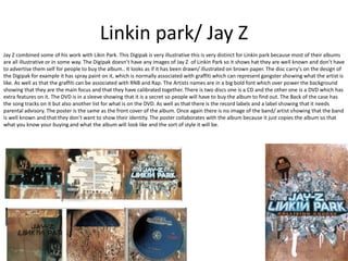
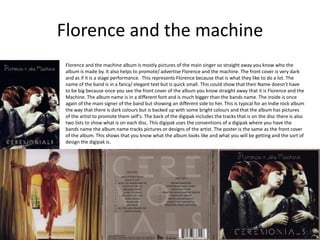
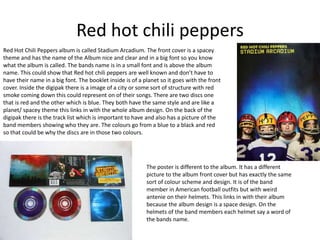
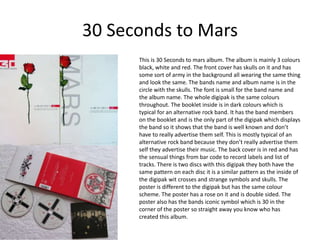
Digipak analysis
Linkin park/ Jay Z 
Jay Z combined some of his work with Likin Park. This Digipak is very illustrative this is very distinct for Linkin park because most of their albums 
are all illustrative or in some way. The Digipak doesn’t have any images of Jay Z of Linkin Park so it shows hat they are well known and don’t have 
to advertise them self for people to buy the album.. It looks as if it has been drawn/ illustrated on brown paper. The disc carry's on the design of 
the Digipak for example it has spray paint on it, which is normally associated with graffiti which can represent gangster showing what the artist is 
like. As well as that the graffiti can be associated with RNB and Rap. The Artists names are in a big bold font which over power the background 
showing that they are the main focus and that they have calibrated together. There is two discs one is a CD and the other one is a DVD which has 
extra features on it. The DVD is in a sleeve showing that it is a secret so people will have to buy the album to find out. The Back of the case has 
the song tracks on it but also another list for what is on the DVD. As well as that there is the record labels and a label showing that it needs 
parental advisory. The poster is the same as the front cover of the album. Once again there is no image of the band/ artist showing that the band 
is well known and that they don’t want to show their identity. The poster collaborates with the album because it just copies the album so that 
what you know your buying and what the album will look like and the sort of style it will be.
Linkin Park Reanimation 
Linkin parks album Reanimation links in with the art work. Once again 
they have used all illustration for their album but the robots represent 
each member of the band. The colour scheme is the same throughout the 
album. The art style has a pattern which looks like a honey comb. In the 
title ‘N’ Is reversed which is Likin parks style and is there image. There 
logo is ‘Lq’ where the p is reversed which is also their main image. When 
you see that logo you know its Linkin Park. At the back is The lists of the 
songs but at the side is who remixed them. The animation at the bottom 
right is from another album called Hybrid theory. The name of the album 
links in with the album because it is all remixes of the songs. The poster 
collaborates with the Digipak very well and uses one of the animation 
robot as the poster.
Florence and the machine 
Florence and the machine album is mostly pictures of the main singer so straight away you know who the 
album is made by. It also helps to promote/ advertise Florence and the machine. The front cover is very dark 
and as if it is a stage performance. This represents Florence because that is what they like to do a lot. The 
name of the band is in a fancy/ elegant text but is quick small. This could show that their Name doesn’t have 
to be big because once you see the front cover of the album you know straight away that it is Florence and the 
Machine. The album name is in a different font and is much bigger than the bands name. The inside is once 
again of the main signer of the band but showing an different side to her. This is typical for an Indie rock album 
the way that there is dark colours but is backed up with some bright colours and that the album has pictures 
of the artist to promote them self's. The back of the digipak includes the tracks that is on the disc there is also 
two lists to show what is on each disc. This digipak uses the conventions of a digipak where you have the 
bands name the album name tracks pictures or designs of the artist. The poster is the same as the front cover 
of the album. This shows that you know what the album looks like and what you will be getting and the sort of 
design the digipak is.
Red hot chili peppers 
Red Hot Chili Peppers album is called Stadium Arcadium. The front cover is a spacey 
theme and has the name of the Album nice and clear and in a big font so you know 
what the album is called. The bands name is in a small font and is above the album 
name. This could show that Red hot chili peppers are well known and don’t have to 
have their name in a big font. The booklet inside is of a planet so it goes with the front 
cover. Inside the digipak there is a image of a city or some sort of structure with red 
smoke coming down this could represent on of their songs. There are two discs one 
that is red and the other which is blue. They both have the same style and are like a 
planet/ spacey theme this links in with the whole album design. On the back of the 
digipak there is the track list which is important to have and also has a picture of the 
band members showing who they are. The colours go from a blue to a black and red 
so that could be why the discs are in those two colours. 
The poster is different to the album. It has a different 
picture to the album front cover but has exactly the same 
sort of colour scheme and design. It is of the band 
member in American football outfits but with weird 
antenie on their helmets. This links in with their album 
because the album design is a space design. On the 
helmets of the band members each helmet say a word of 
the bands name.
30 Seconds to Mars 
This is 30 Seconds to mars album. The album is mainly 3 colours 
black, white and red. The front cover has skulls on it and has 
some sort of army in the background all wearing the same thing 
and look the same. The bands name and album name is in the 
circle with the skulls. The font is small for the band name and 
the album name. The whole digipak is the same colours 
throughout. The booklet inside is in dark colours which is 
typical for an alternative rock band. It has the band members 
on the booklet and is the only part of the digipak which displays 
the band so it shows that the band is well known and don’t 
have to really advertise them self. This is mostly typical of an 
alternative rock band because they don’t really advertise them 
self they advertise their music. The back cover is in red and has 
the sensual things from bar code to record labels and list of 
tracks. There is two discs with this digipak they both have the 
same pattern on each disc it is a similar pattern as the inside of 
the digipak wit crosses and strange symbols and skulls. The 
poster is different to the digipak but has the same colour 
scheme. The poster has a rose on it and is double sided. The 
poster also has the bands iconic symbol which is 30 in the 
corner of the poster so straight away you know who has 
created this album.

Digipak analysis 1

  • 1.
  • 2.
    Linkin park/ JayZ Jay Z combined some of his work with Likin Park. This Digipak is very illustrative this is very distinct for Linkin park because most of their albums are all illustrative or in some way. The Digipak doesn’t have any images of Jay Z of Linkin Park so it shows hat they are well known and don’t have to advertise them self for people to buy the album.. It looks as if it has been drawn/ illustrated on brown paper. The disc carry's on the design of the Digipak for example it has spray paint on it, which is normally associated with graffiti which can represent gangster showing what the artist is like. As well as that the graffiti can be associated with RNB and Rap. The Artists names are in a big bold font which over power the background showing that they are the main focus and that they have calibrated together. There is two discs one is a CD and the other one is a DVD which has extra features on it. The DVD is in a sleeve showing that it is a secret so people will have to buy the album to find out. The Back of the case has the song tracks on it but also another list for what is on the DVD. As well as that there is the record labels and a label showing that it needs parental advisory. The poster is the same as the front cover of the album. Once again there is no image of the band/ artist showing that the band is well known and that they don’t want to show their identity. The poster collaborates with the album because it just copies the album so that what you know your buying and what the album will look like and the sort of style it will be.
  • 3.
    Linkin Park Reanimation Linkin parks album Reanimation links in with the art work. Once again they have used all illustration for their album but the robots represent each member of the band. The colour scheme is the same throughout the album. The art style has a pattern which looks like a honey comb. In the title ‘N’ Is reversed which is Likin parks style and is there image. There logo is ‘Lq’ where the p is reversed which is also their main image. When you see that logo you know its Linkin Park. At the back is The lists of the songs but at the side is who remixed them. The animation at the bottom right is from another album called Hybrid theory. The name of the album links in with the album because it is all remixes of the songs. The poster collaborates with the Digipak very well and uses one of the animation robot as the poster.
  • 4.
    Florence and themachine Florence and the machine album is mostly pictures of the main singer so straight away you know who the album is made by. It also helps to promote/ advertise Florence and the machine. The front cover is very dark and as if it is a stage performance. This represents Florence because that is what they like to do a lot. The name of the band is in a fancy/ elegant text but is quick small. This could show that their Name doesn’t have to be big because once you see the front cover of the album you know straight away that it is Florence and the Machine. The album name is in a different font and is much bigger than the bands name. The inside is once again of the main signer of the band but showing an different side to her. This is typical for an Indie rock album the way that there is dark colours but is backed up with some bright colours and that the album has pictures of the artist to promote them self's. The back of the digipak includes the tracks that is on the disc there is also two lists to show what is on each disc. This digipak uses the conventions of a digipak where you have the bands name the album name tracks pictures or designs of the artist. The poster is the same as the front cover of the album. This shows that you know what the album looks like and what you will be getting and the sort of design the digipak is.
  • 5.
    Red hot chilipeppers Red Hot Chili Peppers album is called Stadium Arcadium. The front cover is a spacey theme and has the name of the Album nice and clear and in a big font so you know what the album is called. The bands name is in a small font and is above the album name. This could show that Red hot chili peppers are well known and don’t have to have their name in a big font. The booklet inside is of a planet so it goes with the front cover. Inside the digipak there is a image of a city or some sort of structure with red smoke coming down this could represent on of their songs. There are two discs one that is red and the other which is blue. They both have the same style and are like a planet/ spacey theme this links in with the whole album design. On the back of the digipak there is the track list which is important to have and also has a picture of the band members showing who they are. The colours go from a blue to a black and red so that could be why the discs are in those two colours. The poster is different to the album. It has a different picture to the album front cover but has exactly the same sort of colour scheme and design. It is of the band member in American football outfits but with weird antenie on their helmets. This links in with their album because the album design is a space design. On the helmets of the band members each helmet say a word of the bands name.
  • 6.
    30 Seconds toMars This is 30 Seconds to mars album. The album is mainly 3 colours black, white and red. The front cover has skulls on it and has some sort of army in the background all wearing the same thing and look the same. The bands name and album name is in the circle with the skulls. The font is small for the band name and the album name. The whole digipak is the same colours throughout. The booklet inside is in dark colours which is typical for an alternative rock band. It has the band members on the booklet and is the only part of the digipak which displays the band so it shows that the band is well known and don’t have to really advertise them self. This is mostly typical of an alternative rock band because they don’t really advertise them self they advertise their music. The back cover is in red and has the sensual things from bar code to record labels and list of tracks. There is two discs with this digipak they both have the same pattern on each disc it is a similar pattern as the inside of the digipak wit crosses and strange symbols and skulls. The poster is different to the digipak but has the same colour scheme. The poster has a rose on it and is double sided. The poster also has the bands iconic symbol which is 30 in the corner of the poster so straight away you know who has created this album.