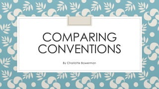
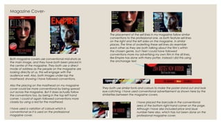
This document compares the author's movie teaser poster and magazine cover to professional examples, analyzing how well conventions were followed. For the teaser poster, conventions like centering the main image and including information below are followed, though a non-black background was used. Both posters include taglines and production company logos in conventional areas. For the magazine cover, conventions like using a central mid-shot image and masthead placement in the top left are followed, though the masthead design and sell lines could better match industry standards. Overall, the author's designs generally adhere to conventions but also take some non-conventional approaches.
Presentation on Patents and Trademarks given by the State Library of Arizona's Patent and Trademark Resource Center (PTRC) Librarian at the Scottsdale Public Library's Eureka Loft. Topics covered include: basic types of intellectual property, patent process, utility, design and plant patents, and search resources and tips. Trademark basics, descriptive, suggestive, arbitrary and fanciful trademarks, trademark search tips and tips for working with an attorney.
This is my first evaluation question answering: In what ways does your media product use, develop or challenge forms and conventions of real media products?
3. Teaser Poster-
The images on both are clearly presented in the
middle of the pages, making them the focus of
attention on both. This shows my poster is following the
correct conventions.
Both poster provide information underneath the main
image, showing I have followed conventions of form.
The professional teaser poster has chosen to give the
name of the film, whereas I have decided to keep
that information a secret, and have simply put coming
soon instead. Neither of the posters include a blocking
bill in this area of the poster because they are teasers-
shows again that I have followed the correct
conventions. They also both use bold and eye-
catching fonts, and capital letters to attract the
audience.
I have used less conventional lighting for my
poster as I felt it would look better with the main
image to include a white background. The
professional poster has stuck to the use of a more
conventional black background, following those
horror conventions. This shows where I have gone
against conventions used on a real poster.
Both posters have included a tagline in order to draw attention
from the audience, but they have been placed in different
conventional areas. From my research on this genre, I know it is
conventional to place a tagline both at the top, and the bottom
of the poster, rather then say on the side! This is giving us an
example off two posters using both conventional spaces. This
also shows that I have used a conventional font and colour and
mine resembles the professional poster.
Both posters include logos of the companies that produced them, in the
obvious conventional place, showing I have follows the correct
conventional layout.
4. Magazine Cover-
Both magazine covers use conventional mid-shots as
the main image, and they have both been placed in
the centre of the magazine. They both use a direct
mode of address as the people on the magazine are
looking directly at us, this will engage with the
audience well. Also, both images under-lap the
masthead; showing I have followed conventions.
Also the placing on the masthead on my magazine
cover could be more conventional by being spread
out across the magazine. But it does actually follow
the conventions too, by being in the top left hand
corner. I could of again followed conventions more
closely by using a red for the masthead.
I have used a variation of colours which is
conventional as it is used on the professional
magazine cover.
The placement of the sell lines in my magazine follow similar
conventions to the professional one, as both feature sell lines
on the right and the left sides on the magazine, in similar
places. The time of avderiting these sell lines do resemble
each other as they are both talking about the film’s within
the chosen genre, but I feel I could have followed
conventions more my advertising my own film in the sill lines,
like Empire has done with Harry potter, instead I did this using
the anchorage text.
They both use similar fonts and colours to make the poster stand out and look
eye-catching. I have used conventional advertisement as shown here by the
similarities between the magazine covers.
I have placed the barcode in the conventional
area of the bottom right-hand corner on the page.
Although I have also included price and issue
number here also, which has not been done on the
professional magazine cover.