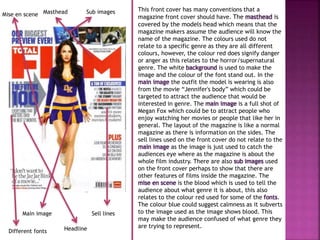
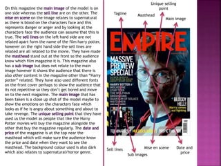
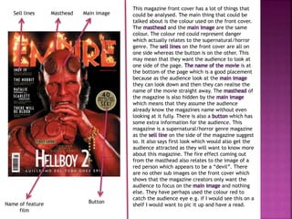
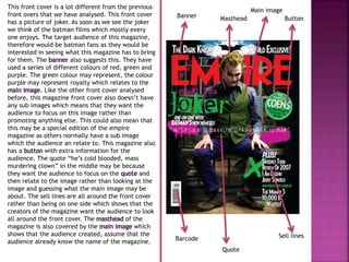
This document analyzes magazine front covers from different genres. It discusses several elements of magazine design including the masthead, images, colors, fonts, layout and how they are used to target audiences. Specific magazines examined include ones for horror/supernatural films, Harry Potter and Batman. Elements like the prominent placement of stars and quotes are aimed at attracting fans of the featured works. Colors like red are chosen to represent themes like danger relevant to the genre. The layouts are designed to guide the viewer's eyes across different elements of the cover.
This is my second magazine analysis of a general movie magazine, promoting comedy film, 'Anchorman 2'. I analysed this in order to find out more about conventions of general movie magazines, in order to help me when creating my own magazine.
2. This front cover has many conventions that a
magazine front cover should have. The masthead is
covered by the models head which means that the
magazine makers assume the audience will know the
name of the magazine. The colours used do not
relate to a specific genre as they are all different
colours, however, the colour red does signify danger
or anger as this relates to the horror/supernatural
genre. The white background is used to make the
image and the colour of the font stand out. In the
main image the outfit the model is wearing is also
from the movie “Jennifer's body” which could be
targeted to attract the audience that would be
interested in genre. The main image is a full shot of
Megan Fox which could be to attract people who
enjoy watching her movies or people that like her in
general. The layout of the magazine is like a normal
magazine as there is information on the sides. The
sell lines used on the front cover do not relate to the
main image as the image is just used to catch the
audiences eye where as the magazine is about the
whole film industry. There are also sub images used
on the front cover perhaps to show that there are
other features of films inside the magazine. The
mise en scene is the blood which is used to tell the
audience about what genre it is about, this also
relates to the colour red used for some of the fonts.
The colour blue could suggest calmness as it subverts
to the image used as the image shows blood. This
may make the audience confused of what genre they
are trying to represent.
Masthead
Sub images
Main image Sell lines
Headline
Mise en scene
Different fonts
3. On this magazine the main image of the model is on
one side whereas the sell line are on the other. The
mise en scene on the image relates to supernatural
as there is blood on the characters face and this
represents danger or anger and by looking at the
characters face the audience can assume that this is
true. The sell lines on the left hand side are not
related apart form the name of the film harry potter,
however on the right hand side the sell lines are
related are all related to the movie. They have made
the masthead stand out at the front so the audience
know which film magazine it is. This magazine also
has a sub image but does not relate to the main
image however it shows the audience that there is
also other content in the magazine other than “Harry
potter” related. They have also used different fonts
on the front cover perhaps to show the audience that
its not repetitive so they don’t get bored and move
on to the next magazine. The main image that has
been taken is a close up shot of the model maybe to
show the emotions on the characters face which
looks as if he is angry about something and about to
take revenge. The unique selling point that they have
used us the model as people that like the Harry
Potter movies will buy the magazine alongside the
other that buy the magazine regularly. The date and
price of the magazine is at the top near the
masthead which will make sure the audience know
the price and date when they want to see the
masthead. The background colour used is also dark
which also relates to supernatural/horror genre.
Tagline Masthead
Main image
Sell lines
Mise en scene
Sub images
Unique selling
point
Date and
price
4. This magazine front cover has a lot of things that
could be analysed. The main thing that could be
talked about is the colour used on the front cover.
The masthead and the main image are the same
colour. The colour red could represent danger
which actually relates to the supernatural/horror
genre. The sell lines on the front cover are all on
one side whereas the button is on the other. This
may mean that they want the audience to look at
one side of the page. The name of the movie is at
the bottom of the page which is a good placement
because as the audience look at the main image
they can look down and then they can realise the
name of the movie straight away. The masthead of
the magazine is also hidden by the main image
which means that they assume the audience
already know the magazines name without even
looking at it fully. There is also a button which has
some extra information for the audience. This
magazine is a supernatural/horror genre magazine
as the sell line on the side of the magazine suggest
so. It also says first look which would also get the
audience attracted as they will want to know more
about this magazine. The fire effect coming out
from the masthead also relates to the image of a
red person which appears to be a “devil”. There
are no other sub images on the front cover which
shows that the magazine creators only want the
audience to focus on the main image and nothing
else. They have perhaps used the colour red to
catch the audience eye e.g. if I would see this on a
shelf I would want to pic it up and have a read.
Sell lines Masthead Main image
Name of feature
film
Button
5. This front cover is a lot different from the previous
front overs that we have analysed. This front cover
has a picture of joker. As soon as we see the joker
we think of the batman films which mostly every
one enjoys. The target audience of this magazine,
therefore would be batman fans as they would be
interested in seeing what this magazine has to bring
for them. The banner also suggests this. They have
used a series of different colours of red, green and
purple. The green colour may represent, the colour
purple may represent royalty which relates to the
main image. Like the other front cover analysed
before, this magazine front cover also doesn’t have
any sub images which means that they want the
audience to focus on this image rather than
promoting anything else. This could also mean that
this may be a special edition of the empire
magazine as others normally have a sub image
which the audience an relate to. This magazine also
has a button with extra information for the
audience. The quote “he’s cold blooded, mass
murdering clown” in the middle may be because
they want the audience to focus on the quote and
then relate to the image rather than looking at the
image and guessing what the main image may be
about. The sell lines are all around the front cover
rather than being on one side which shows that the
creators of the magazine want the audience to look
all around the front cover. The masthead of the
magazine is also covered by the main image which
shows that the audience created, assume that the
audience already know the name of the magazine.
Main image
Banner Masthead Button
Sell lines
Quote
Barcode