This is a powerpoint on brand identity and my ideas for using brand identity, which has been created as part of my AS Media Coursework (foundation portfolio)
This is a powerpoint on brand identity and my ideas for using brand identity, which has been created as part of my AS Media Coursework (foundation portfolio)
You could be a professional graphic designer and still make mistakes. There is always the possibility of human error. On the other hand if you’re not a designer, the chances of making some common graphic design mistakes are even higher. Because you don’t know what you don’t know. That’s where this blog comes in. To make your job easier and help you create better designs, we have put together a list of common graphic design mistakes that you need to avoid.
Transforming Brand Perception and Boosting Profitabilityaaryangarg12
In today's digital era, the dynamics of brand perception, consumer behavior, and profitability have been profoundly reshaped by the synergy of branding, social media, and website design. This research paper investigates the transformative power of these elements in influencing how individuals perceive brands and products and how this transformation can be harnessed to drive sales and profitability for businesses.
Through an exploration of brand psychology and consumer behavior, this study sheds light on the intricate ways in which effective branding strategies, strategic social media engagement, and user-centric website design contribute to altering consumers' perceptions. We delve into the principles that underlie successful brand transformations, examining how visual identity, messaging, and storytelling can captivate and resonate with target audiences.
Methodologically, this research employs a comprehensive approach, combining qualitative and quantitative analyses. Real-world case studies illustrate the impact of branding, social media campaigns, and website redesigns on consumer perception, sales figures, and profitability. We assess the various metrics, including brand awareness, customer engagement, conversion rates, and revenue growth, to measure the effectiveness of these strategies.
The results underscore the pivotal role of cohesive branding, social media influence, and website usability in shaping positive brand perceptions, influencing consumer decisions, and ultimately bolstering sales and profitability. This paper provides actionable insights and strategic recommendations for businesses seeking to leverage branding, social media, and website design as potent tools to enhance their market position and financial success.
White wonder, Work developed by Eva TschoppMansi Shah
White Wonder by Eva Tschopp
A tale about our culture around the use of fertilizers and pesticides visiting small farms around Ahmedabad in Matar and Shilaj.
Between Filth and Fortune- Urban Cattle Foraging Realities by Devi S Nair, An...Mansi Shah
This study examines cattle rearing in urban and rural settings, focusing on milk production and consumption. By exploring a case in Ahmedabad, it highlights the challenges and processes in dairy farming across different environments, emphasising the need for sustainable practices and the essential role of milk in daily consumption.
Hello everyone! I am thrilled to present my latest portfolio on LinkedIn, marking the culmination of my architectural journey thus far. Over the span of five years, I've been fortunate to acquire a wealth of knowledge under the guidance of esteemed professors and industry mentors. From rigorous academic pursuits to practical engagements, each experience has contributed to my growth and refinement as an architecture student. This portfolio not only showcases my projects but also underscores my attention to detail and to innovative architecture as a profession.
Expert Accessory Dwelling Unit (ADU) Drafting ServicesResDraft
Whether you’re looking to create a guest house, a rental unit, or a private retreat, our experienced team will design a space that complements your existing home and maximizes your investment. We provide personalized, comprehensive expert accessory dwelling unit (ADU)drafting solutions tailored to your needs, ensuring a seamless process from concept to completion.
Коричневый и Кремовый Деликатный Органический Копирайтер Фрилансер Марке...
Colour Scheme for my magazine - Background
1. Colour Scheme for my magazine – Background
The Colour scheme for my magazine will be created on Adobe Photoshop, I intent on
keeping the colour of the background the same for my Front Cover and Contents Page
because those components are used in every issue of a magazine and they need to convey
brand identity. I will have the same colour for my Double page spread but with a little
variation in the gradient.
I will not be using a single colour for the background for; instead I will be using a colour
gradient. The gradient will include three different variants of the same colour (light variant,
normal variant and dark variant), which will give a crisp and slightly ‘shadowed’ look to my
front cover. I will be using three different variants of the colour Gold in the gradients. I have
chosen gold because I feel it connotes the rap genre very well; the use of gold emphasises
on the ‘wealthy’ aspects of rappers and could be a representation of the props they wear
and the money they get, hence why I have chosen gold for my colour gradient.
These are the three different variants of gold that I am using in my front cover and my
contents page:
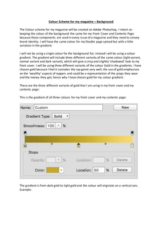
This is the gradient of all three colours for my front cover and my contents page:
The gradient is from dark gold to light gold and the colour will originate on a vertical axis.
Example:
2. This is the gradient of all three colours for my double-page spread:
3. The difference is that the gradient goes from light gold to dark gold and the colour will
originate from a horizontal axis. Example:
These are the individual colours of my magazine:
Colour #1 – Dark Gold (78681c – Adobe Photoshop code)
5. I will not change the colour of my gradient for any of my magazine components because I
want to establish continuity and brand identity throughout my magazine and keeping a
similar colour gradient would ensure that there is continuity and brand identity.
Note: These colours will be used in my first draft of all my three components of the
magazine. It can be subjected to change in the second draft and the final draft.