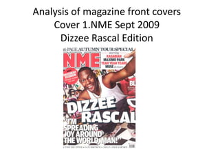
2. THE FRONT COVER ANALYSIS THE HEADER…
MASTHEAD
USE OF A FLASH- THE SELL
(offering something extra LINES/COVER
to T.A) LINES
THE MAIN IMAGE ….
BACKGROUND
THE MAIN COVER
USE OF A PULL LINE
QUOTE
Barcode-
RULE OF date/issue/price
THIRDS/THE
LEFT THIRD
THE FOOTER
3. The purpose of each feature on this magazine
• The mast head – in this particular magazine the mast head is “NME” these are initials of the longer brand name “new musical express.”
As well as this it is a play on words and sounds acoustically similar to the word “enemy” this helps us understand who the target
audience is as the word enemy makes you think of rebellious individuals, usually around the young adult ages. The connotations of the
colour scheme and font used in this issue (red and bold) give the sense of danger backing up the previous comment on target audience.
• Use of flash – on this magazine front cover they have used a flash to show the news which can be found inside. It gives the impression
that the audience have been waiting to find out this information and is therefore made appealing to the consumer by using contrasting
colours (white writing on a red background) as it is a sell point.
• Main image – the main image of this magazine is one of a well recognised rap artist “Dizzee rascal” this image is made appealing to the
audience by using a canted technique to making it go against regularities supporting the “rebel” like portrayal. The image is placed in
front of the mast head showing that it is of more importance than the title itself.
• The main cover line – this is the line on the cover which shows the reader what is actually in the magazine in this issue NME have used
the name if the artist himself which helps those who are unfamiliar with his appearance but not his music identify him.
• Background – The background of this magazine is part of the main image itself this gives the impression that it is their to define the
image of the artist and his personality itself. As it is graffiti it supports the rap/ gangster image.
• Pull quote – this looks similar to a sell line however it is placed in quotation marks to show that it is something that someone of
significance has said themselves. In this particular image it is something that dizzee rascal has said himself “im spreading joy around the
world, man” this informal language shows that it is not for the older audiences. However it does make it seem as though the image is
talking to you directly as the reader because of the open mouth in the image.
• The footer – the footer uses a rule of three which means that they use 3 points to talk to the audience, this is used as three is a
memorable amount of information so if someone was talking to their friends about it these are the points you would be making.. These
key points are main things that will be in the magazine and the diversity in band names shown show us that it is an indie magazine.
• The barcode – every magazine has a barcode and on here there will often be the price and the date of the magazine this is so that the
reader can know the issue and means that they can sell the product.
4. TARGET AUDIENCE OF THIS MAGAZINE
-The target audience
for this magazine are
mostly males around
METHODS USED TO
the age of 23 this is ATTRACT THIS TARGET
shown through the AUDIENCE ARE:
price (£2.30) not too
-Bold headings
dear one of a students
budget. -Dominating images
-The audience that -main sell lines
reads this magazine
are most likely the -Headers and footers
most up to date in the
music world and are -Colour schemes unique
therefore more to the audience
influential in their
social circle. They are
-Cheap prices
often obsessed with
music this is obvious
as the magazine is of
music orientation.
5. NME background of the music magazine
• This music publication has been available and on sale in the united kingdom since
march 1952. initially starting of a music newspaper its initial target age range was
more mature around the early 30’s. Its detailed reviews and articles of music
bands and artists helped it to become the best-selling music newspaper in Britain
enabling them to turn it into a newspaper in the 1980’s. writers such as “tony
parsons” and “Julie burchill” gave the magazine its association with punk rock that
it still has today. Today the music magazine also has an online publication making it
available to people all over the world.
7. NME MASTHEAD SAME
COLOUR CODE AS FRONT Contents page NME (SEPT 2009) ANALYSIS
BANNER AT TOP
DATE
Main image
SUB HEADING BLOCKED
OUT INTO BLACK SUB
SECTIONS
Bands are listed in red
with page number in
black BRIEF HEADING +SUMMARY
OF CONTENT WITH PAGE
NUMBER IN RED
Image is edited so it
looks like a photograph PREVIOUS/FUTURE
EDITIONS OF NME
ARE SHOWN WITH
DETAILS OF
WEBSITE/PHONE
NUMBER ETC
Editors introduction to contents
of magazine
8. ANALYSIS OF CONTENTS PAGE
(Title/date of magazine analysed)
- NME, one of Britain's first music magazines and still one of the most popular. This publication has had a lot of experience in
attracted readers and obviously keeping them therefore they must be doing something right. This contents page is very busy
with lots of information on however this is very well organized with colour coordination. On the left of the page we see a
subheading “band index”. This tells the reader where they can find the latest news on certain bands and makes it easier for
them by putting the band names in red and the page numbers in black. All of which is placed onto a white background
making it stand out on the page.
- In the center of the page they have included the editors introduction to the magazine. This is the easiest and quickest way to
sum up the key selling points of what's included. The way that the editor has written, in an informal chatty way, makes the
audience feels as though they are actually being spoken to and therefore makes them feel comfortable and in a way build a
relationship with that magazine.
- The main image on the contents page is accompanying the short introduction. The image they have chosen is a tour bus and
a “punk chick” standing next to it this straight away gives an image of the sort of audience they are appealing to.
- To the right of the page the editor has included a section on previous and future magazines this along with a saving
incentive is all to encourage the reader to subscribe. Every magazine includes one of these however where it is positioned
throughout it varies with each one. This includes all the information necessary for the reader to subscribe such as phone
number and site address.
- The title and the date are carefully placed at the top of the page. This is so it is easy for the reader to find this page as it is
essential to any magazine. The title uses the same mast head as the front cover to keep with the style of the magazine.
- On the right of the contents page we find subheadings which include key headings that the editor feels will interest the
reader. These are things such as “radar and news” to make the subheadings stand out the writing is contrasting the
background to catch the readers eye.
9. ANALYSIS OF LAYOUT/DESIGN FEATURES OF CONTENTS PAGE
MASTHEAD AND WORD CONTENTS –
BOLD AT TOP WITH DATE/ISSUE
NUMBER
10. ANALYSIS OF ARTICLES- DOUBLE PAGE SPREAD 1 NME
Caption saying Dizzee
Mise en scene
created by graffiti
wall background.... By-line (credit for autho
and photographer
Main heading/headline
Main Image
Sub heading
4 columns –notice text w
around the image of the r
Page number
NME title Copy (text) begins with A large letter Y
Date using Drops Cap Second image used
11. Analysis of double page spread
The double page spread always includes a main article which
has an appealing factor to the target audience. This specific
article is titled “from tags to riches” this is a play on words
with a common saying, from rags to riches which is often said
when someone has gone from having nothing to having a lot.
In this case Dizee rascal has went from roaming the streets
tagging walls and bridges to being famous and rich. The title
is in bold writing with a tilted letter to show that it’s coincides
with the attitude of the artist it is written about, a rebellious
street youth. This article is of interest to the reader as it
emphasises the fact that at one point he was just like them.
The background for the page with writing on is primarily white
as it helps the text to stand out whilst still keeping it
aesthetically pleasing to the reader . This double page
spread is about dizee rascal a backstreet youth who has
grown into a world wide known music artist. The page has
been clearly advertised on the front cover to show its
importance and to emphasize it’s a key feature to this
particular magazine. the one page is just an image of the
artist graffiti on a wall with a look as though he’s about to get
caught. This image helps identify to the reader what the
article is about. The editor has clearly used mise-en-scene
to develop the image of the artist, helped with his outfit.