2. 1. In what ways does your media product use, develop or challenge forms and
conventions of real media products?
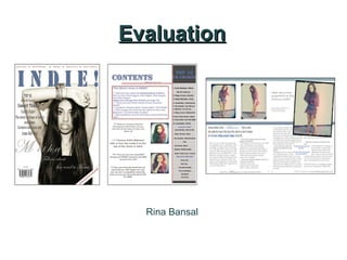
Front Cover
Headlines
Masthead
Cover lines
Main cover line
Barcode, issue date & price
Main Image which
anchors the main
cover line. Also the
model stares directly
into the camera
My front cover has included many conventions of a real music magazine cover. I have included a price tag, barcode, date and
issue number, which are essential to a magazine cover. As well as this, I have used the ‘magic C’ rule for the layout of the
magazine cover. I have included a flash in the corner of the magazine, which shows more advertisement. There is only one
image used here, which draws more attention to the mainly focused article. The medium close-up shot of the model also is
effective as it does not overcrowd the cover. Also, the model is staring directly into the camera to grab the readers attention. I
have also used the ‘drop-shadow’ effect and used ‘Edwardian Script ITC’, for the main cover line to make it stand out more
from the page. The title of the magazine also overlaps the main image.
3. Contents Page Contents title
Issue date
Cover line title
Page reference
in the image
Images of artists’
Page references with
some information on the
page
Extra information about
events and more about
the articles- some page
references
My contents page also contains conventions of a real contents cover. I have included the issue date underneath the main title,
as well as using the same font style for the contents title, to show continuity. I have included a ‘top 10 UK charts’ to portray
further that this is a music magazine, but also to inform the reader of the ‘latest music hits’ that are popular- I have also
categorised them. I have used only two images, which I have edited, to show that the main focused article is about the artist
within the image. To anchor this idea, I have made the page reference with information on the article, in a larger font size
compared to the others. I have included an extra section, which is bordered to make it stand out from the page, where is gives
more insight on what else is in the magazine. It includes a competition to interest the readers. The colour scheme of the page
also show continuity to the front cover, however I have added more to make it slightly different so it would not appear boring.
4. Double-Page Spread
Magazine logo
Main focused image
overlaps the content
Page numbers
Main title of the article
columns
Grab quote
Extra advertisement
Tells us who wrote the article and The website of the magazine
photographed the images
My double-page spread is an interview with an artist. It is written in columns and includes a ‘grab quote’ of what the artist has
said. The ‘grab quote’ wraps around the text and is highlighted as it is in a different font colour to make it stand out. The artists
name is in a different font style and colour to make it stand out more, as well as ‘best selling acoustic single’ to show that they
are the important part of the article title. The main image also overlaps the decoration of the 3 lines, and the text wraps around
the bottom of the image, which makes the image more or less stand out. This image is purposely focused on as the artist is
looking directly at the camera smiling, which would instantly build a relationship with the reader and gives off a positive
atmosphere. Each of the 3 images have a different border, however the same effect (to show continuity), to make the page
more outstanding from the others. The page numbers are also included. The colour scheme of blue, white and grey is
consistent with the front colour and looks more professional.
5. Planning
Before I created the music magazine, I had planned out my designs and information by
carefully sketching some drafts of the production along with annotations of the colour schemes
and font size, style and colour.
Throughout the development of the magazine however, some of the designs had changed as
these drafts were only a rough outline of the magazine. For example, the draft for the contents
and double page spread, the placement of images and the layout of the page have been
changed slightly.
As well as this, the article for the double-page spread had also been planned out on a
Microsoft Word document. This was to ensure that it was suitable for the content. We then
imported the article from the word document into the ‘InDesign’ document (which was the
software I used to create the double page spread).
The Drafts:
6. 2. How does your media product represent particular social groups?
My magazine represented a wide range of age and culture. It was particularly
aimed towards Asian females along with many other ethnicities. I have chosen a
female target audience as the results in my questionnaire showed that more
females read more music magazines than males. However some of the articles
included in the contents page could also be aimed towards males who are
interested in the genre of the magazine: “Find out more about the Reading Music
Festival…”
My magazine was mainly aimed towards teenagers and adults which range
between the ages of 17-24 years.
I have represented this by included a range of music artists that teenagers and
young adults are now listening to- my questionnaire had revealed that this
particular age range listen to a variety of Indie Rock, RnB and Pop, therefore have
chosen the genre of my magazine to be a mix of Indie Rock and RnB and have
included artists such as Rihanna, Lana Del Rey, Arctic Monkeys and David Guetta.
7. I have included a variety of artists’
from the two chosen genres
Represents the target audience
The style represents the genres of
the magazine
8. A variety of topics which
can be aimed towards
both male and female.
Have given a range of music hits
which are popular in both genres
Indie Rock and RnB.
Given contrasting images as the
new focused artist is different
from the model on the front
cover.
9. Contrasting images
from the ones on the
contents page- now
smiling, therefore
portraying a positive
connection from the
celebrity to the
audience.
Article conveys how she made it to
the charts- portrays a positive role
model figure for the audience.
10. Although my target audience is predominantly
focused around Asian females, which are
interested in Indie Rock and RnB, there is a large
variety of Black and White artists/bands which
support the genres of the magazine.
11. 3. What kind of media institution might distribute your media product and why?
IPC might be interested to distribute my media product as they particularly focus on a target
female audience. The distribute many magazines which are especially for women such as: Now;
Woman’s Own and Marie Claire (which are only a few of the magazines in which IPC institution
produces).
IPC also produce magazines such as NME, which is an extremely popular music magazine in the
UK since 1952. This particular magazine focuses on a variety of music genres, mainly Indie Rock,
Rock and RnB (two of which is the main genres of my music magazine).
IPC attract the right audience for a music magazine, and by introducing a fresh music magazine
which involves a mix of Indie Rock and RnB and is focused on an Asian ethnicity as well as Black
and White, there could be a possibility of widening the audience as there would be a different
genre, style and theme of a new music magazine. Therefore IPC would be perfect to distribute my
music magazine.
12. Bauer would be my main rival as they also distribute their music magazines (such
as Kerrang!; Q and Mojo) and have a range of music genres, some of which are
similar to my music magazines genres. However, I think that Bauer’s marketing and
distribution of music magazines are not as focused on a female audience, but
specialize more on both male and female audiences.