
Recommended
More Related Content
What's hot
What's hot (14)
Viewers also liked
Similar to Creating an eye-catching magazine front cover
Similar to Creating an eye-catching magazine front cover (20)
More from asmediag12
More from asmediag12 (20)
Creating an eye-catching magazine front cover
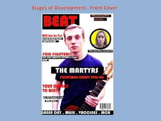
- 2. The first think I did in the production of my front cover was create my masthead. To begin, I added a black rectangle using the rectangle tool so that the colour of the text would contrast it’s background so that it would stand out and catch the reader’s attention. I then added the text and added effects to it such as stroke, inner glow, outer glow and drop shadow. This meant that I was able to make the masthead stand out even more.
- 3. Next, I edited an image separately and added it to the front cover. Originally, the image was very dark so I adjusted it to make the image brighter and look more professional. Then I moved the layer over the masthead so that the image covered a small fraction of the masthead. This was to make the magazine look more professional.
- 4. Then, I added my main cover line. I placed it in the centre of the page as this is where main cover lines are conventionally positioned on magazines. I stuck to the house style colours of red, black and white as the colours contrast and make the text stand out more.
- 5. I then added the other cover lines to the front cover. I made the text similar to the main cover line to keep the font the same and create a familiar style. I added the black rectangles in order to stand out but made the cover lines much smaller than the main one as to not distract focus from the main selling point of the magazine.
- 6. Next. I added a date, issue number and a footer. Again keeping to the house style text and colours. I did this to make the magazine look more professional and realistic. I also added an image of a barcode for the same reason as this would mean that the magazine could be sold.
- 7. Then I added another image to the front cover in order to make it look more interesting and attract more attention. Also it is conventional that there are more images than just the one main image on front covers.
- 8. Finally, I edited the new image and placed it inside a yellow circle and added another cover line. I did this to make the image stand out more and attract attention. Also, I used the colour yellow for the circle as it is different and contrasts the house style colours. This means that it would attract the audience attention quickly.