
Recommended
More Related Content
What's hot
What's hot (20)
Similar to Drake's Style Revealed in VIBE Magazine Cover
Similar to Drake's Style Revealed in VIBE Magazine Cover (20)
Recently uploaded
Recently uploaded (20)
Drake's Style Revealed in VIBE Magazine Cover
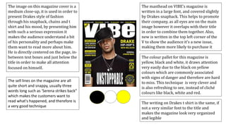
- 1. The image on this magazine cover is a medium close-up, it is used in order to present Drakes style of fashion through his snapback, chains and t shirt and his mood, by presenting him with such a serious expression it makes the audience understand a bit of his personality and perhaps make them want to read more about him. He is directly centered on the page, in- between text boxes and just below the title in order to make all attention focused on himself. The writing on Drakes t shirt is the same, if not a very similar font to the title and makes the magazine look very organized and legible The colour pallet for this magazine is yellow, black and white, it draws attention very easily due to the black on yellow colours which are commonly associated with signs of danger and therefore are hard to miss. This technique is very clever and is also refreshing to see, instead of cliché colours like black, white and red. The masthead on VIBE’s magazine is written in a large font, and covered slightly by Drakes snapback. This helps to promote their company, as all eyes are on the main image however it overlaps with their title in order to combine them together. Also, new is written in the top left corner of the V to show the audience it’s a new issue, making them more likely to purchase it The sell lines on the magazine are all quite short and snappy, usually three words long such as ‘Serena strikes back” which makes the customers want to read what's happened, and therefore is a very good technique
- 2. The image on this magazine is a medium close up of famous music producer ‘Metro Boomin’. It is used to show his personality through his friendly smile and the type of clothes that he wears, which help to determine that the magazine is about American hip hop (Because supreme clothing is largely associated with the genre) Also, the fact it’s a medium close up means that the main focus is on his face and the audience can become attracted to the magazine because of this. The colour pallet for this magazine is unusual and stands out from most mainstream magazines. This helps for the magazine to stand out on the shelves from all the rest, and works very well The masthead for this magazine is quite a large sized font, however quite slim sized lettering. It covers up around a fifth of the page and works well to show the audience who was responsible for the magazine without being over the top. Also, the fact that the magazine name is being overlapped by Metro Boomins head helps to keep the audience attention specifically on the expression of his face and the name of the magazine, which is what the company will most likely want to achieve. The target audience for this magazine cover is definitely for those interested in American hip hop as the image on the cover is of someone who produces American hip hop songs. This magazine does not have any sell lines apart from the name of the music producer on the front. The font is very similar to the title if not the same and makes the magazine very eye catching. Fader are known for plain magazines, and because it reflects their reputation, it works well for them, however if a not so well known magazine was to do this, I do not think it would work as they would need sell lines in order to make sales.
- 3. The masthead on this magazine from ’XXL’ is very different to the rest. This is because it only covers half the width of the page, whereas usually we would see the whole width almost being covered. This works well as its unordinary and stands out on the shelf. Also, the ’L’ is largely covered up by A$ap Rocky's head and works effectively to direct the audiences attention to the image, however I feel that this would not work on my magazine as its not a well known magazine, and my audience would not know what the remaining letter of my magazine name was. The tag lines are very short and effective in the way that they simply state names, creating a mystery for the audience which might make them want to open up and read what the publisher has to say about the artist. The image on this magazine is very eye catching for many reasons. The fact the artist is staring down his nose into the camera lens forces the audience to make eye contact with him, and look into his mysterious eyes, and the use of a medium close up helps to make this happen to its best ability. Also, the way he has his mouth open showing his grills shows an arrogant attitude which may make the audience want to see what XXL have written about him, or what he himself has to say. XXL are well known for using the same colour pallet on most of their magazines, especially with the use of red. This makes it easy for audiences to recognize an XXL magazine and perhaps start to become loyal to their branding. The colour pallet works very well, as it is very legible with black white and red, the red especially is very eye catching The target audience for this magazine is certainly american hip hop, as A$ap rocky is one of the most famous rappers in america at the moment. Also, I can tell this by the fact that grills are largely associated with the industry