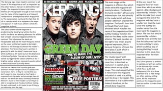
1. The Kerrang logo (mast head) is common to all
issues of the magazine so isn’t as important as
the other features hence it is behind the main
image. The magazine’s layout and colour
themes are recognisable enough to not need to
see the name of the magazine as a frequent
reader would already know which magazine it
is. The exclamation mark and the fact that it’s
all in capitals which is to represent the anger
and passion in rock music which is what the
magazine is about.
The colour theme of the magazine is
predominantly black/ grey/ white, like the
outfits the band are wearing whereas the all the
text is bright colours (red/green/white) to
contrast. This is because the band are
recognisable and are the main thing you notice
on the cover so the text needs to be bright
colours to still manage to attract the reader’s
attention. The ‘Green Day’ part is written in
green to fit with the band’s name and has a
white outline so it’ll stand out on the blackness
of the band’s shirts. The red on the text also
stands out against the colour scheme as it’s a
brighter colour and can represent passion which
is what rock music is usually about.
This box has 3 words that’d quickly grab your
attention written in bright colours in capitals with
exclamation marks as they’re 3 words that you
don’t expect to hear shouted so they’ll grab a
response from the reader and encourage them to
read on. The words are also a summary of Marilyn
Manson’s music so if the reader is a fan they’ll be
able to recognise what it’s about without reading
the part underneath so it’d easier to see if they’re
just skimming over the page
The main image on the
magazine is of Green Day which
shows what the magazine will
mainly be about. The faces of
the band member’s all have very
widened eyes that look directly
at the reader which will draw
people’s attention towards this
magazine. The band’s faces look
as though they’ve all been
whitened which matches the
name of the magazine and their
outfits/ makeup matches the
black so they keep to the colour
scheme. The band member on
the right’s face shows a quite
angered expression, this is
because the genre of music the
band plays is punk which is
mostly about anger.
The ‘studio report’ with
Paramore, beneath the main
cover line, is described as
‘exclusive’ in capitals and a
white colour on top of the
image. This emphasises that this
is exclusive to this magazine
only which is used as a selling
point to draw in the reader. This
information is in a bubble which
makes it stand out on the
already busy magazine.
At the very top of the
magazine there’s 4 main
cover lines which are white
against a black background
separated by red stars. This
will be to make them stand
out against the rest of the
magazine and they’re in a
smaller font than the main
cover line as they are
smaller bands than the
main band the magazine is
about. The fact that they’re
separated by red stars
could be to do with the fact
that the colour red can link
to rock and they’re stars,
which is subtly a way of
stating that they’re rock
stars but in this issue, less
important than the main
cover line.
The ‘5 free posters’ is written
in capitals and with an outline
in the bottom right corner
which has a quite dark
background, this is to draw
attention to it as free things
are often a strong selling
point. All the important
points on the magazine cover
have an outline to make them
stand out.
2. Similar to the last cover, the logo on
this cover is behind the image showing
it’s less important but recognisable.
The colour scheme on this cover
always keeps to the white and red
colour scheme that is the signature
colours of Q magazine. The red/ black/
gold coloured text against the duller
text makes the text grab the reader’s
eye as it has to compete with the
picture.
Sticking to the theme of attracting
younger viewers, one of the cover
lines mentions Nicki Minaj, who would
not appeal to the target audience, this
could be a way of them branching out
to a younger audience.
The bubble, in the top right corner
has been put there to make it stand
out on the page by putting it in a fairly
blank section of the page. The text in
the bubble has ‘FREE!’ in black letters
so they stand out against the white
text. The word free would be a strong
selling point as people won’t have to
spend money on it if they’ve bought
the magazine which is a strong selling
point. The fact that it is ‘EXCLUSIVE’
increases it’s desirability to foo
fighters fans.
The main image on the
magazine suits the general age
of the target audience, as the
foo fighters started making
music in 1994, but the listeners
of the foo fighters are all ages,
by using Dave Grohl as the main
image they’re attracting a wider
age range of readers. The actual
image is Dave Grohl with fire
and the rest of his band coming
from his mouth, the fire shows
power and rock, the band is in
his mouth which could express
his former success in the band
Nirvana so he is more wellknown.
The words ‘NICKI MINAJ’ are
smaller than most other words
on the magazine as she is not
the type of music most people
that read Q magazine would
listen to so it’s less relevant to
the magazine however it’s
larger than some other words
on the page as Nicki Minaj fans
would not expect to see this on
this particular magazine so it
would draw more attention to
the fact that she is featured in
this
3. The colour scheme of the magazine
is blue white and red which is the
same colours of the union jack
which relates to the British theme
of the magazine
The points not relevant to the
theme of the magazine are in
yellow to make them stand out as
other points for those more
interested in the other things
featured in the magazine
The bubble advertises an offer of a
discount in HMV which is a selling
point for the magazine and will
attract customers
The main image on
the magazine is a
selection of British
musicians, this lets
the reader know
that this issue of
the magazine will
not just be about
one musician like
most issues of the
magazine, as it will
be about the
‘greatest British
albums ever’
The 0’s on the ‘100
greatest British
albums ever’ are
royal air force
roundels,
commonly
associated with
mods, which is a
style that
originated in the
UK and a lot of
iconic music came
from this style