2. Before taking my picture, I took a few pictures of my background to find the best angle
so my magazine would look professional and would follow the codes of a magazine.
My criteria was to be able to have the “awards evening” words in the background to
explain why Emily had an award in her hand. I also wanted to use the pictures on the
background to allow a little lead room. In the end I chose angle 4 as I found it was the
best angle to use because I found it was the easiest way to fit everything in without the
shot looking messy. However, I did zoom in when taking the picture and cut a bit of the
room out as it looked a bit untidy. I liked angle 1 as I could fit in the main image
without cutting anything off and still had everything on the board in the shot. I didn’t
like the angle of picture 2 because it looked to big and bulky also the main image would
have covered it up. Angle 4 was to wide and was an establishing shot and that wouldn’t
have followed the conventions of a school based magazine.
1 3 42
3. My plan and how it changed
This was my original plan which I drew out as you can see
from my final product, I have changed the plan almost
completely . This is because my original plan broke the codes
and conventions of a normal school based magazine. Starting
with the header of the magazine, most school based magazines
have the title straight at the top clear and not on a slant. I
decided not t have the header multi-coloured because it looked
childish and unprofessional. Also the different coloured shapes
didn’t look great on photo shop so I just wrote over the main
image what was included.
I kept the slogan for the school on the bottom of the magazine
as I researched into other school based magazines and most
had a phrase to encourage the schools behaviour and
encouragement. However I thought that having one person
in the shot made it look empty, so I added a teacher into the
Shot to show encouragement from teachers. I asked them to both smile so it looked like
they were both proud and happy to be there. I couldn’t take the picture in front of a
student of the week display as I didn’t have time to make one. Instead I used a display
in school from an awards evening which had the same effect as what I planned as it
shows the students success instead of holding a student of the week picture, she held an
award which looked more appealing and impressive.
4. Pictures that I didn’t use
This picture was zoomed out too much. Meaning when I
came to cropping the picture, it began to look stretched and
out of proportion. Other problems included Emily looking
into the camera which gave the soot a sense of being un
realistic. Also the teacher is stood in an awkward position
and the handshake was blurry. There were shadows which
shows there wasn’t natural light used in the shoot. This
again takes away the realism of the photograph. Also you
cant see Mr Ali’s face because he turned away from the
camera too much, meaning the shot lost expression and
feeling. Lastly, there is a reflection on the picture at the top
as the lights were placed in the wrong place this is also the
reason for he shadows at the bottom.
5. Pictures I didn’t use
I didn’t like this picture as again Mr Ali’s face
wasn’t in sight as much as I wanted it to be he was
standing too near to the camera. In some ways, this
could be a good thing as it could give the
connotation that the student looks up to him and he
is in charge. The handshake is good as it shows he
is proud of her and is congratulating her. I did like
the fact that both of them had lanyards on as a form
of identity to make them look normal and like a
part of the school. The teacher had his hand in his
hip which I didn’t like as it didn’t suit his role as a
teacher and made the shot look a bit awkward. Also
after cropping it to suit the frame, I lost the effect of
having the words “awards evening” in the
background. Lastly, there is too much space in
between the teacher and the student making it look
awkward.
6. Pictures I didn’t use
Firstly, I didn’t like this picture as I forgot the
brief which said “medium shot” but I took all my
pictures as a long shot. This meant I had to crop
allot out of my chosen picture. This picture had a
very tilted angle which leaves the reader of the
magazine feeling uncomfortable. Also there was a
picture of Mr Ali at awards evening wearing a
different suit. This shows that the picture I took
was clearly not taken at awards evening. I do like
the facial expressions of both the teach and the
student. However, I don’t like the way the teacher
Is standing as it too informal looks too relaxed for
the character of a teacher for this shoot.
7. The picture I used
I love camera angle in this photo because it is nice and
simple and focuses on their expressions. The problem I
had was that is s a long shot and the brief was medium
shot. However I think it looks good to say it is a long
shot as it has all the elements that I wanted from the
writing in the background the photos of other
successful students to give the connotation that it is a
high achieving school. Also both characters have
lanyards to show their form of identity. This makes the
shoot look more realistic. I like how the teacher is
leaning into the student to get to the same level as her.
Drawing in near shows he is comfortable and proud.
They both look happy giving the connotation that they
are both proud of Emily's achievements.
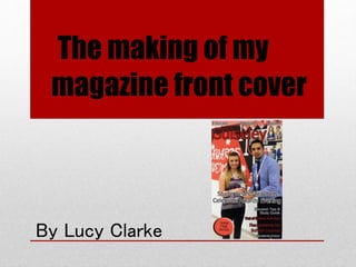
8. The end product …
This is my final product that I made. My school
based magazine consists of a main image, a masthead
in the centre top of the page to follow the codes and
conventions of a normal magazine, a header (the
slogan at the top) to promote the schools expectations
and standards, a main cover line (the biggest
sentence to introduce the main article) colour theme
which is red white and black, as it fits into the
background. The background board is black white
and red. If I had of used blue for the cover lines it
will not have matched and could of clashed with the
outfits worn in the shot. Most magazines have a main
colour theme. So mine follows some codes and
conventions of a school based magazine. The outfits
they are wearing clashes with the colour theme which
in some cases are good as it make the characters
stand out.