
Recommended
More Related Content
What's hot
What's hot (20)
Similar to Media task 3d
Similar to Media task 3d (20)
Recently uploaded
Recently uploaded (20)
Media task 3d
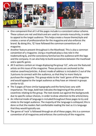
- 1. One componentthat all 3 of the pages include is a consistent colour scheme. These colours are red and black and are used to connote masculinity,in order to appeal to the target audience. This helps create a house theme/style and creates a sense of professionalism for the magazineand also enforces the brand. By doing this, ‘Q’ have followed the commonconventions of a magazine. Another feature present throughout is the Masthead. This is also a common convention of a magazine. Using a masthead playsa key role in the trademarkingQ, and the consistency familiarises the audience with the logo and the company.It can also help to build associations between the masthead and a specific genre. All 3 sections containan image displayingthe group ‘U2’, who are the featured artists on this issue of the magazine. These pictures are anchored to the relative coverlines/articles. A direct mode of address is includedin 2 out of the 3 pictures to connect with the audience, so that they’re more likely to purchase the magazine. This group relate to the ‘rock’ genre of the magazine and would appeal to the target audience as they have an interest in groups similar to U2. The 3 pages all have similartypography and the fonts/sizes vary with importance. The large, bold text indicates the beginningof the article or coverlines relating to the group. The text stands out against the backgrounds due to specific colour choices, in-order to draw attention to the article/story. An informalmode of languageis includedthroughout these pages to try and relate to the target audience. The majority of the language is colloquial; this is done so that the readers feel comfortable reading the text as it is language that they would typically use. The genre of ‘rock’ is followed through on all of these pages; this is a common convention of all magazines and enforces the continuity of the magazine.