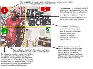
1. The main image is of the model dizzie rascal.
It is the same main image as the front cover,
this is telling us that this is his article/story.
This is a medium long shot as it wants to
show the audience his clothing as this
connotes the type of music he produces as
well as, again, linking to the masthead.
The headline is very bold and
obvious to which feature it is. By
looking at this you can see it is
them main headline anchored to
this story. The font is an
extremely big and bold,
positioned at a slight slant to
suggest the genre.
The other images used suggests the
lifestyle the model has, this would be
said in the article. Moreover it helps
indicate what the icon would be
speaking about in the interview/story.
This can relate to the target audience as
they could have the same interests.
The colours that have been used are very bight on
this page compared to the contents page. This is
not the same house style as the previous pages I
have looked at, this is simply because it is the story
about the celeb, so it represents them. The colours
are vibrant and not dull so it creates a sense of
personality coming from the icon shown.
Page number is at the bottom of the page in empty space,
as it is important but it is not used as an effective feature.
I can see a grid in these pages splitting it into four, shown in yellow lines. 1- models
face, 2- main headline, 3-empty space and 4- main text.