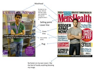
1. Masthead
No date on my
cover. Did not
feel like a date
was needed for
the type of
magazine that it
is.
Selling point
cover line
Cover
lines
Very similar
poses
Pug
No footer on my own cover, I like
the feel of hardly anything blocking
my image.
2. First of all, my magazine uses the very common
technique of the rule of thirds in a conforming
way, with Arun’s body and head dead centre in
the middle of the cover. My masthead is very
clear at the top of the cover and is also done in
a typical masthead style, spreading across the
upper third. The positioning and size of my
cover lines challenge the common magazine as
they are all different sizes and scattered around
the cover instead of going down one side. I
think this is effective because it makes some
cover lines stand out more than others whilst
still maintaining the ability to view all of them
clearly. I used a pug in the bottom right hand of
the cover. I think this is a nice little effect
because it is an extra selling point and it also
makes the cover more aesthetically pleasing in
my opinion. Finally, I have used the college logo
in the bottom left. I have done this as it is a
college magazine yet I acknowledge that in
other, less specific magazines, I would not be
able to use logos due to copyrights.
4. What have I learned about the technologies
from the process of constructing the product?
• I already had some past knowledge and skills in
photoshop so I was able to start quickly with my
magazine. However I have still learned some new
editing techniques when editing my magazine cover. I
have also learned how to use a camera to take
magazine cover style photos, using the rule of thirds
especially. I have used these skills to conduct an
image which either abides by this or challenges it.